—Identity Design, Branding, Custom Type
The new identity introduces a refreshed logo that opens a blank space as a window of imagination, an expanded green palette inspired by the rhythm of the day, and custom typefaces that balance utility with playful charm. Cohesive across signage, packaging, digital, and campaigns, the system unifies Blank Street’s global presence and signals its evolution into a lifestyle brand.
Made at Wolff Olins
—Branding, Identity Design
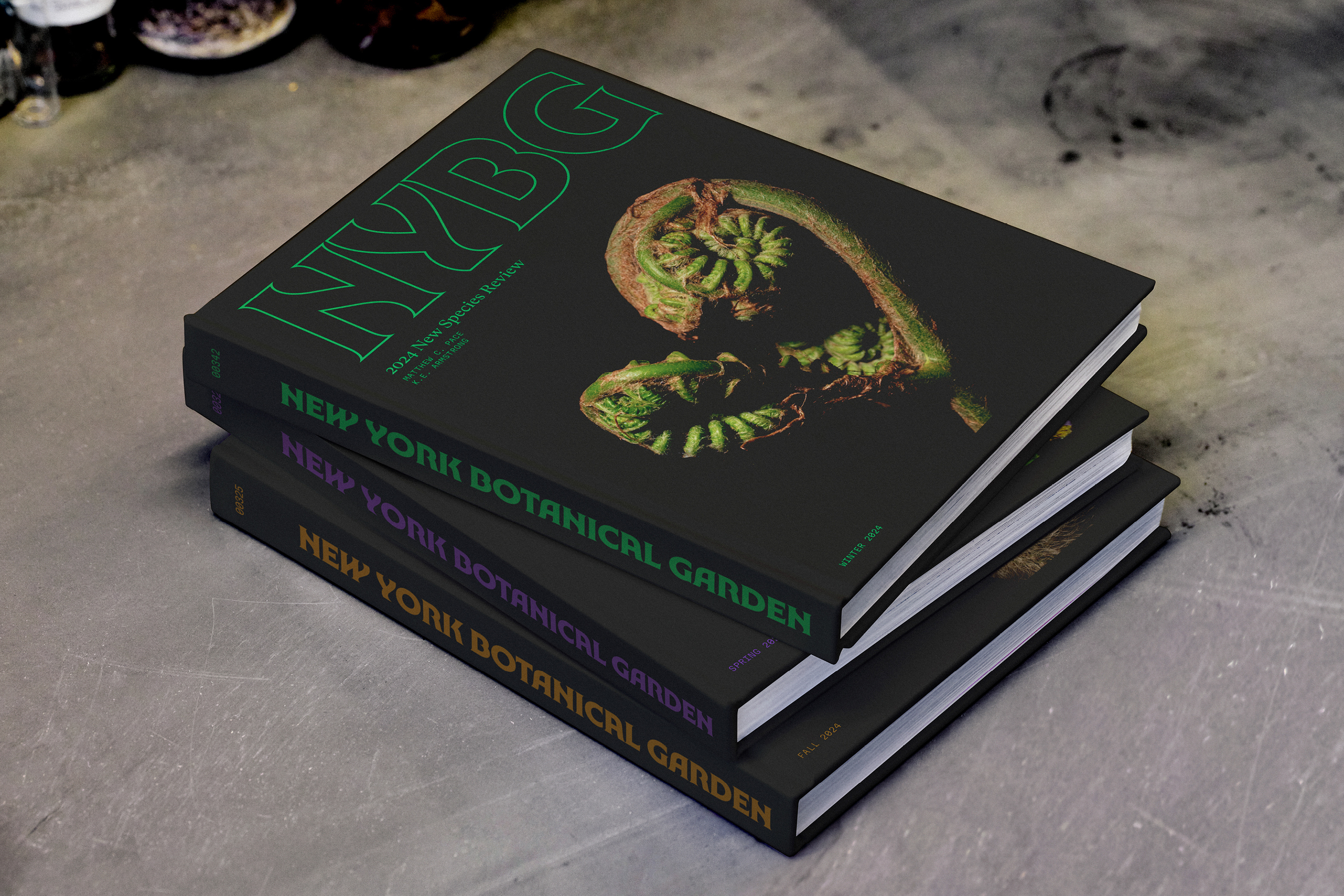
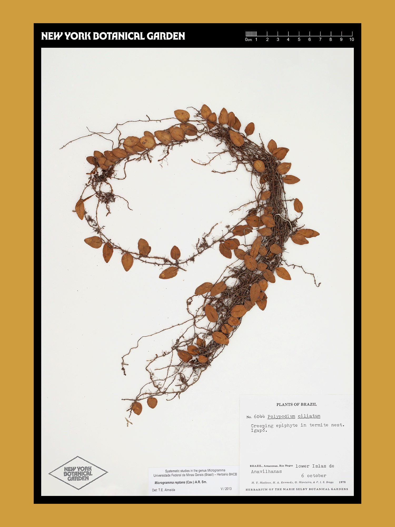
The New York Botanical Garden has been a local treasure since 1891—yet it’s also a globally significant institution. Our work positions them to be known for the organization of action they are, a place of beauty and contemplation as well as a global leader on environmental action and plant science.


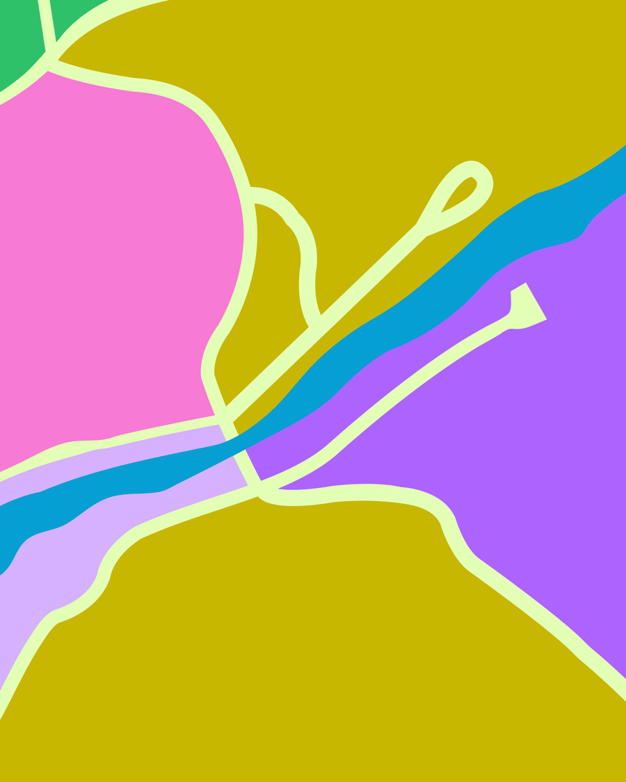


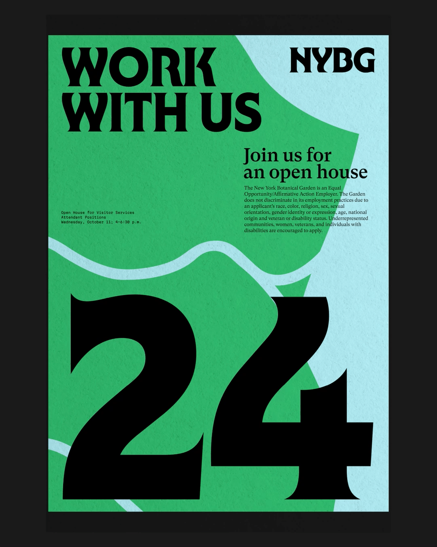
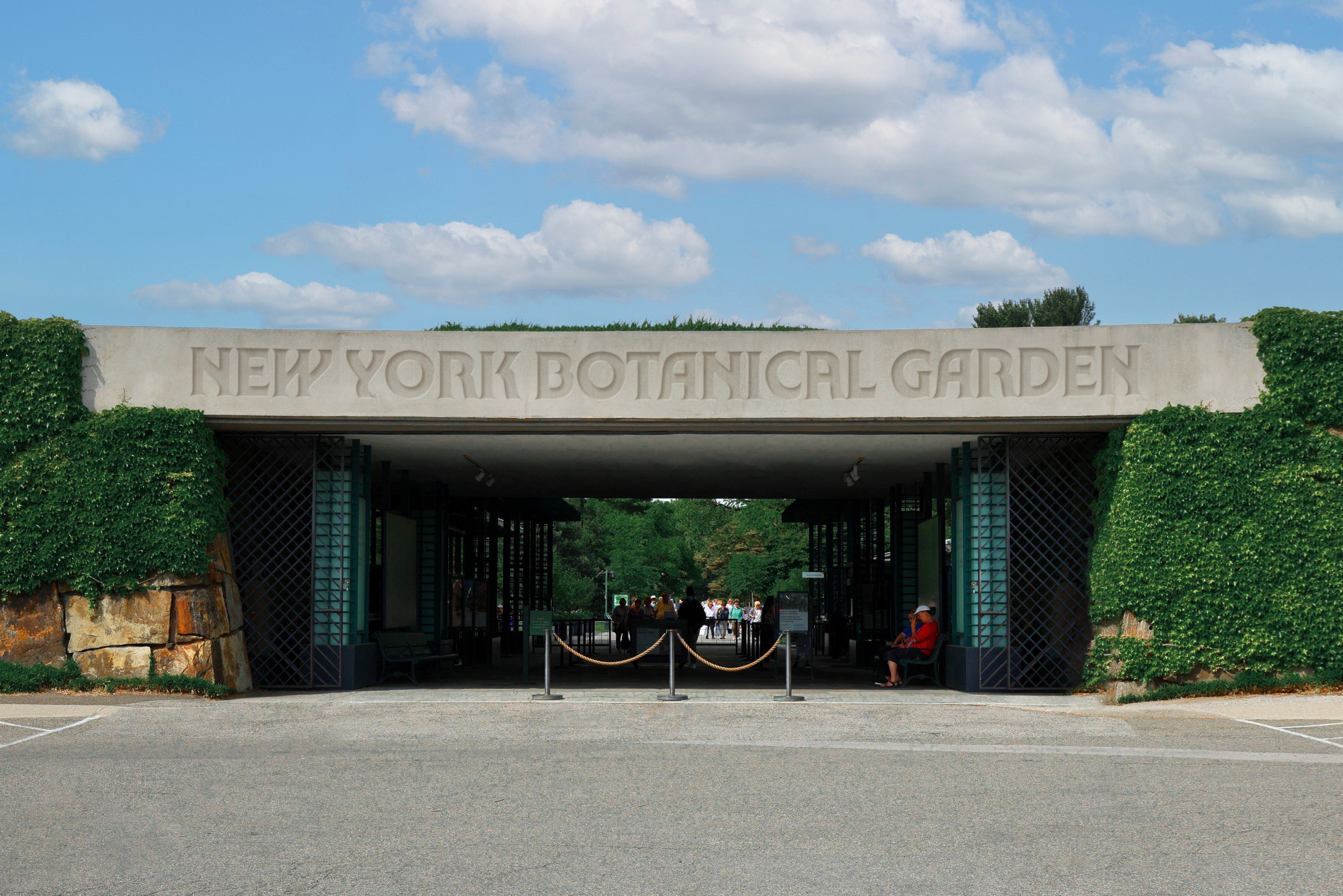
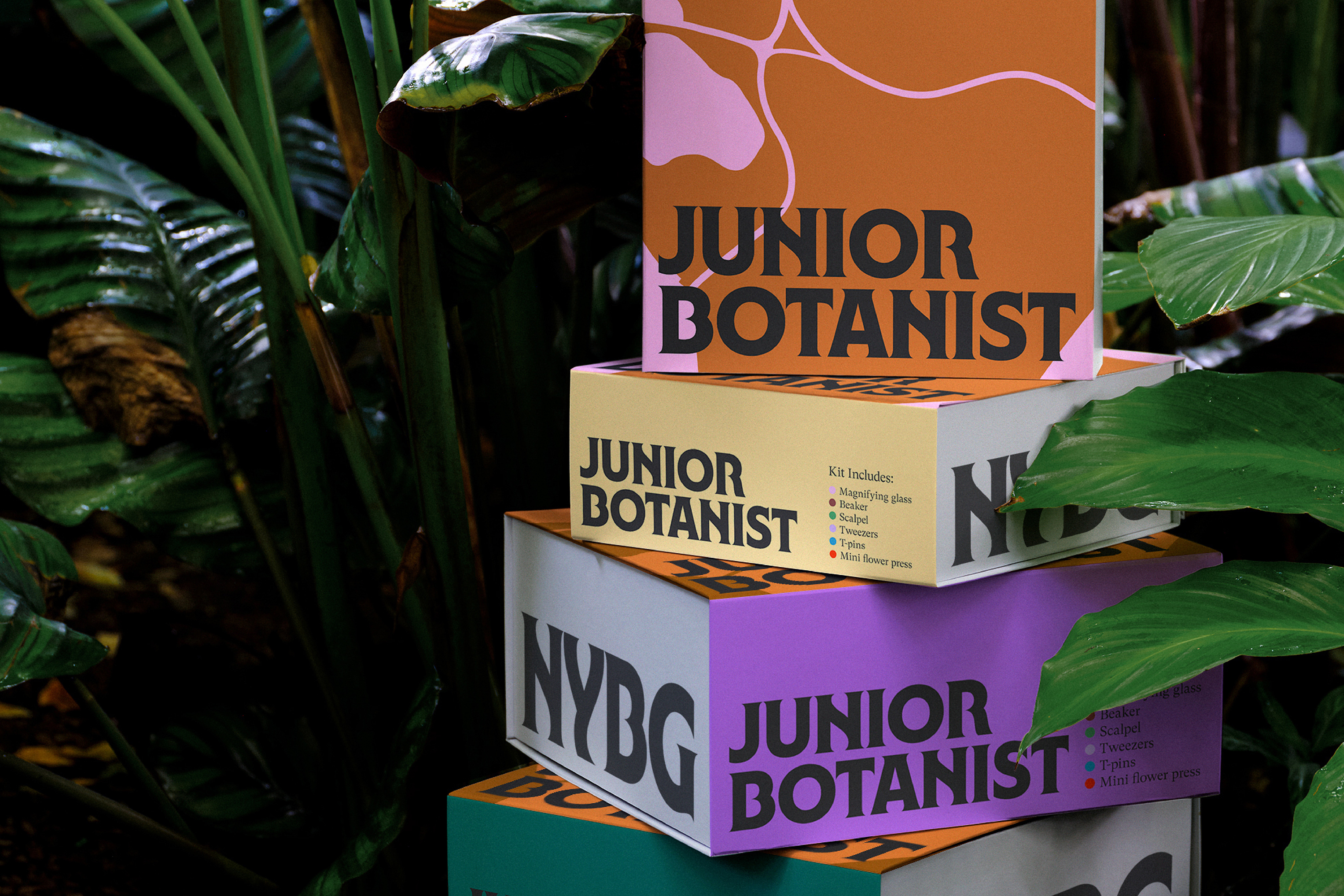


Made at Wolff Olins
Design—Thomas Wilder, Jane Boynton, Melissa Chavez, Jun Hong, Meg Forsyth
Typographer—Ryan Bugden
Motion—Draeger Gillespie, Etienne Godiard, Jason Chen, Yiting Nan
—Identity Design
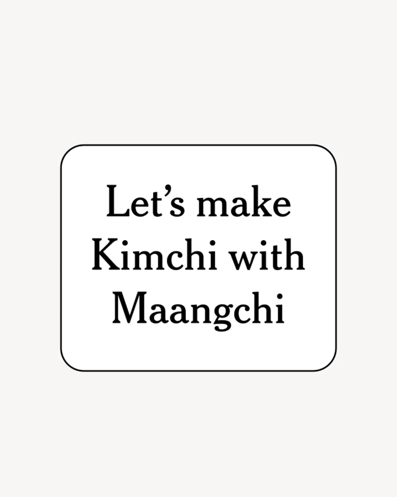
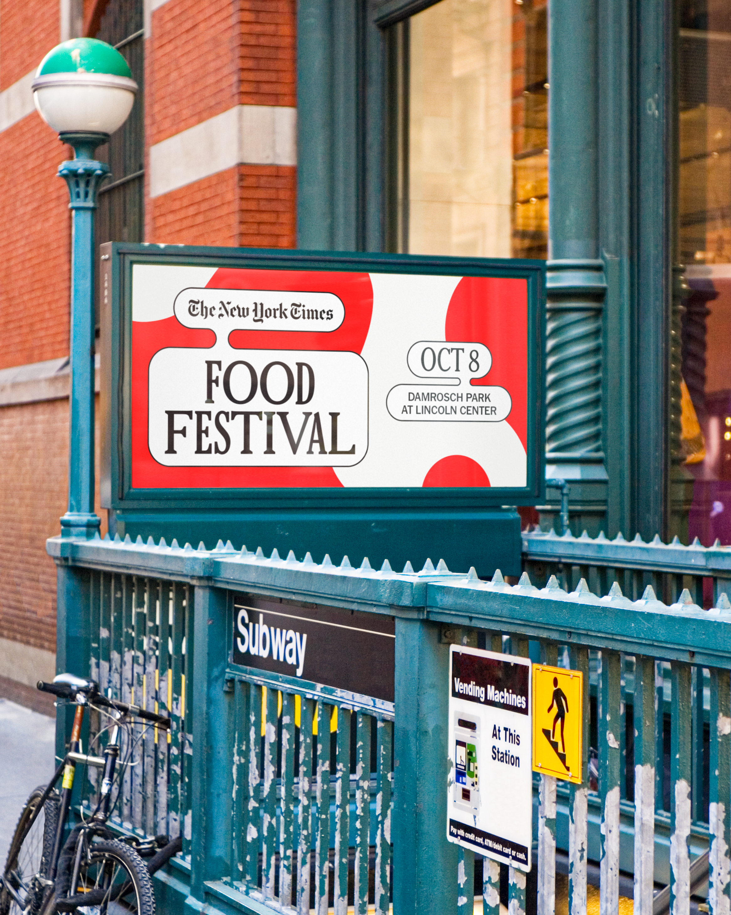
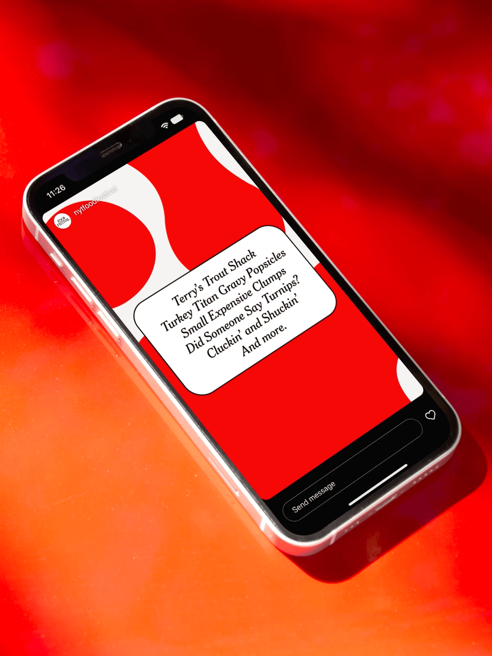
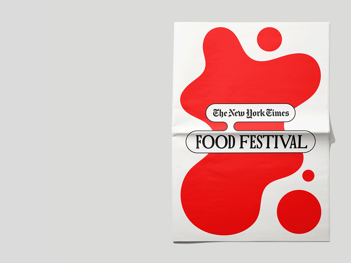
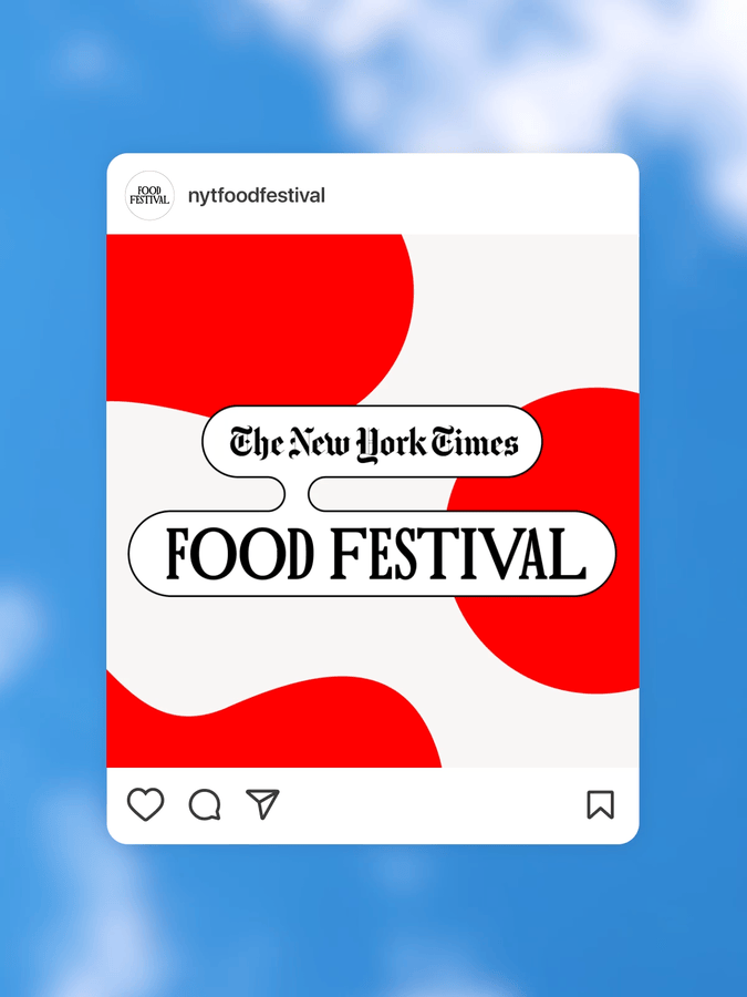
After a two-year hiatus, The New York Times brought back its wildly popular celebration of food and drink for Fall 2022. Updating and expanding our flavorful identity for the 2019 event involved carrying over identifiable elements, and adding a mouthwatering animated system that helped to build-up a big appetite for buying tickets.

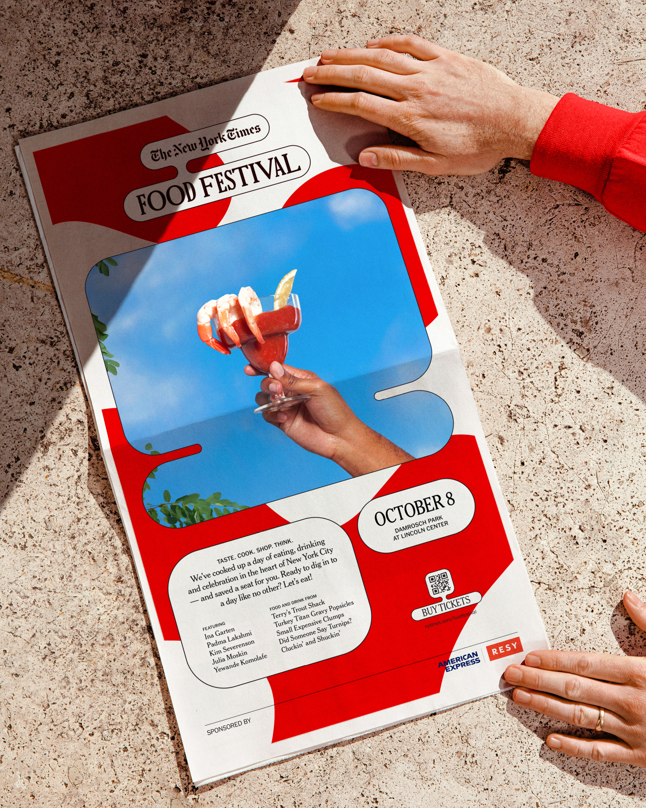

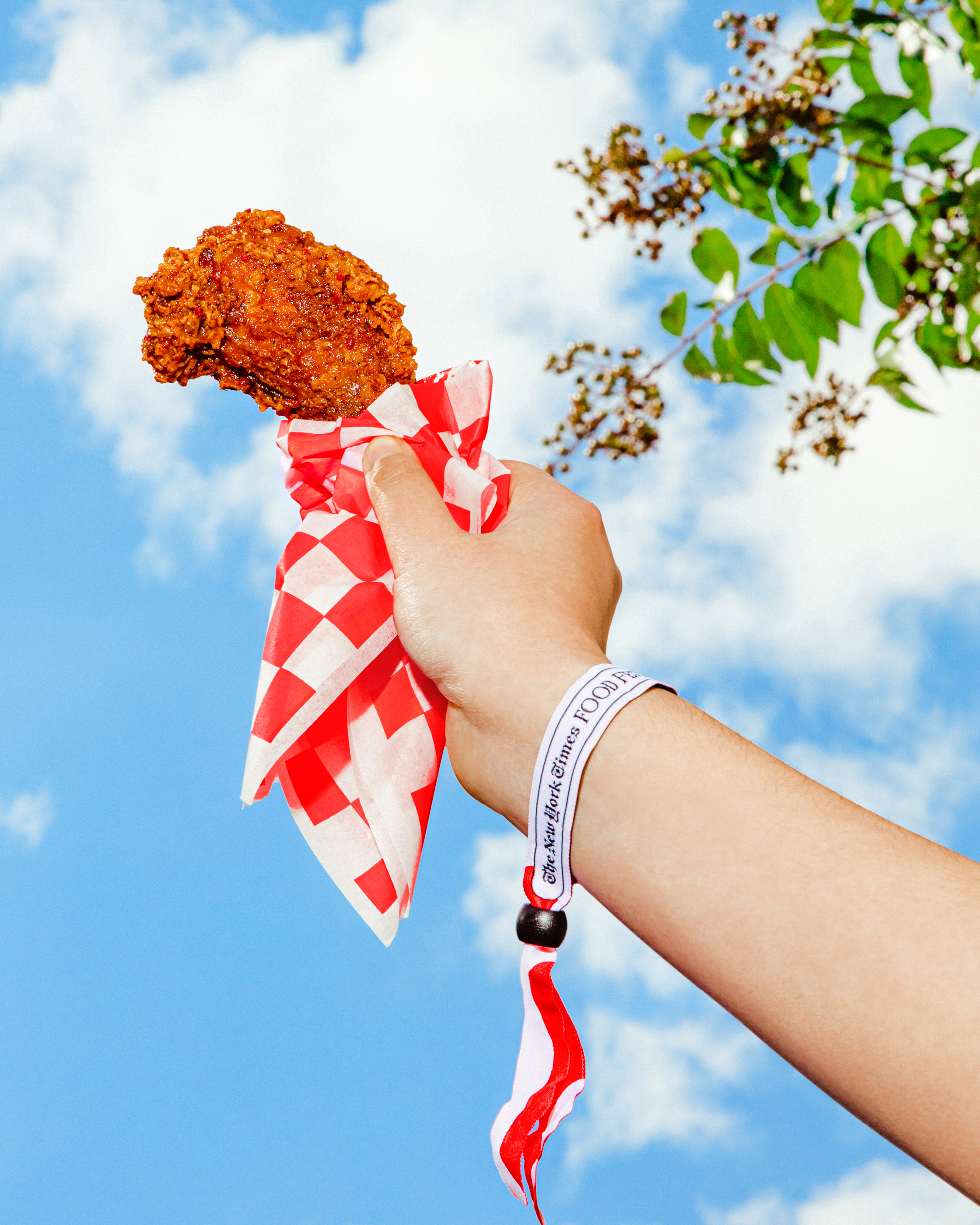

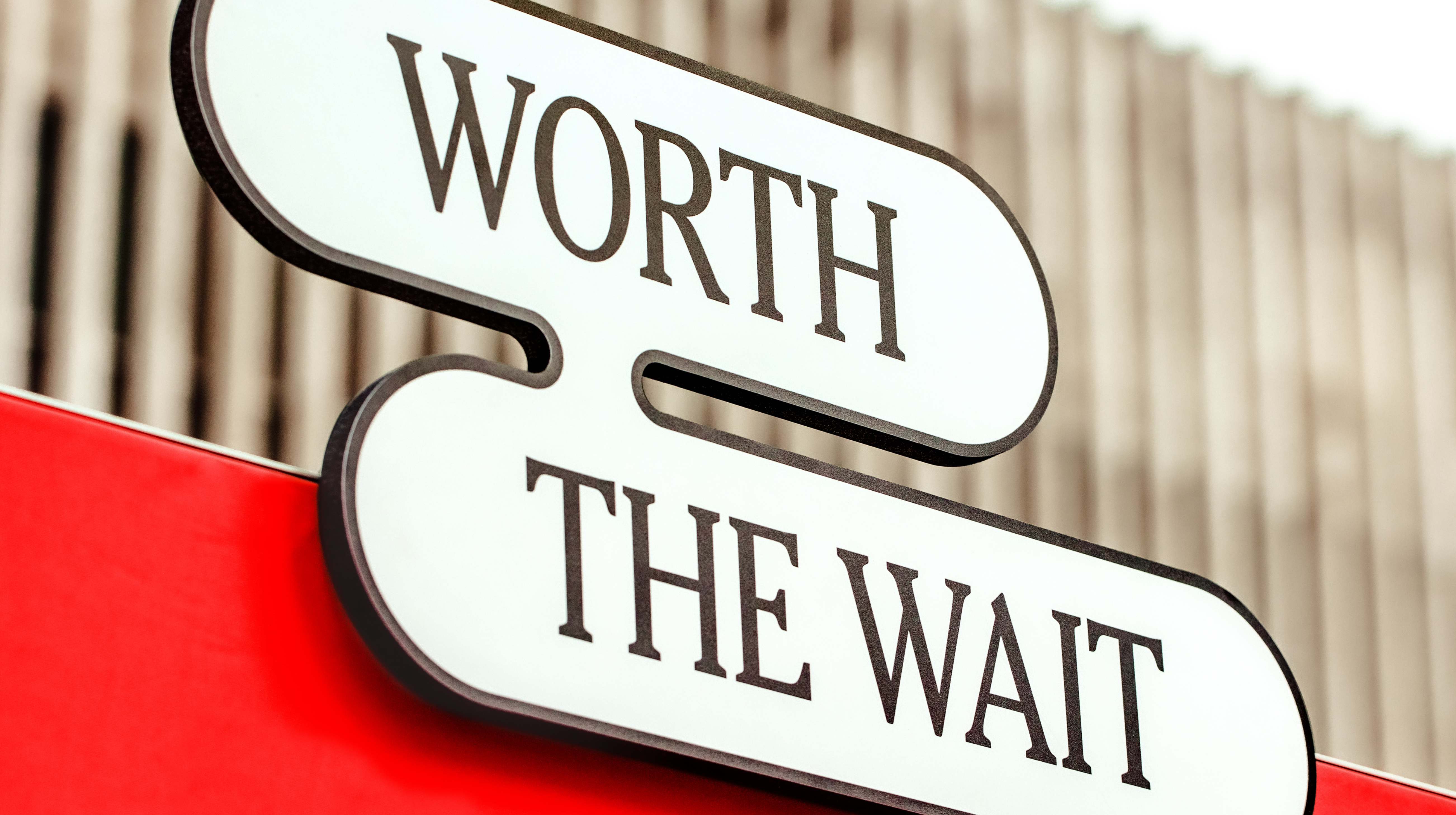
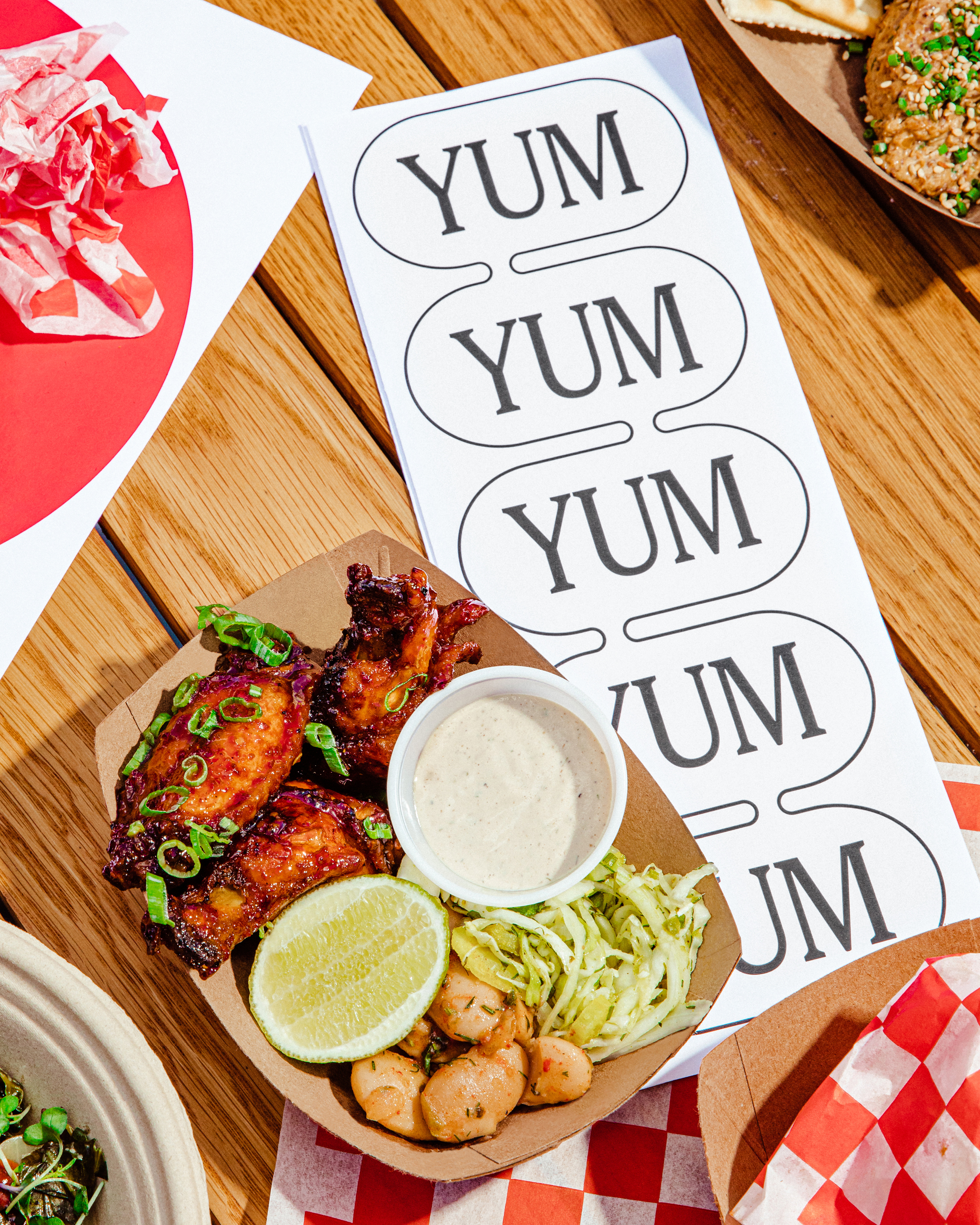


Made at Base Design
Team: Min Lew, Tom Fethers, Jun Hong
Project Managing: Harry Laverty
Motion Design: Nol Honig
Photography: Anisha Sisoda
—Branding, Identity Design
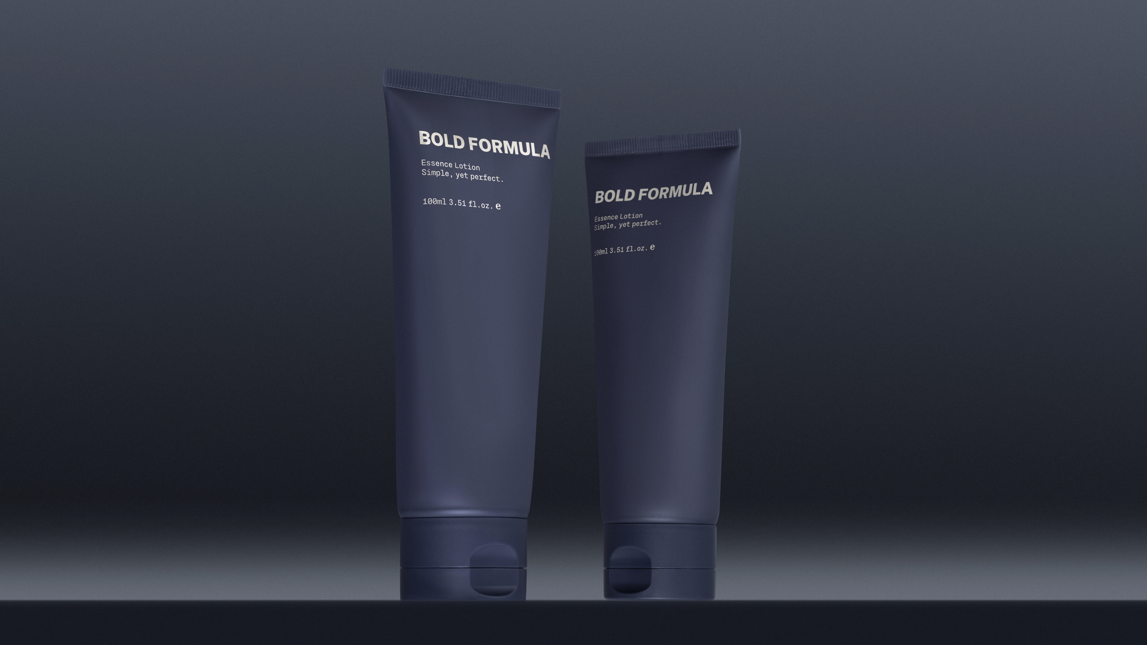
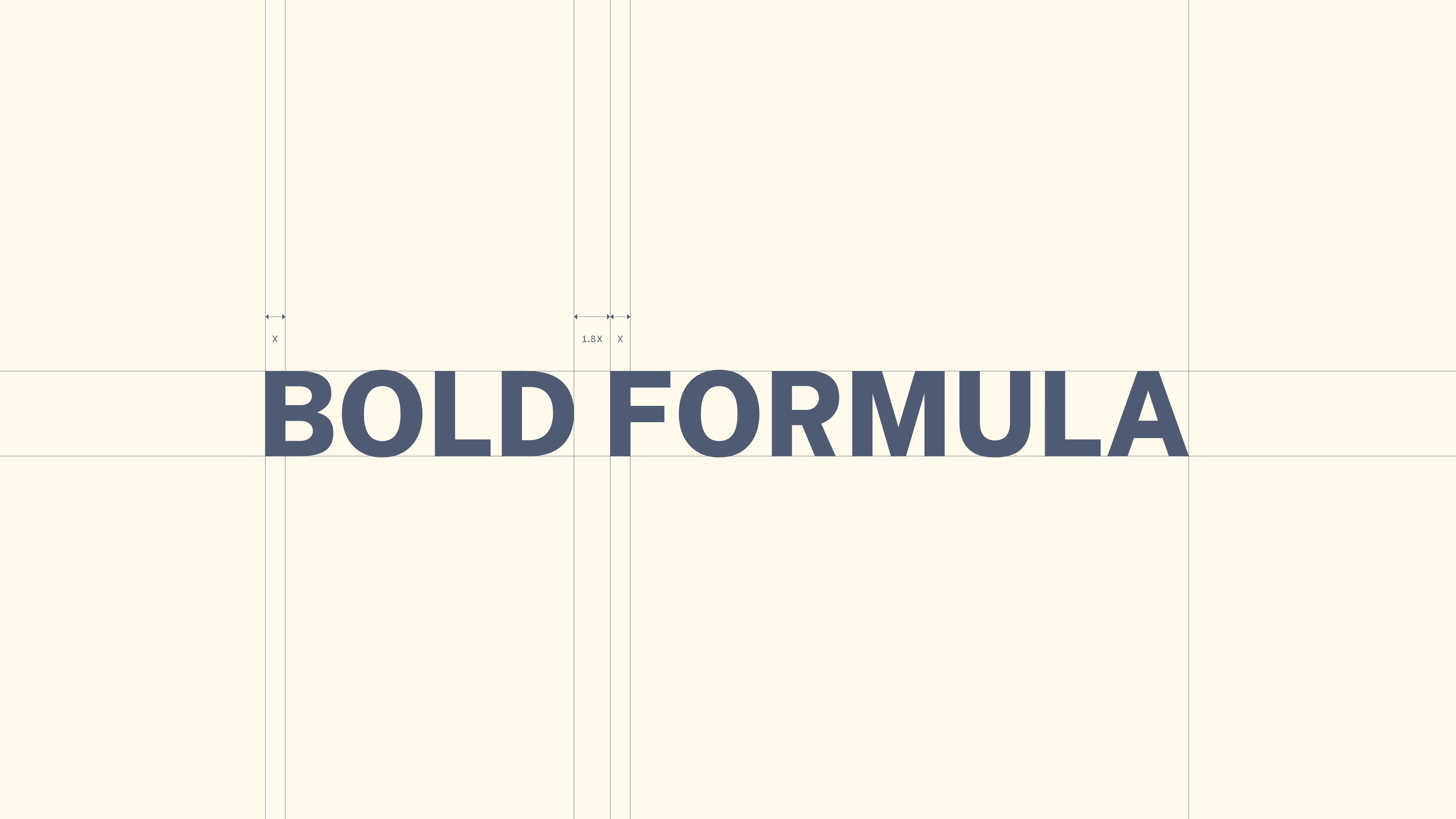
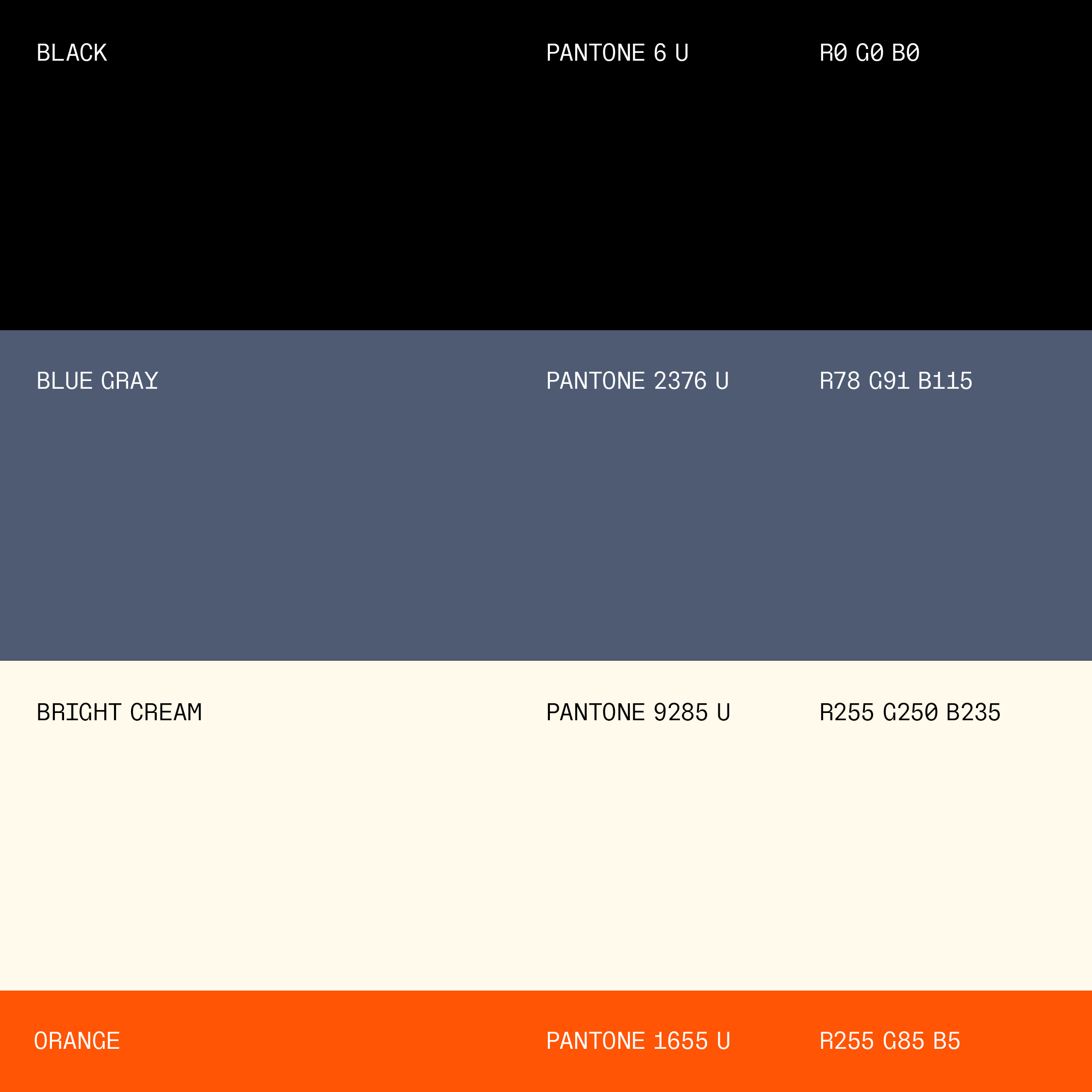
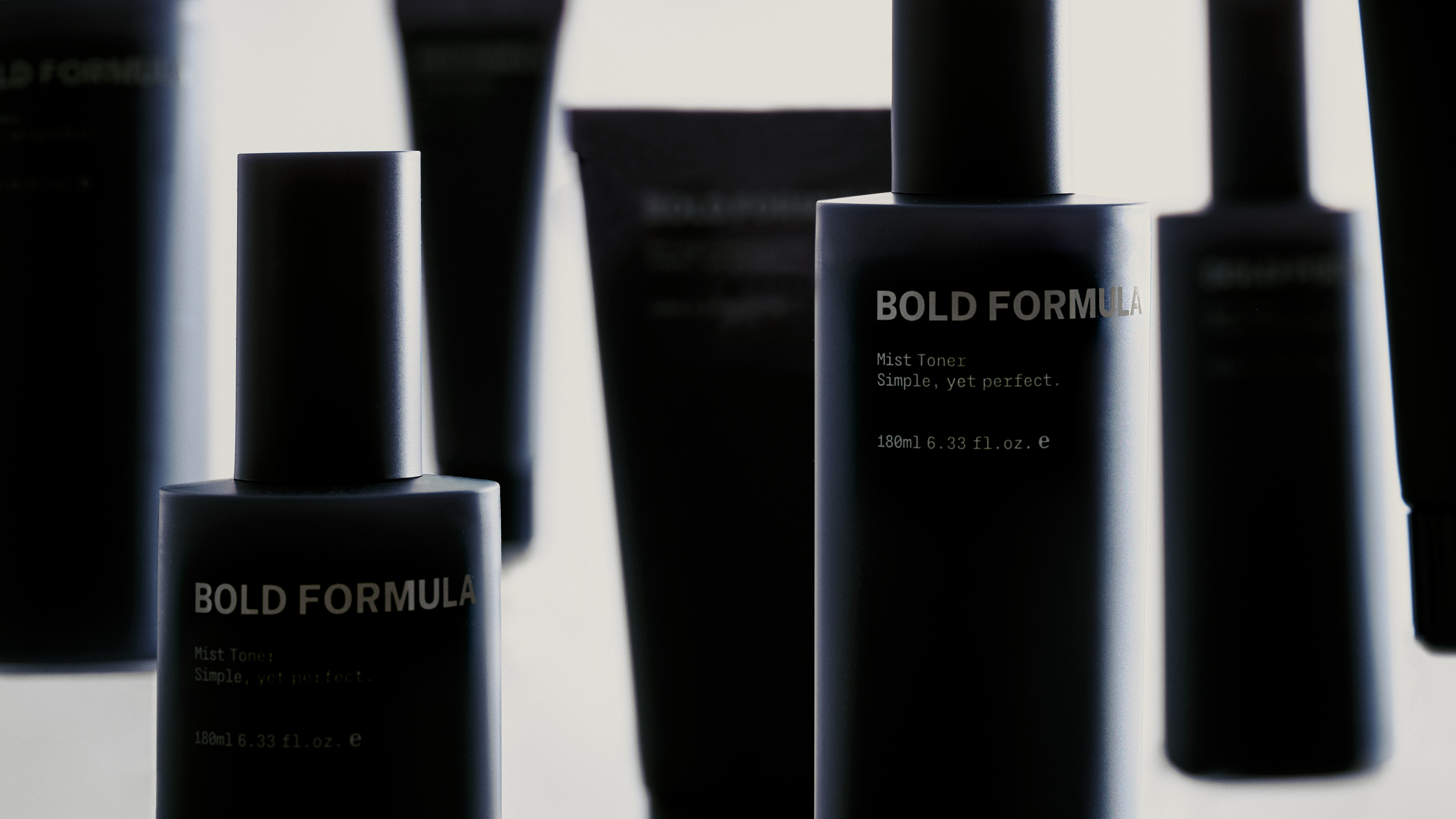
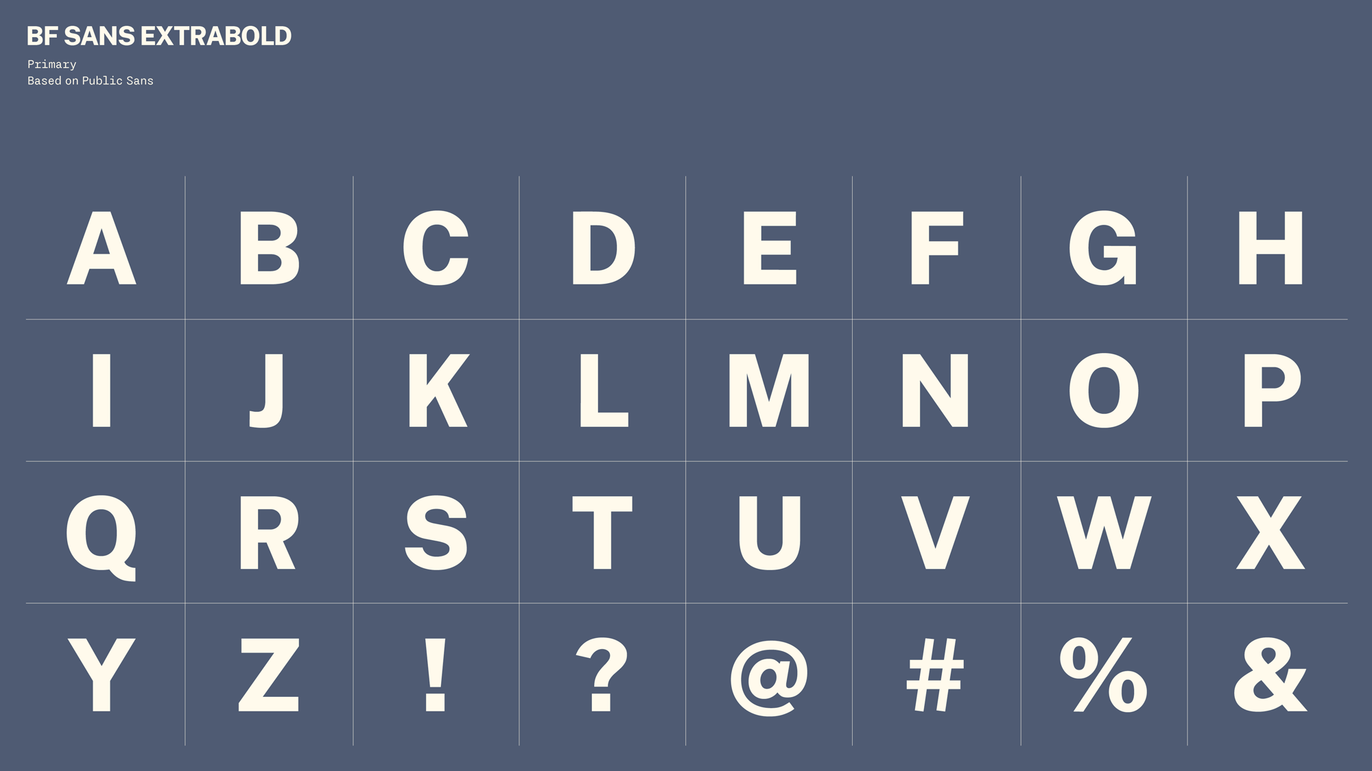
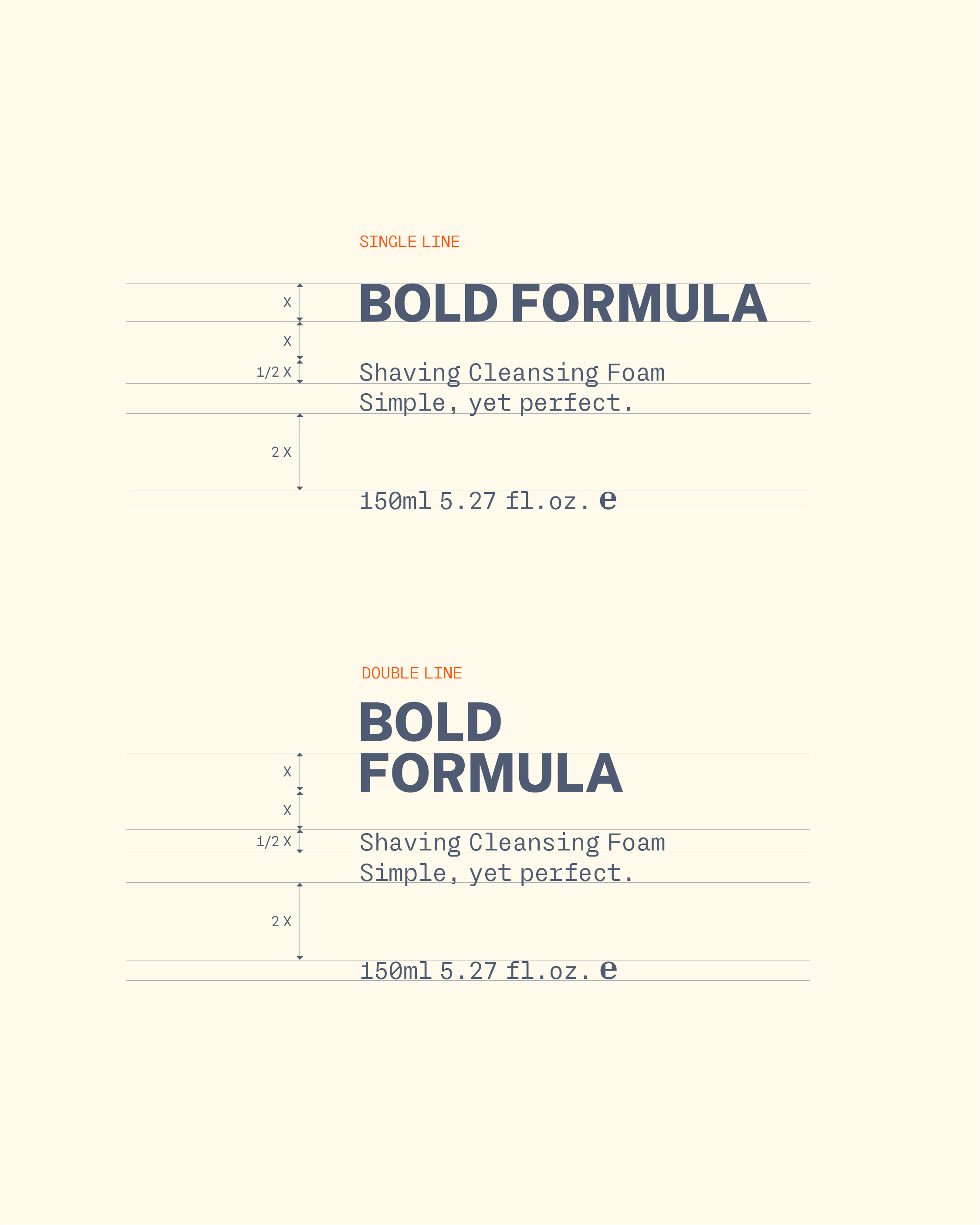
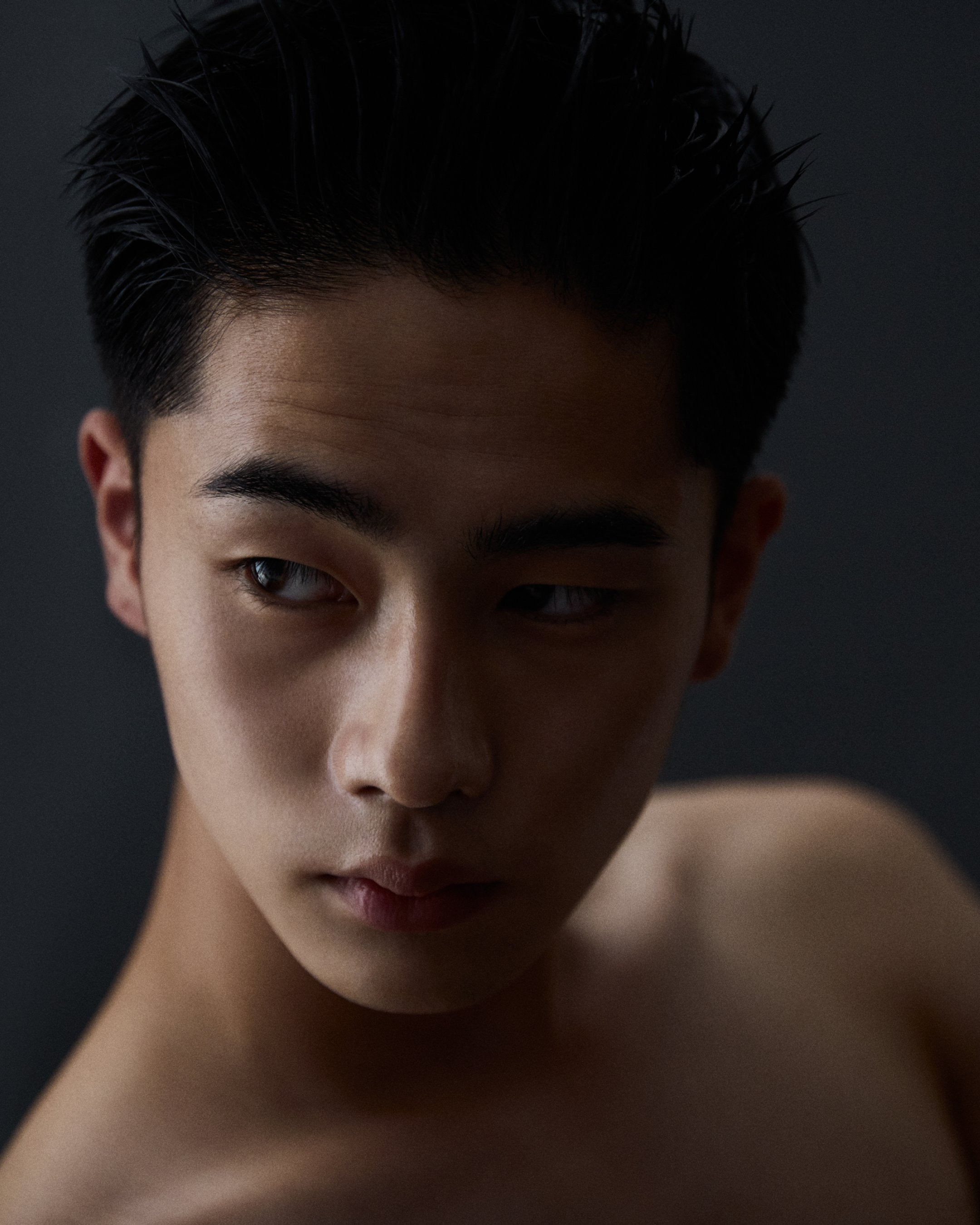
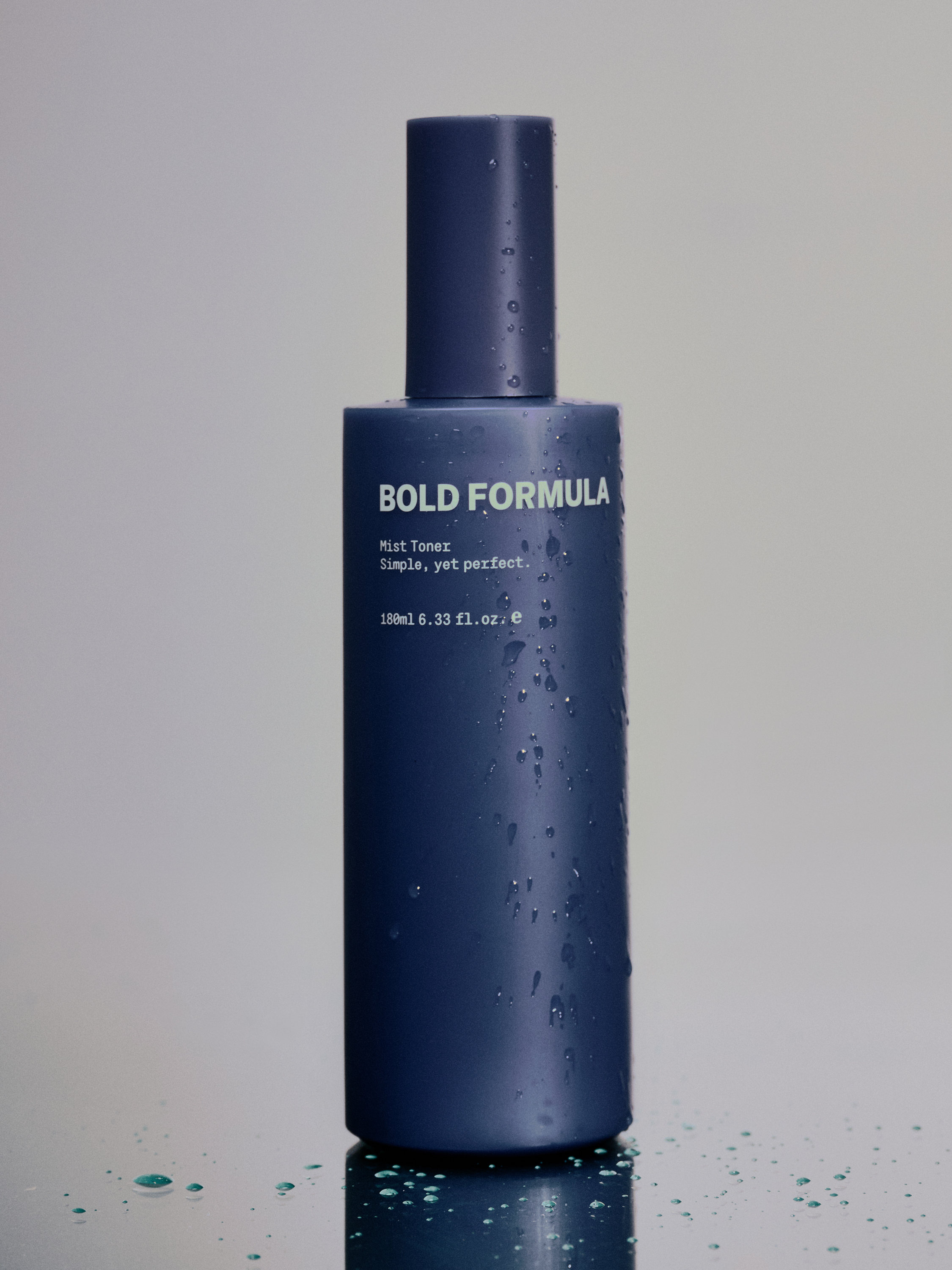
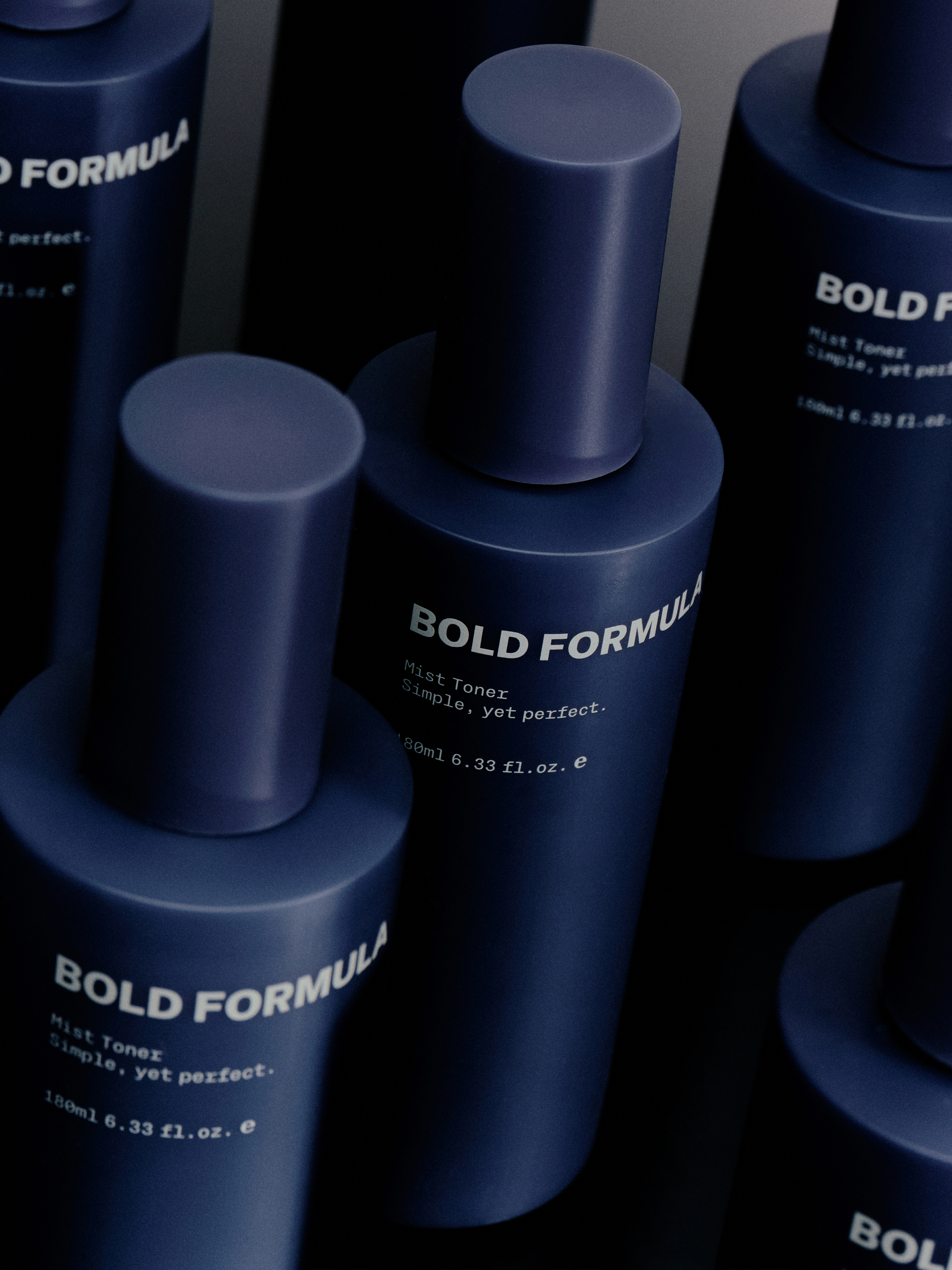
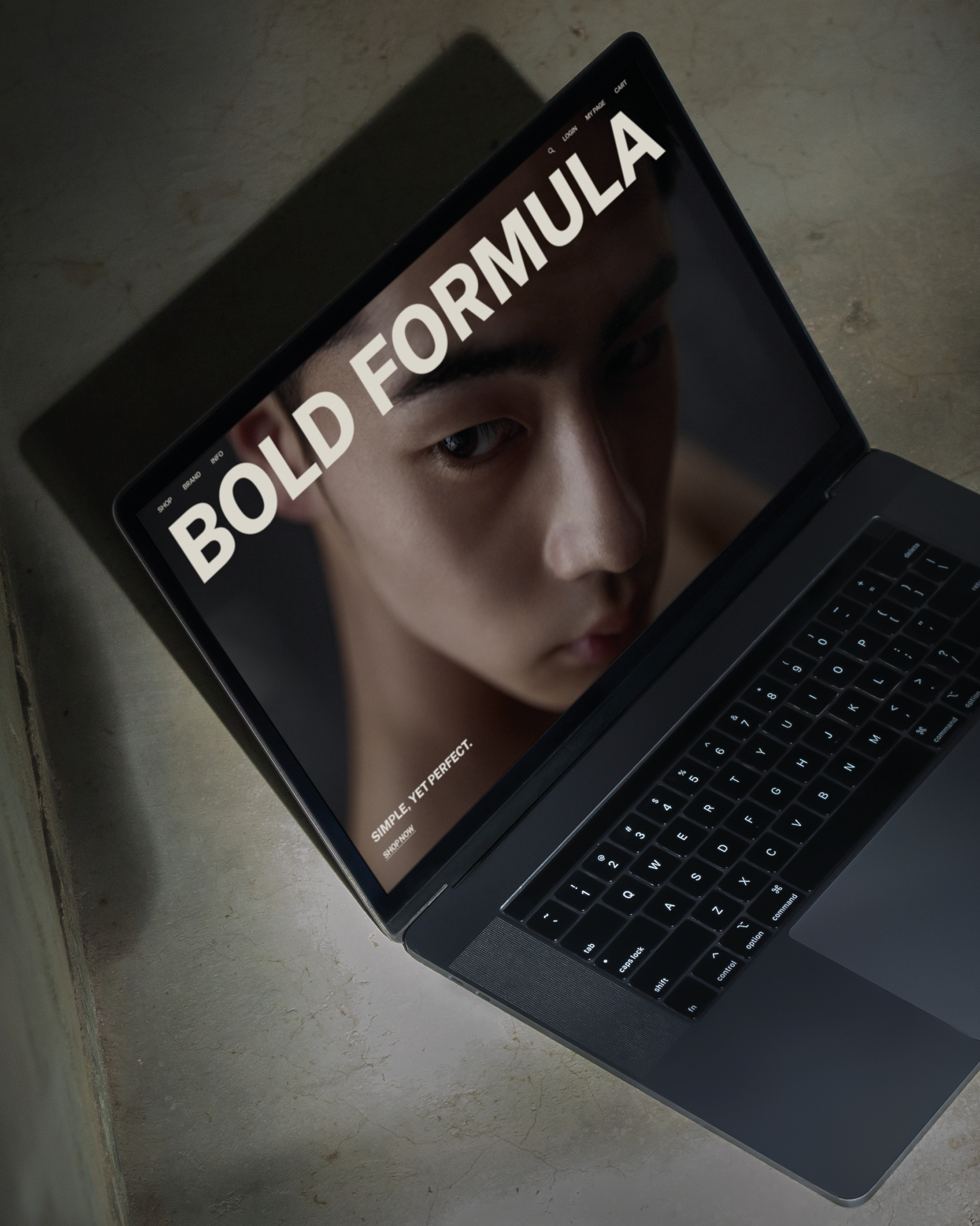
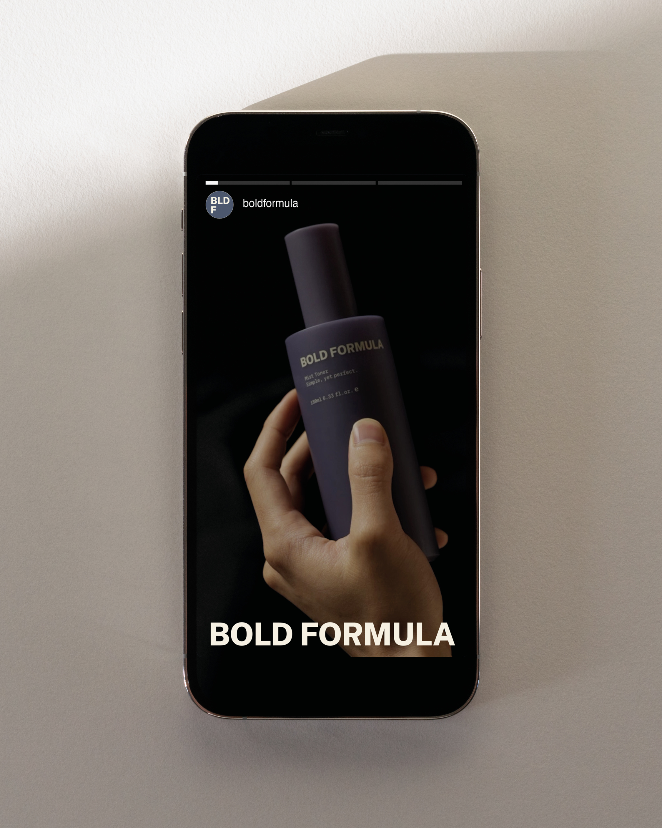
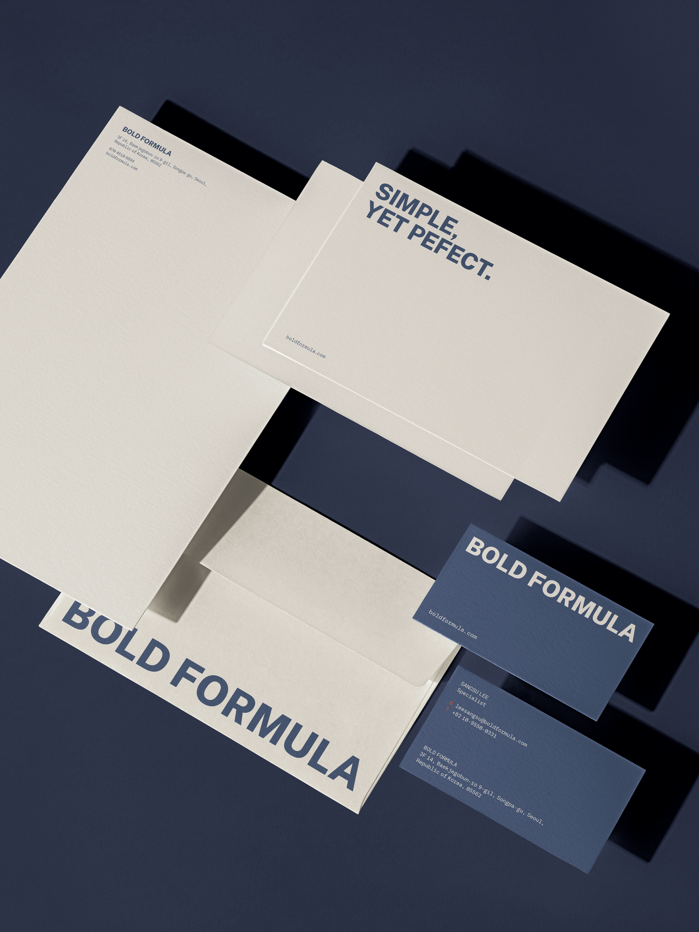
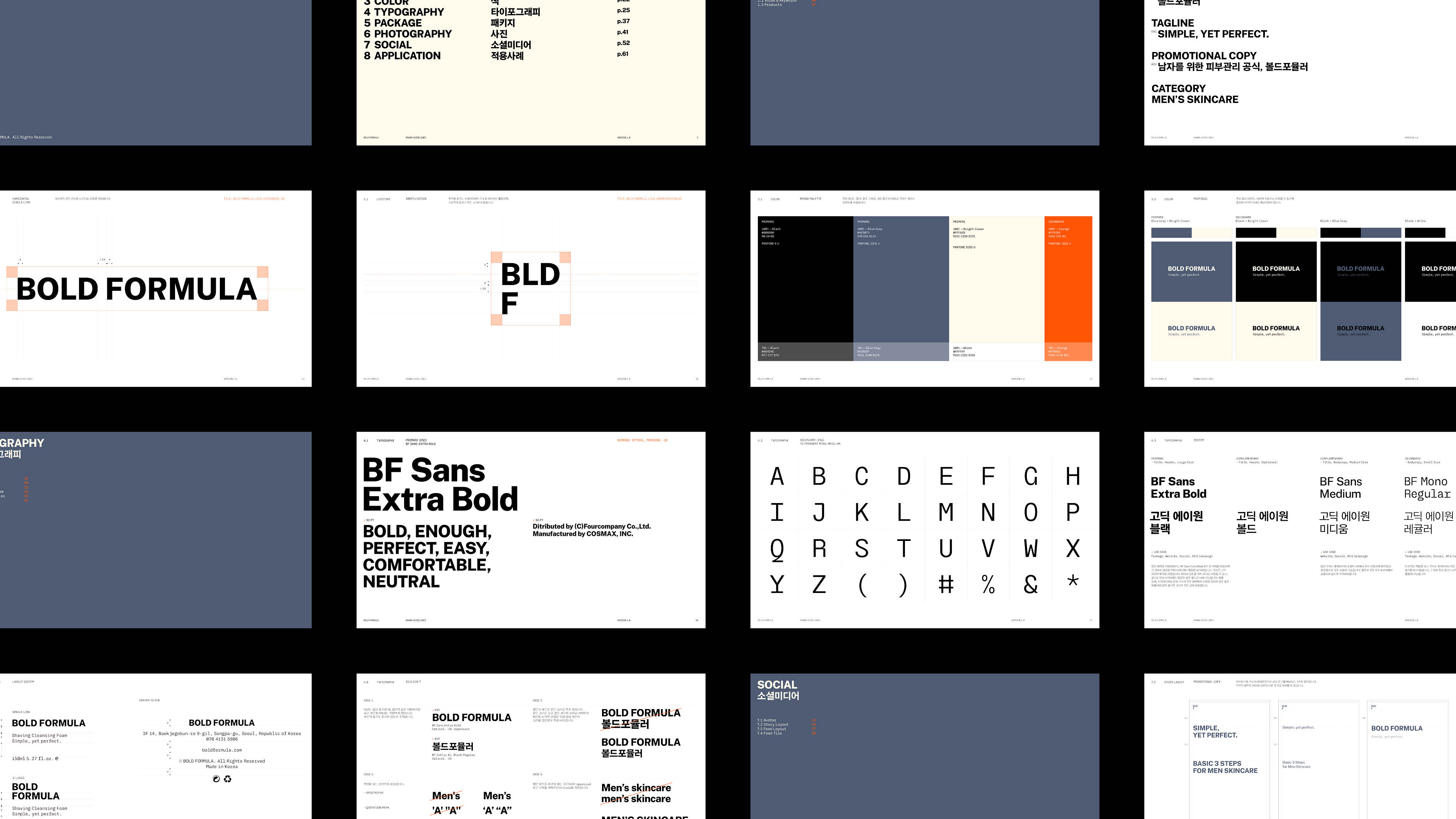
BOLD FORMULA is a skincare brand designed for men who value simplicity. The brand’s visual identity revolves around a simple and striking typography system, aiming to ensure clear and impactful communication across all applications. The goal was to deliver a sense of modernity and confidence, with its simple yet bold typography.


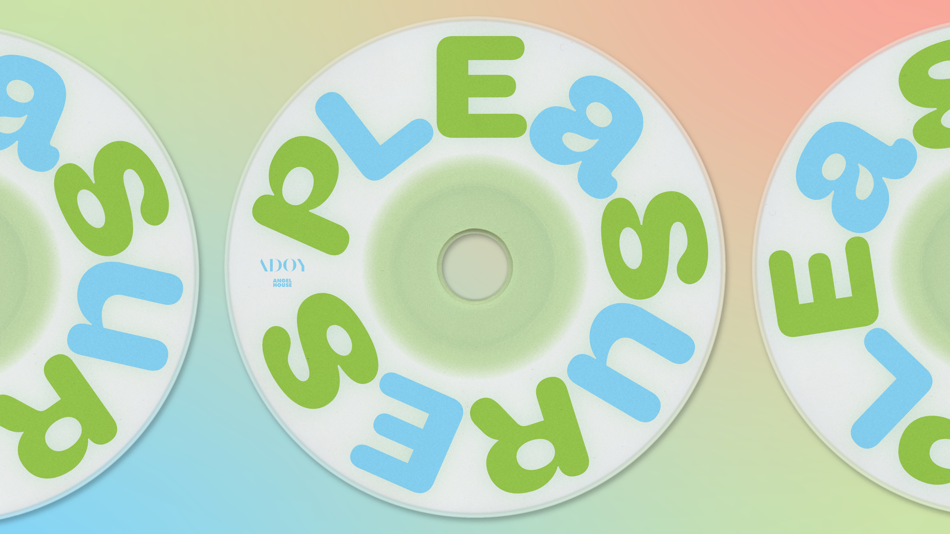
—Album Design
The symbol was designed to resemble a joyful facial expression and a ribbon on a gift box. Warm colors and soft edges were used to convey a gentle, emotional depth. The variable-width typography reflects diverse emotions that music evokes.


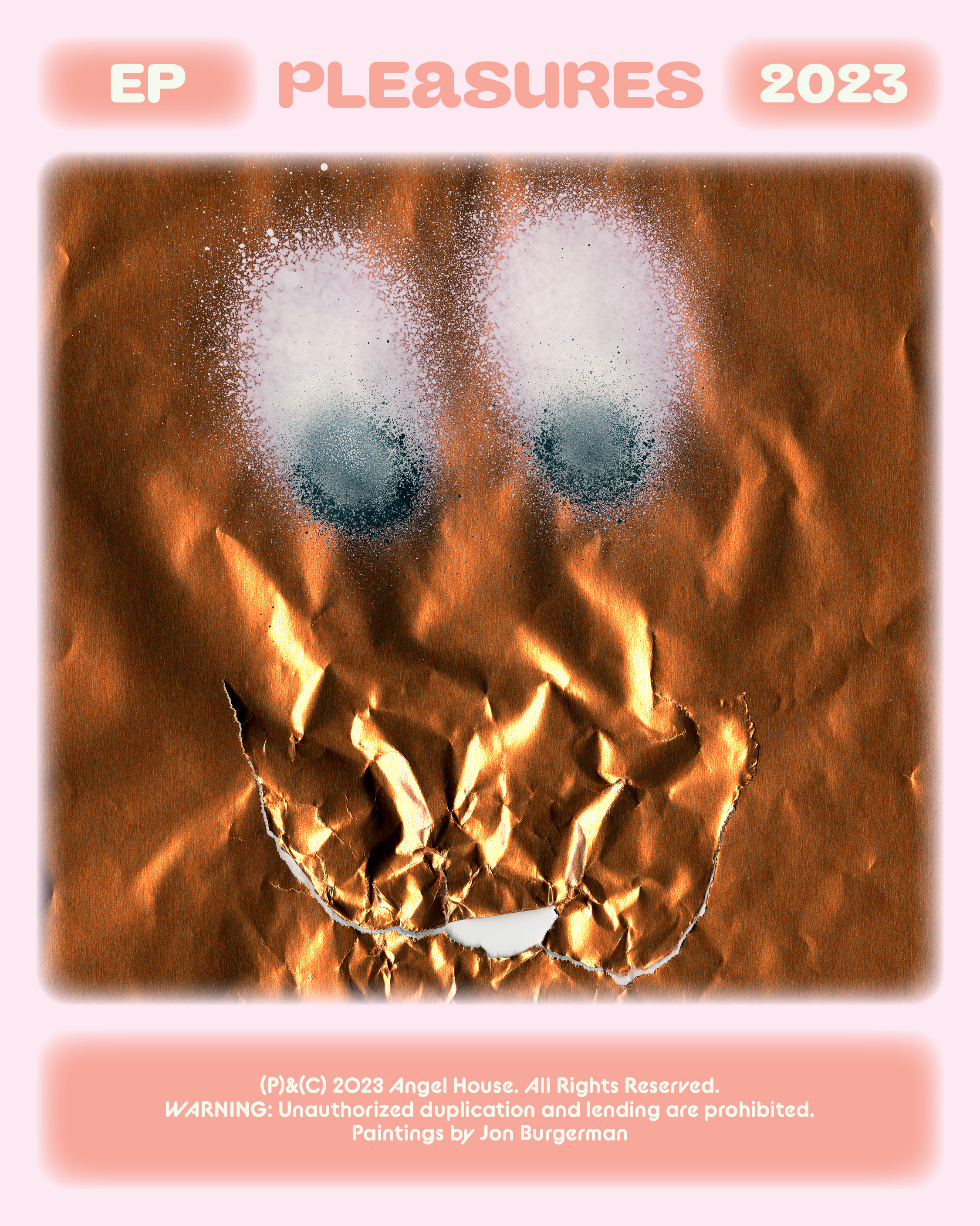


Illustrations by Jon Burgerman