—Album Design
To convey the meaning of their remake album where six artists reinterpreted ADOY’s songs, the letter [u] was utilized as a module and rotated to form the letter [s]. This visually represents the album title [us], emphasizing the collaborative nature of the project.
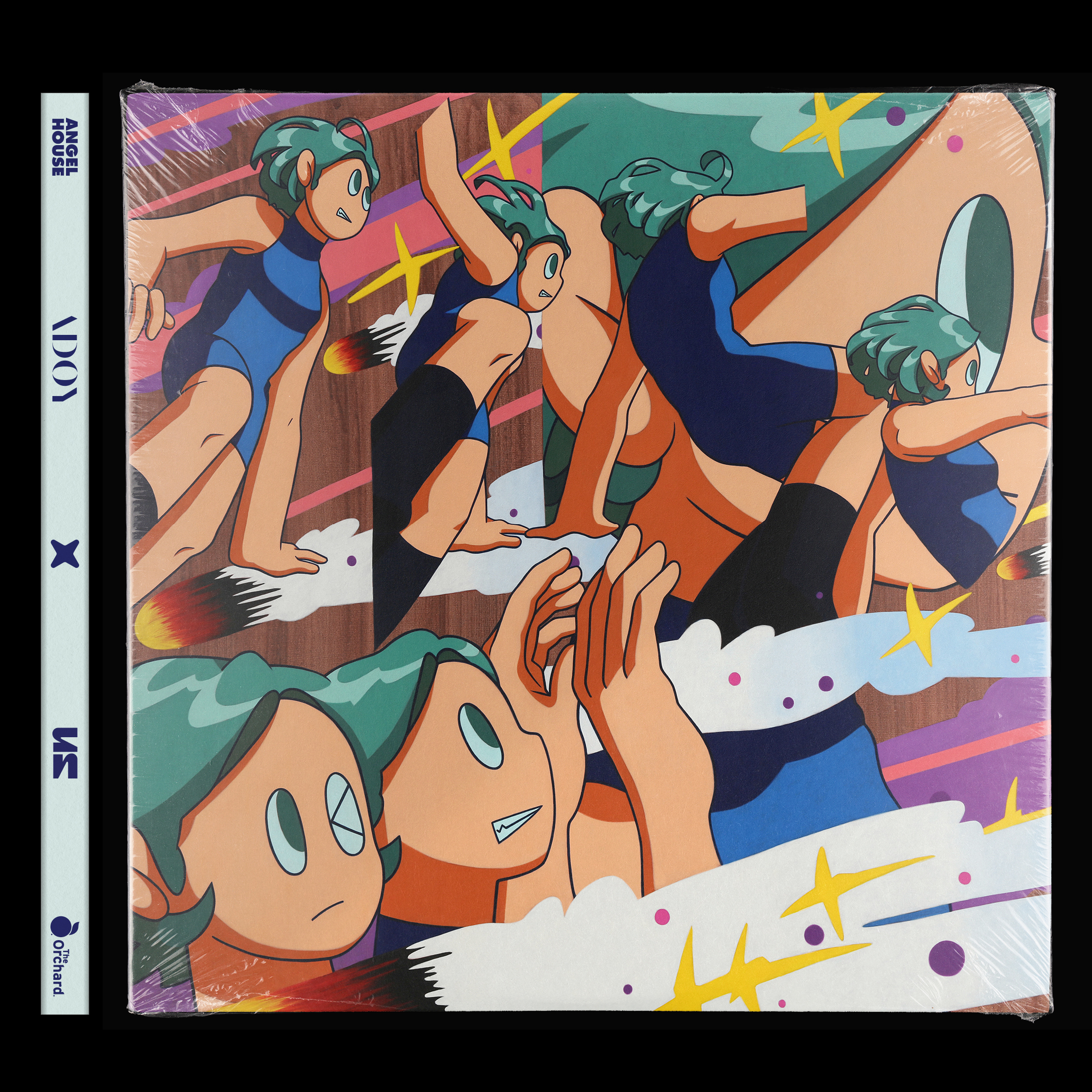
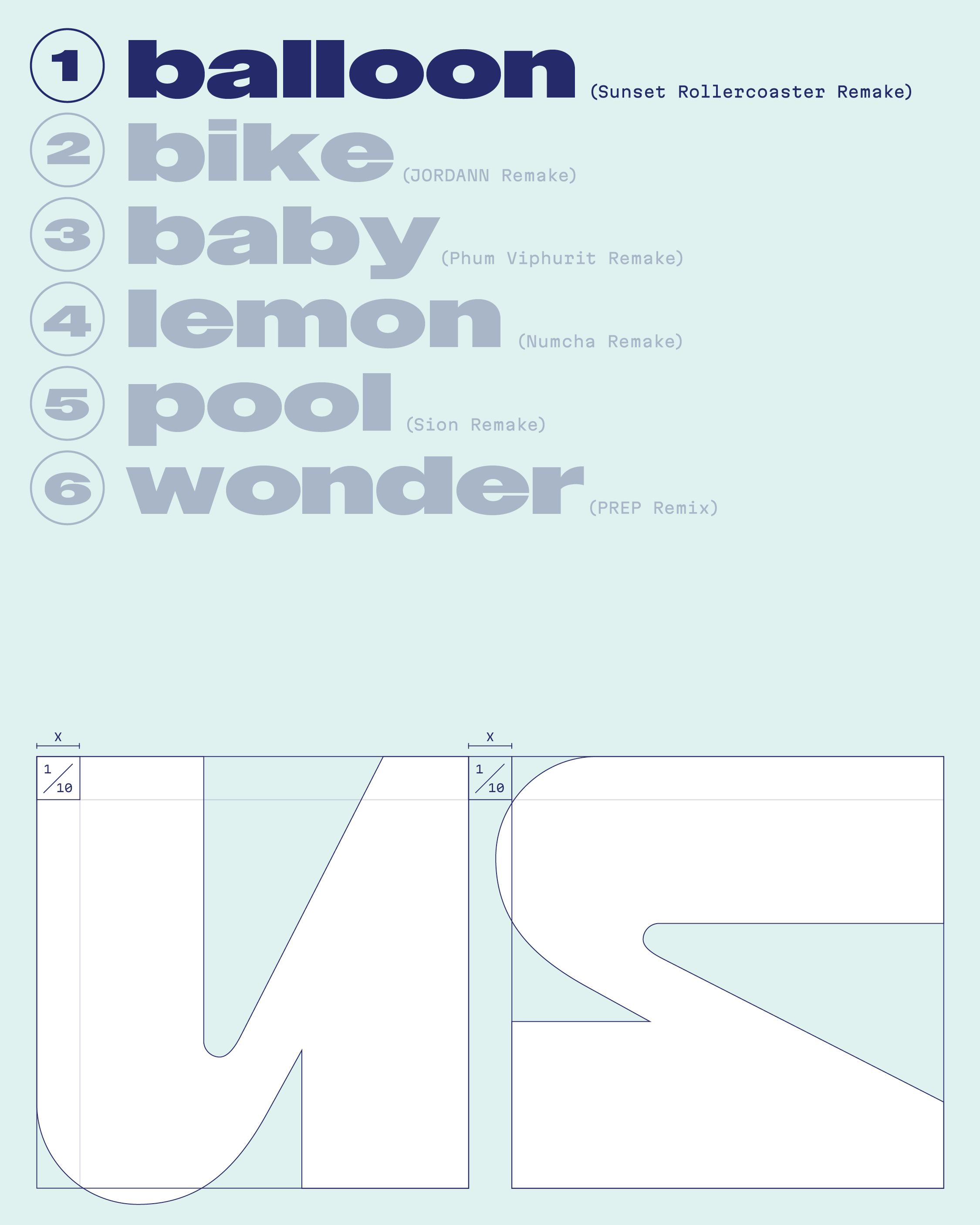
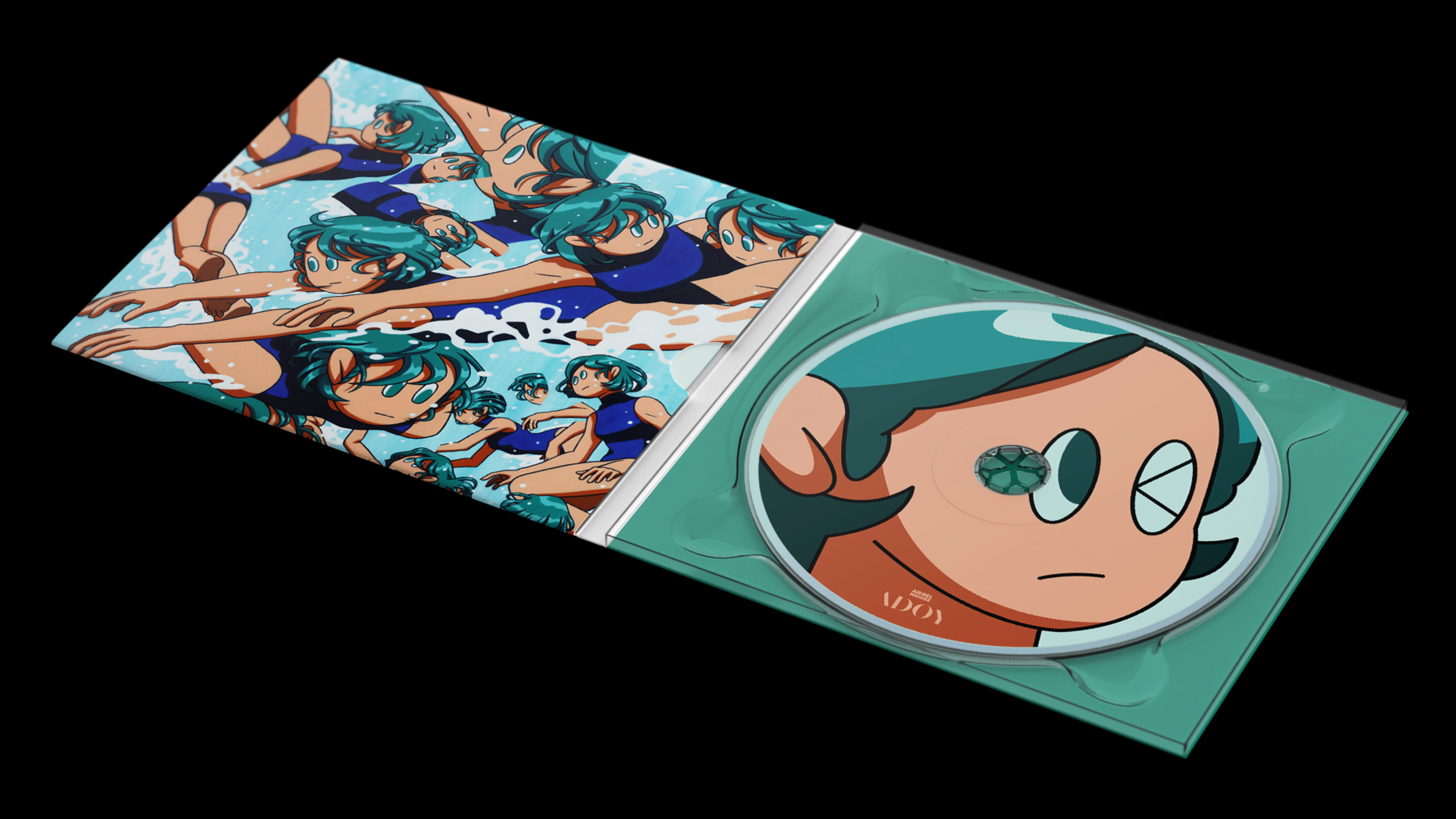
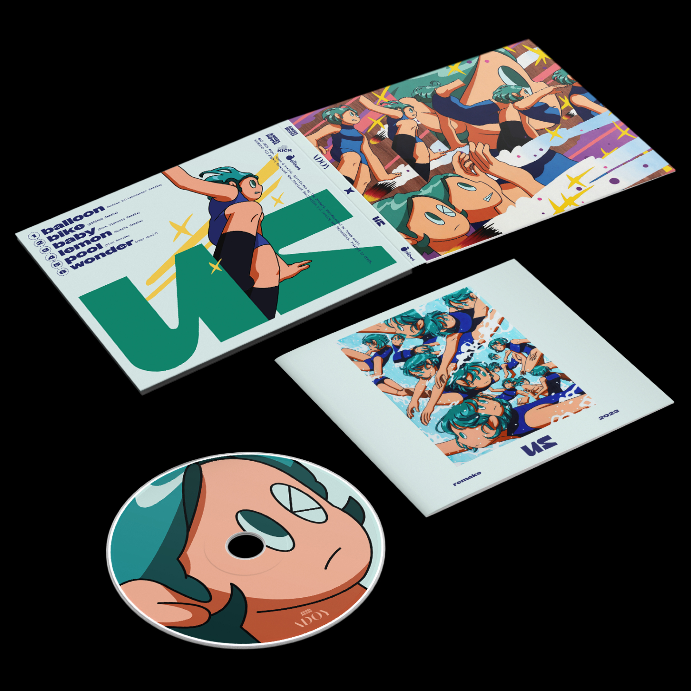
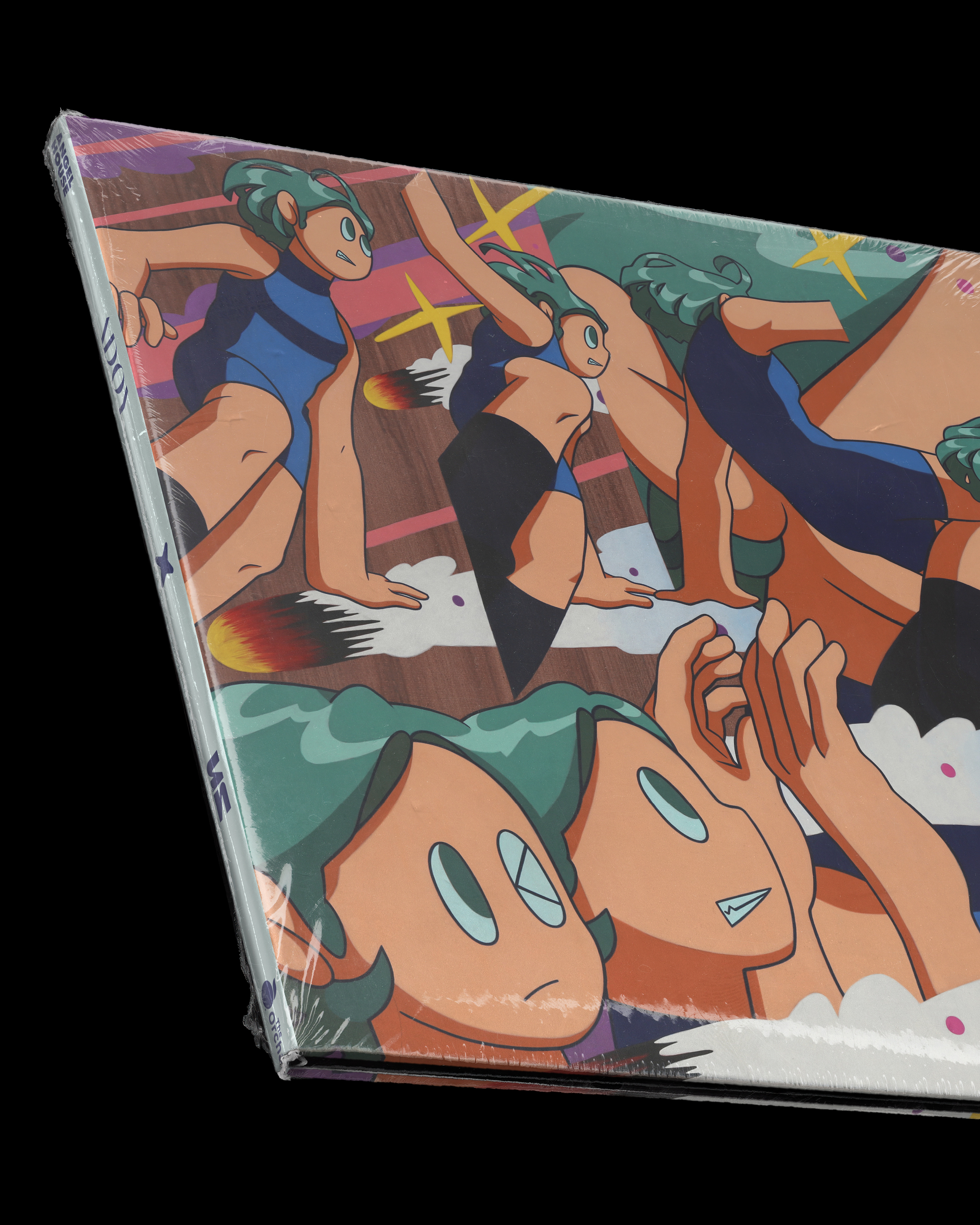
Illustrations by Ju Gio
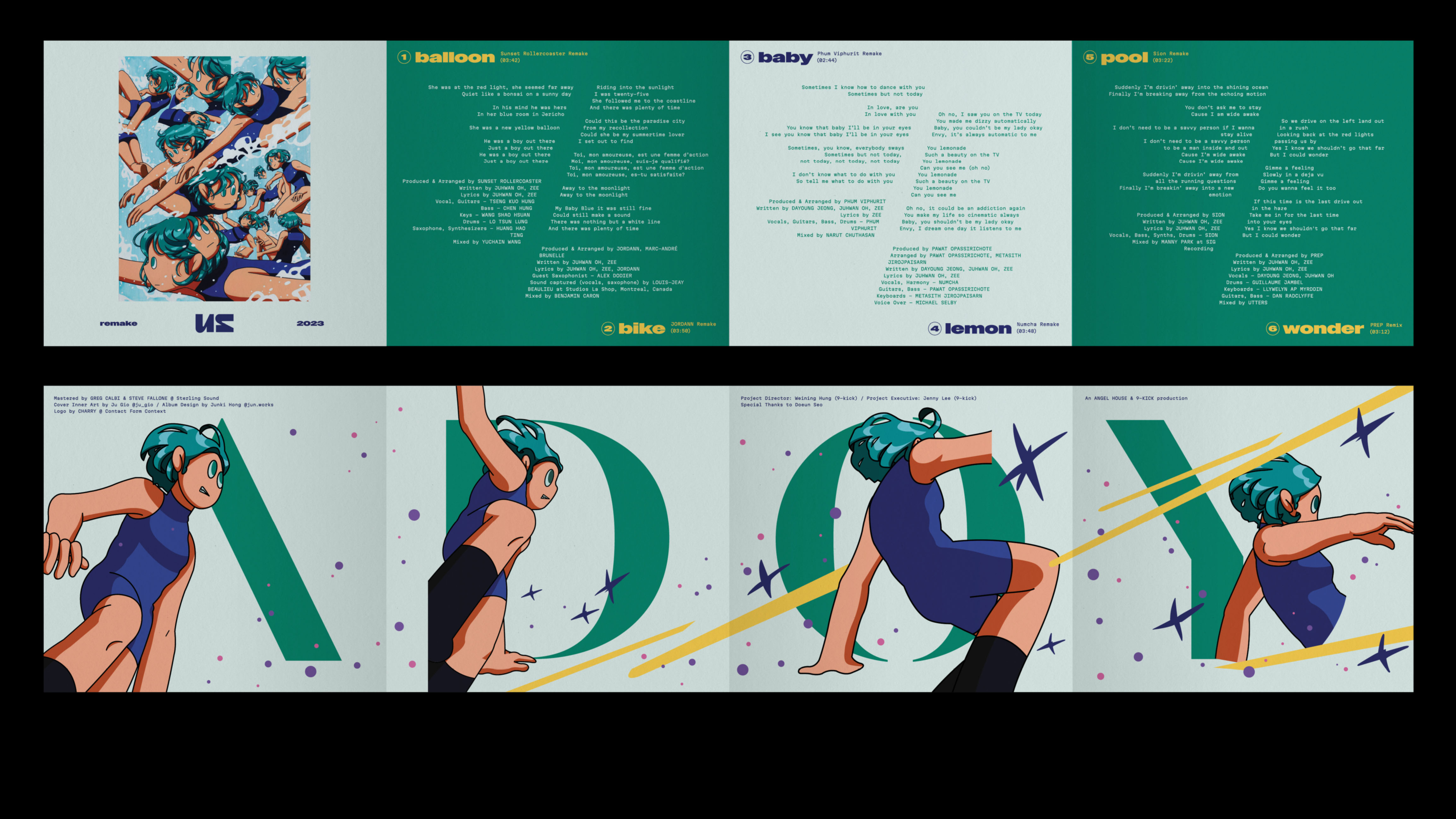
—Album Design
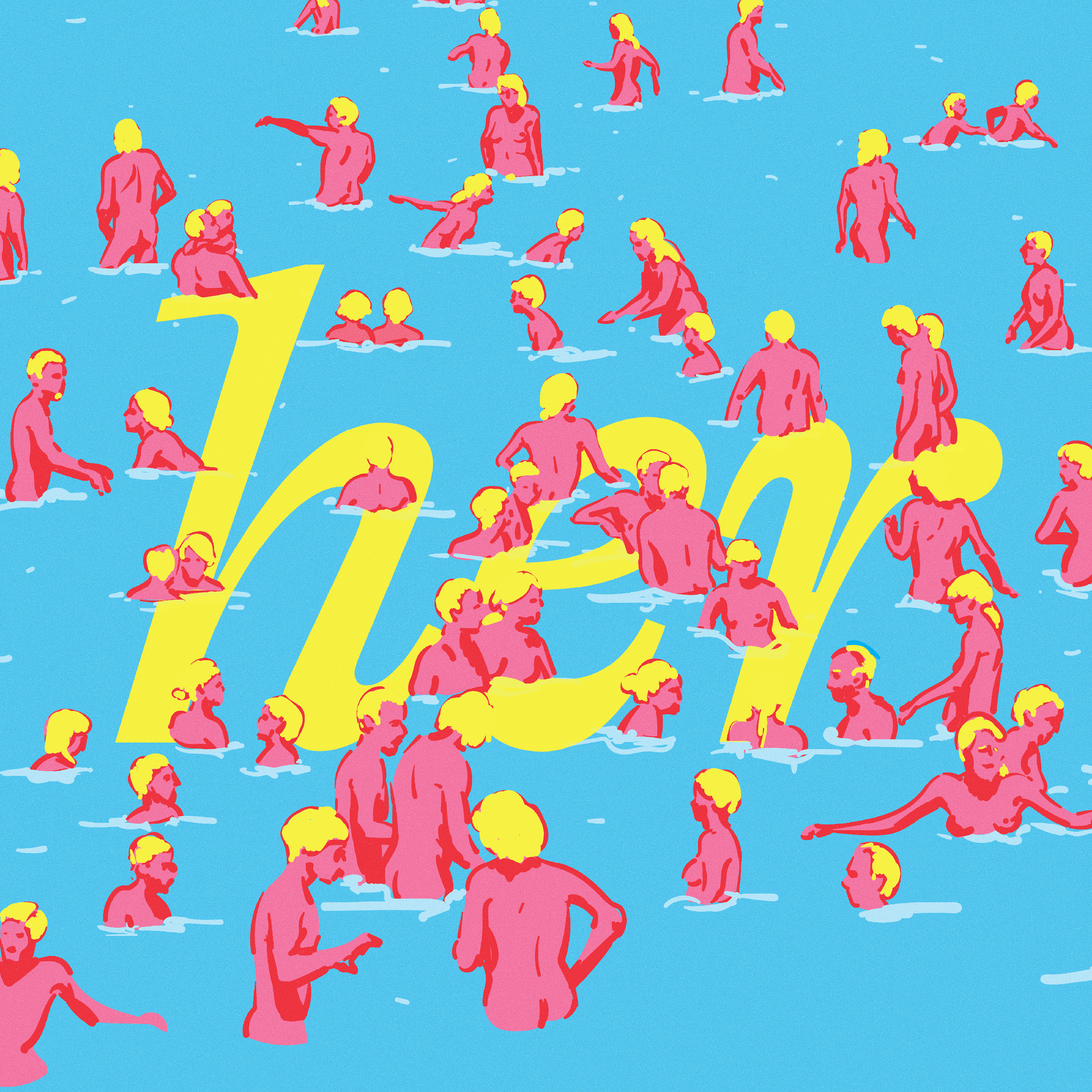
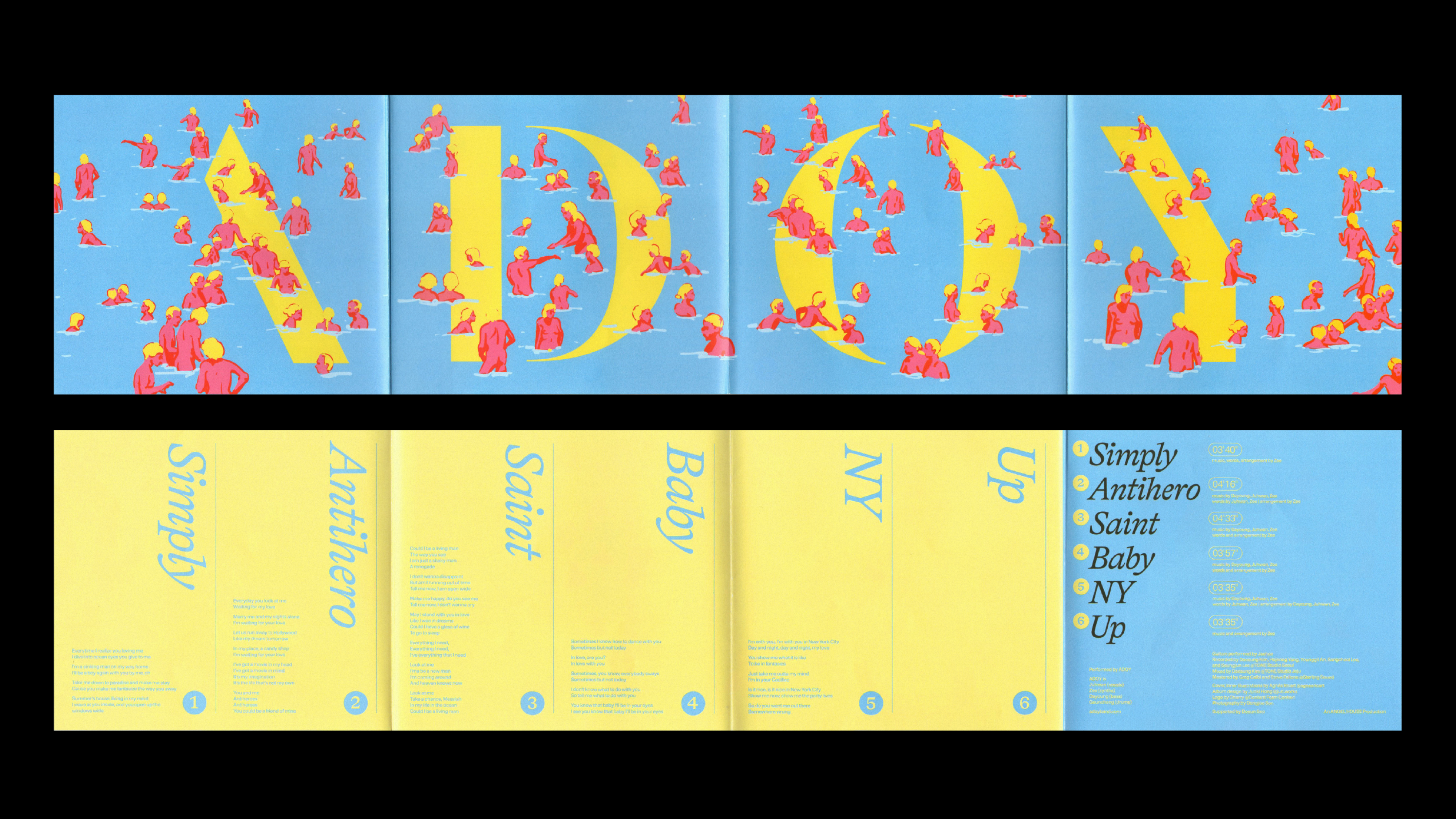


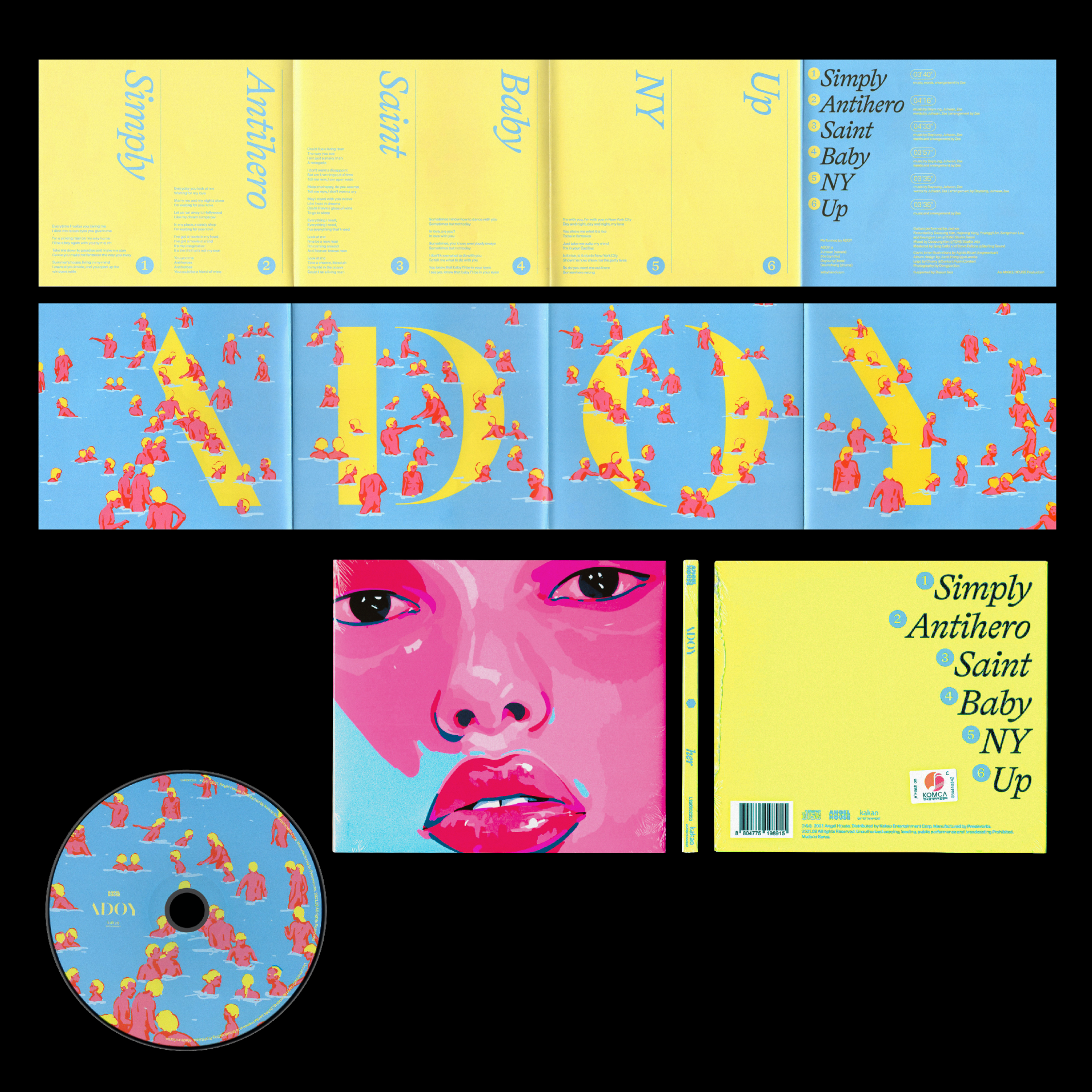
Illustration by Agnès Ricart