—Identity Design, Branding, Custom Type
The new identity introduces a refreshed logo that opens a blank space as a window of imagination, an expanded green palette inspired by the rhythm of the day, and custom typefaces that balance utility with playful charm. Cohesive across signage, packaging, digital, and campaigns, the system unifies Blank Street’s global presence and signals its evolution into a lifestyle brand.

Made at Wolff Olins
—Identity Design, Branding
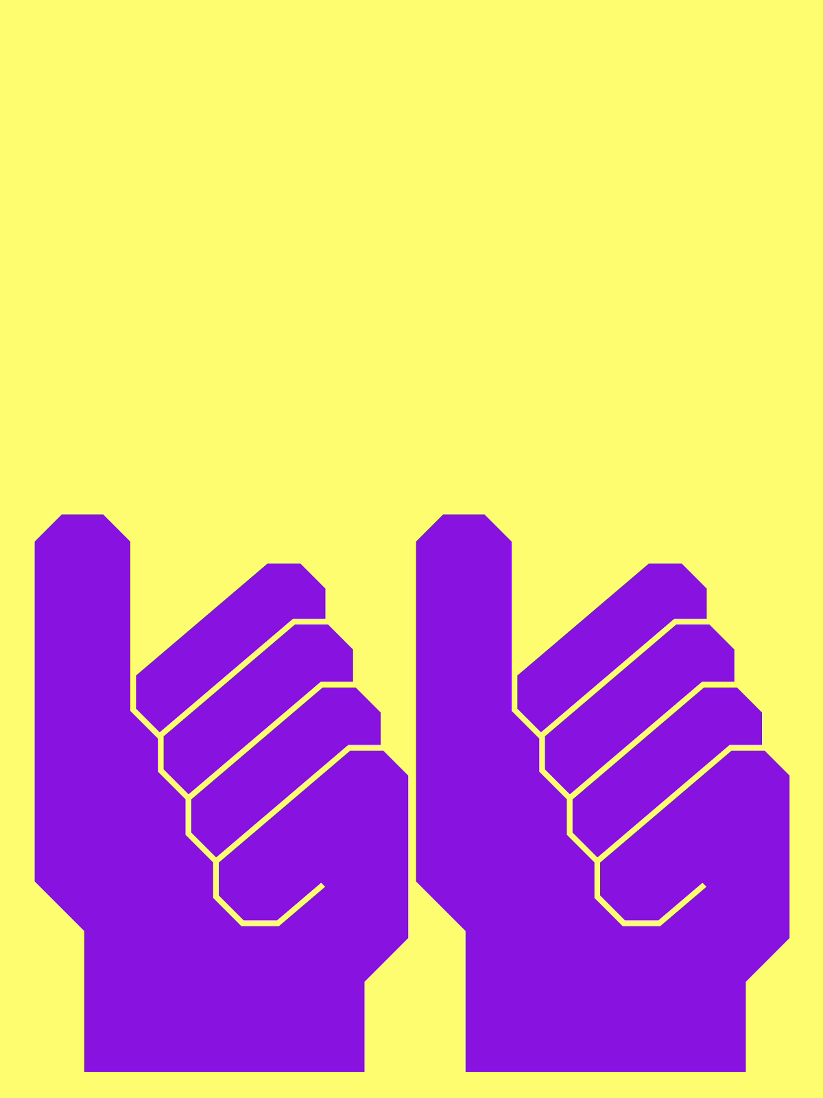
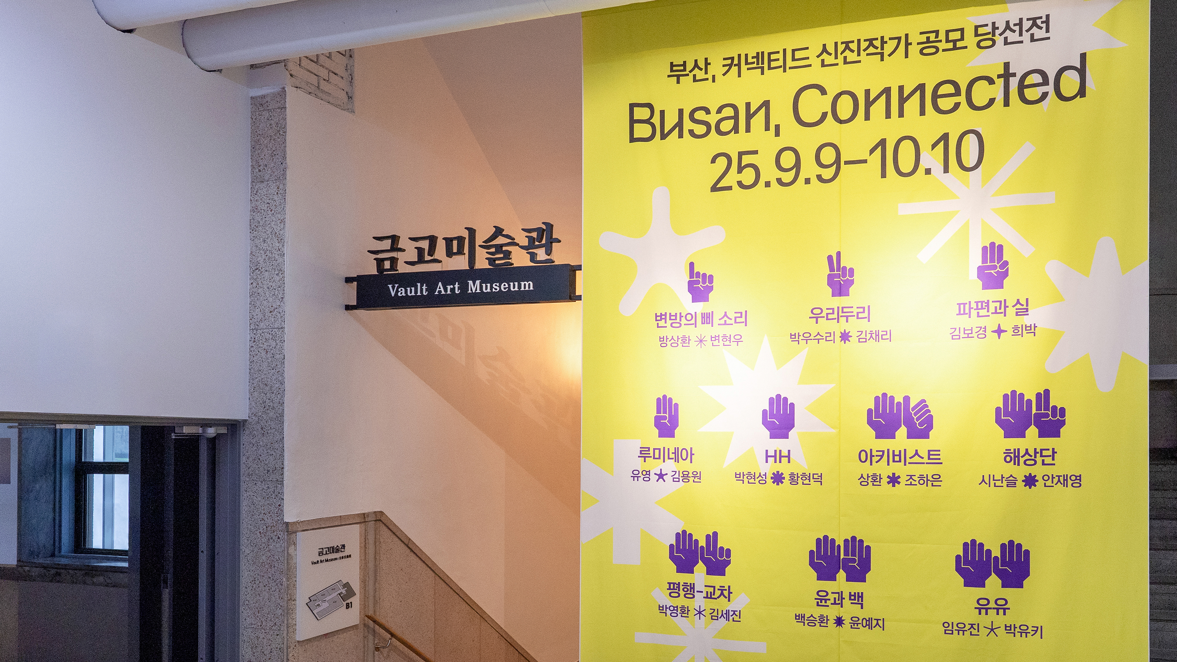
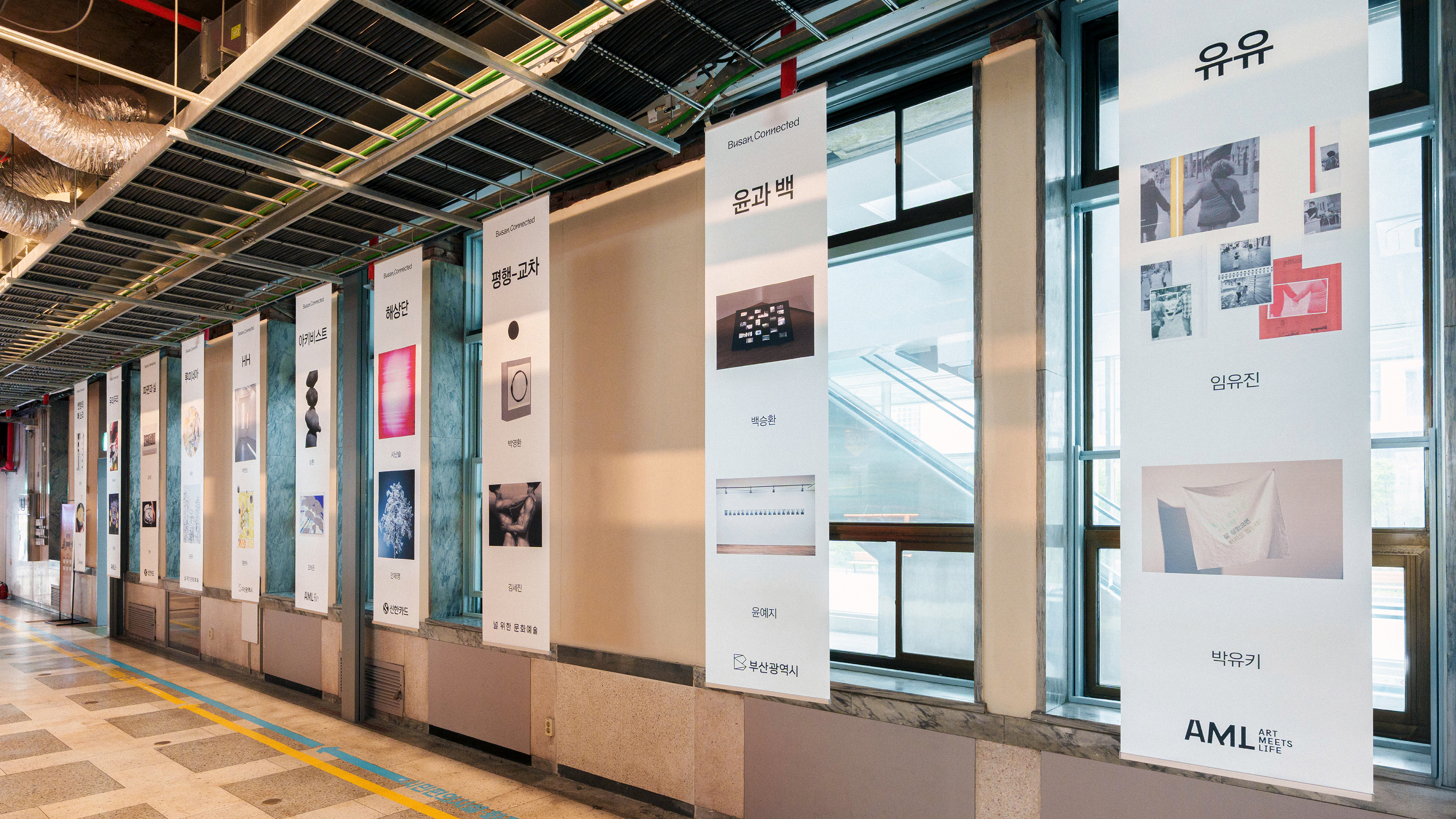
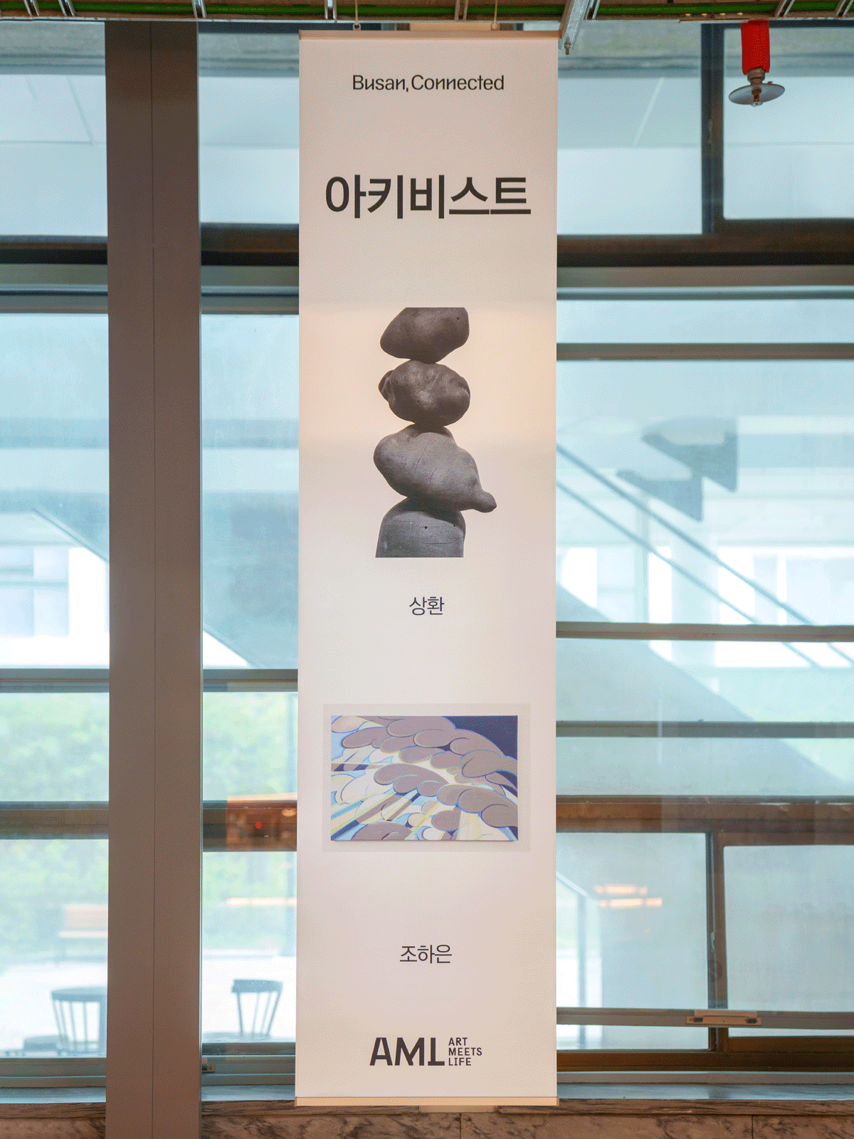
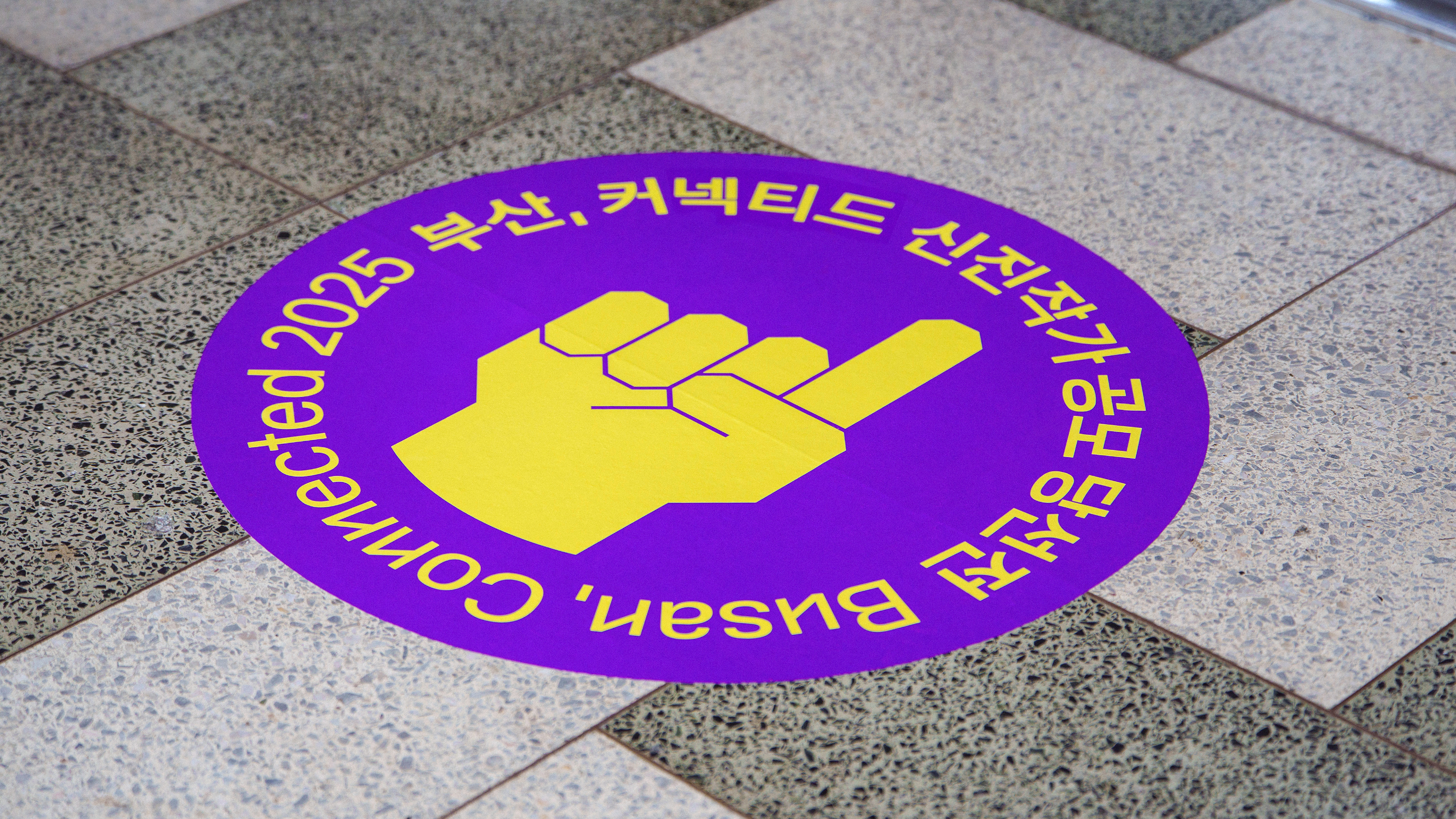
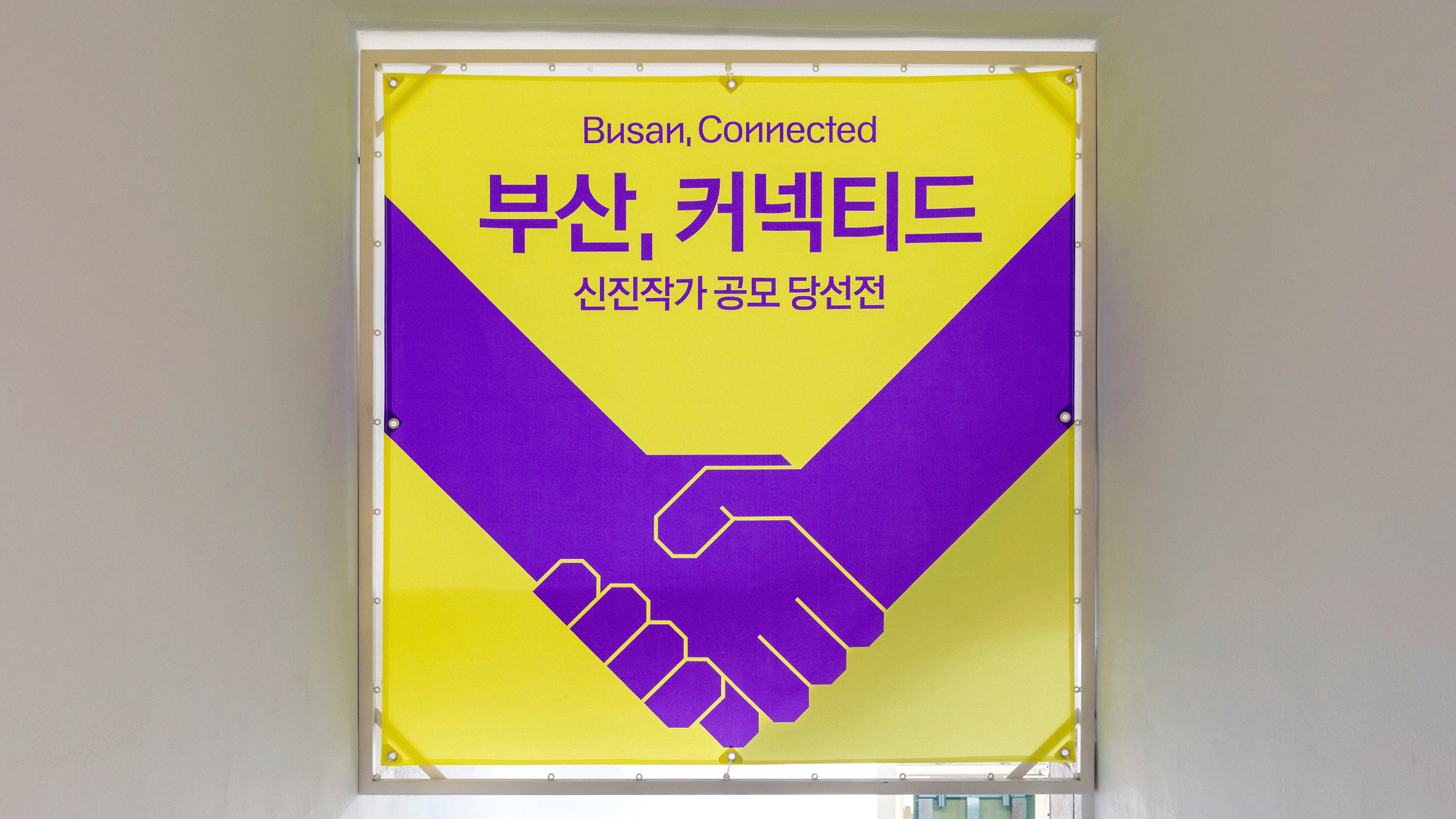
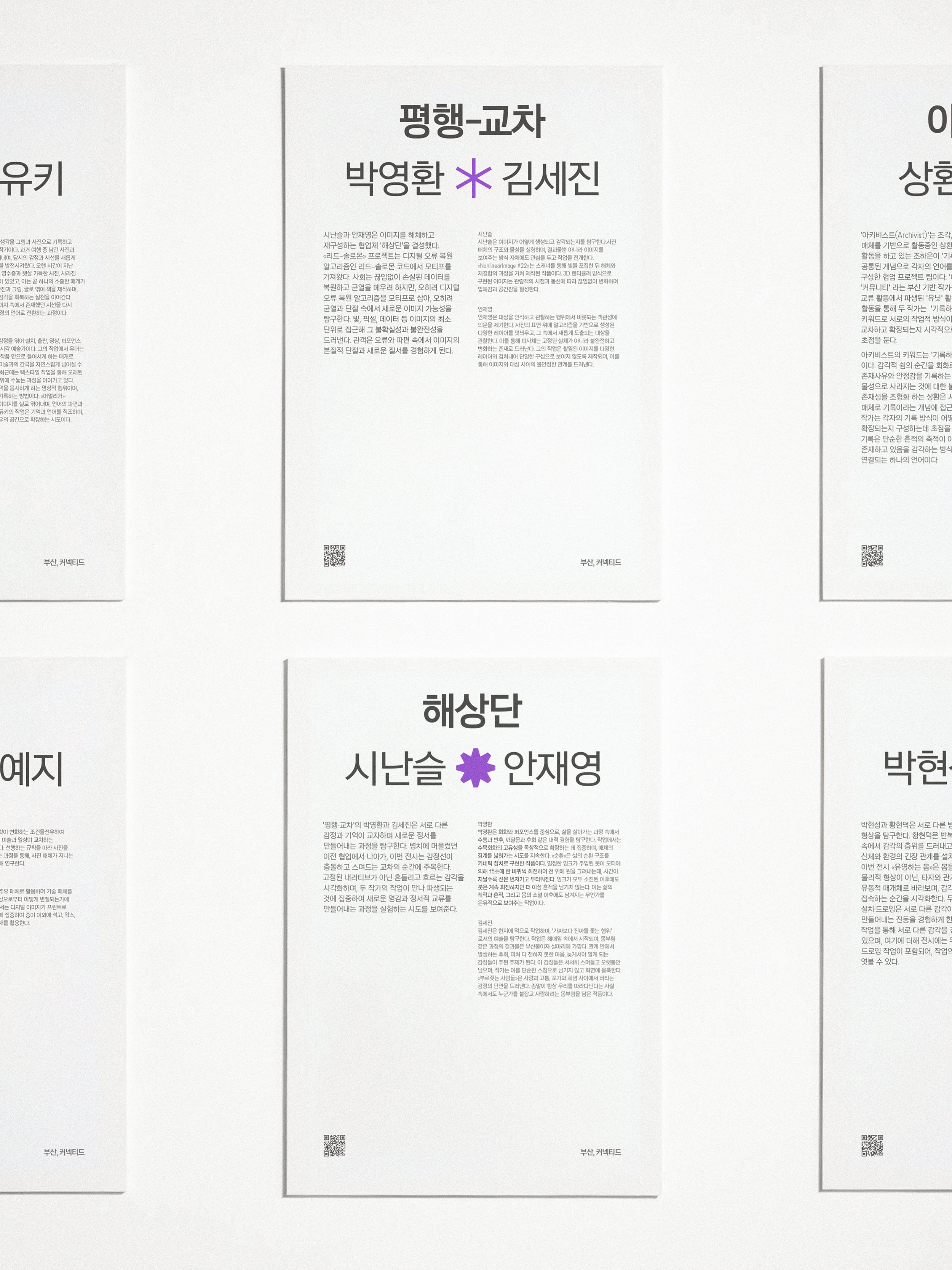
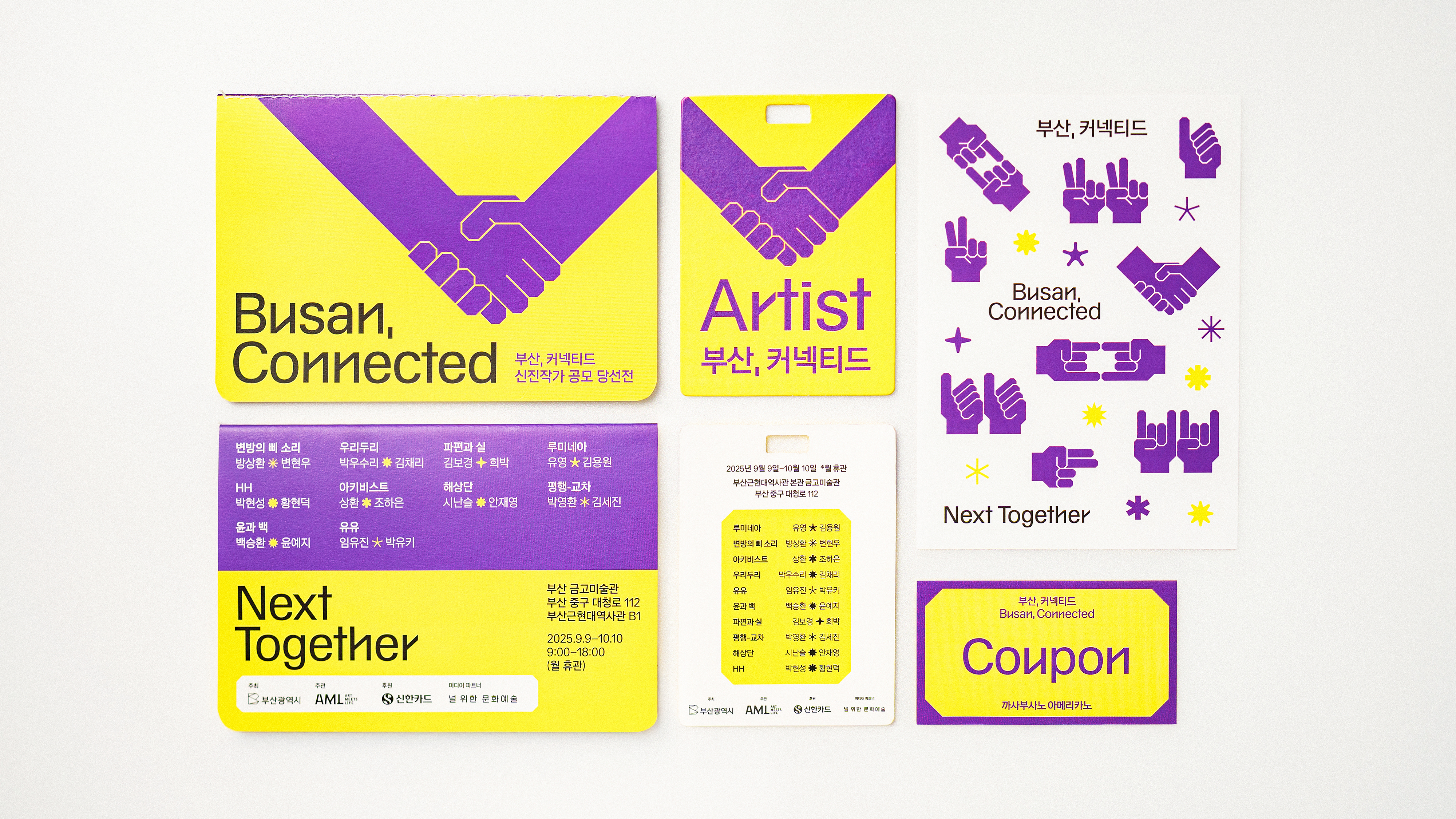
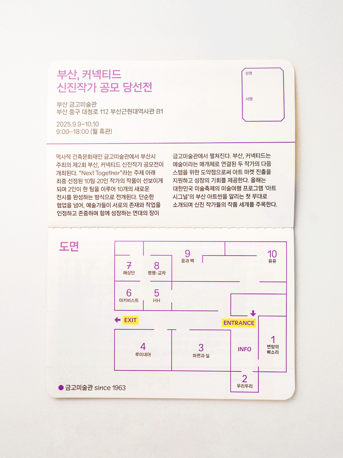
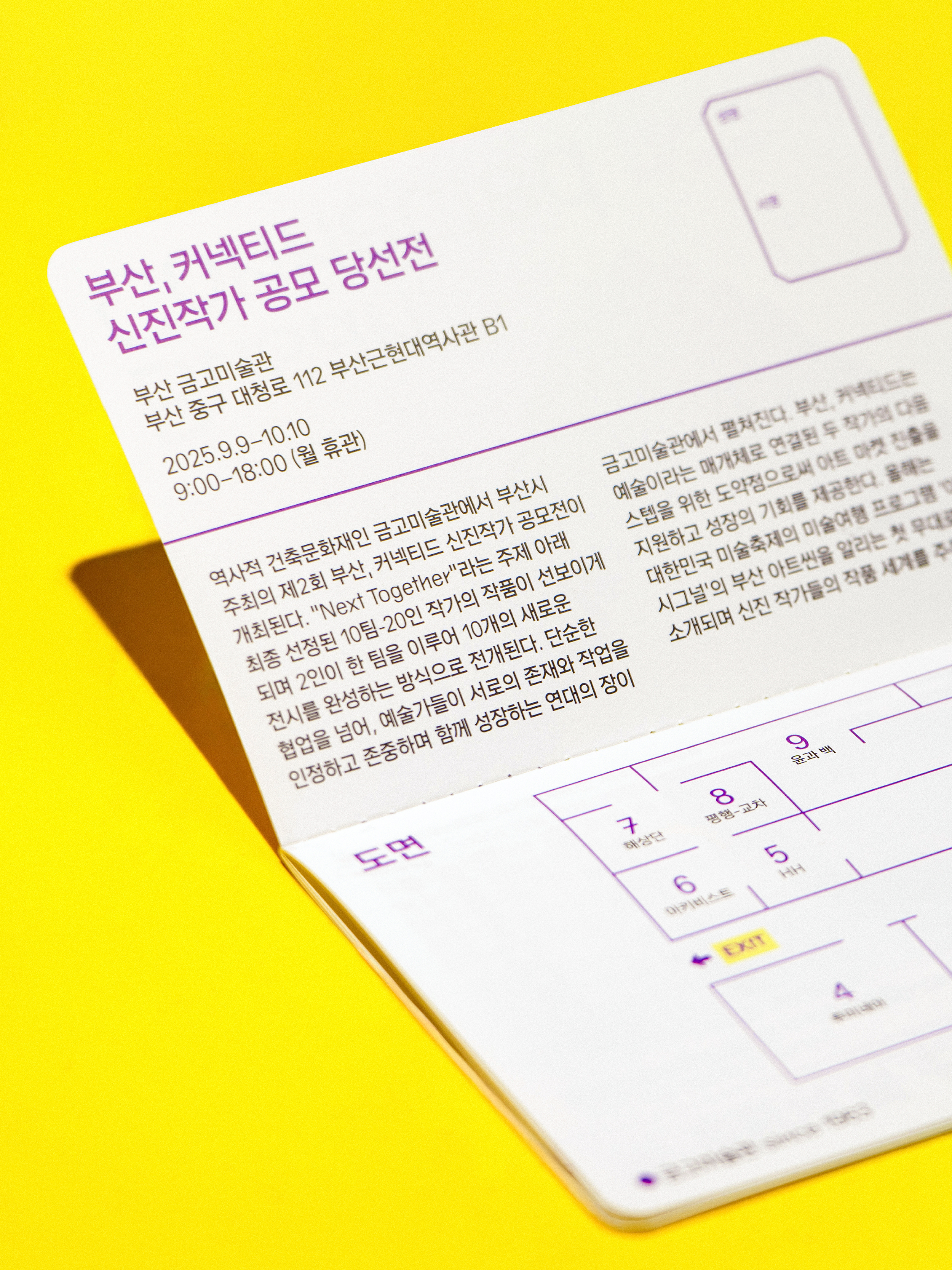
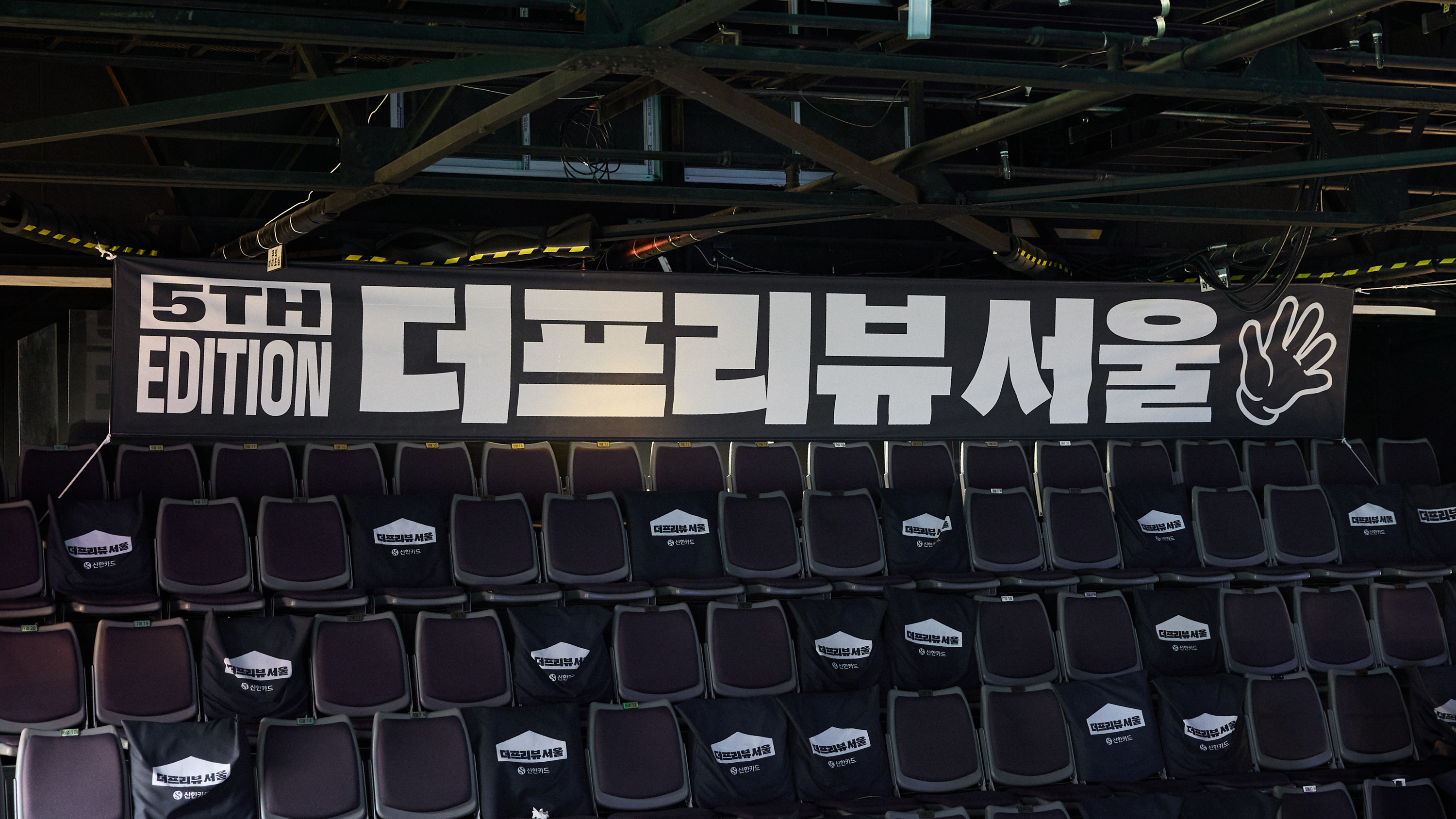
Centered on “Next Together,” this Busan-based exhibition of emerging artists explores collaboration through paired practices. Hand gestures and spark graphics visualize partnership and creative synergy.
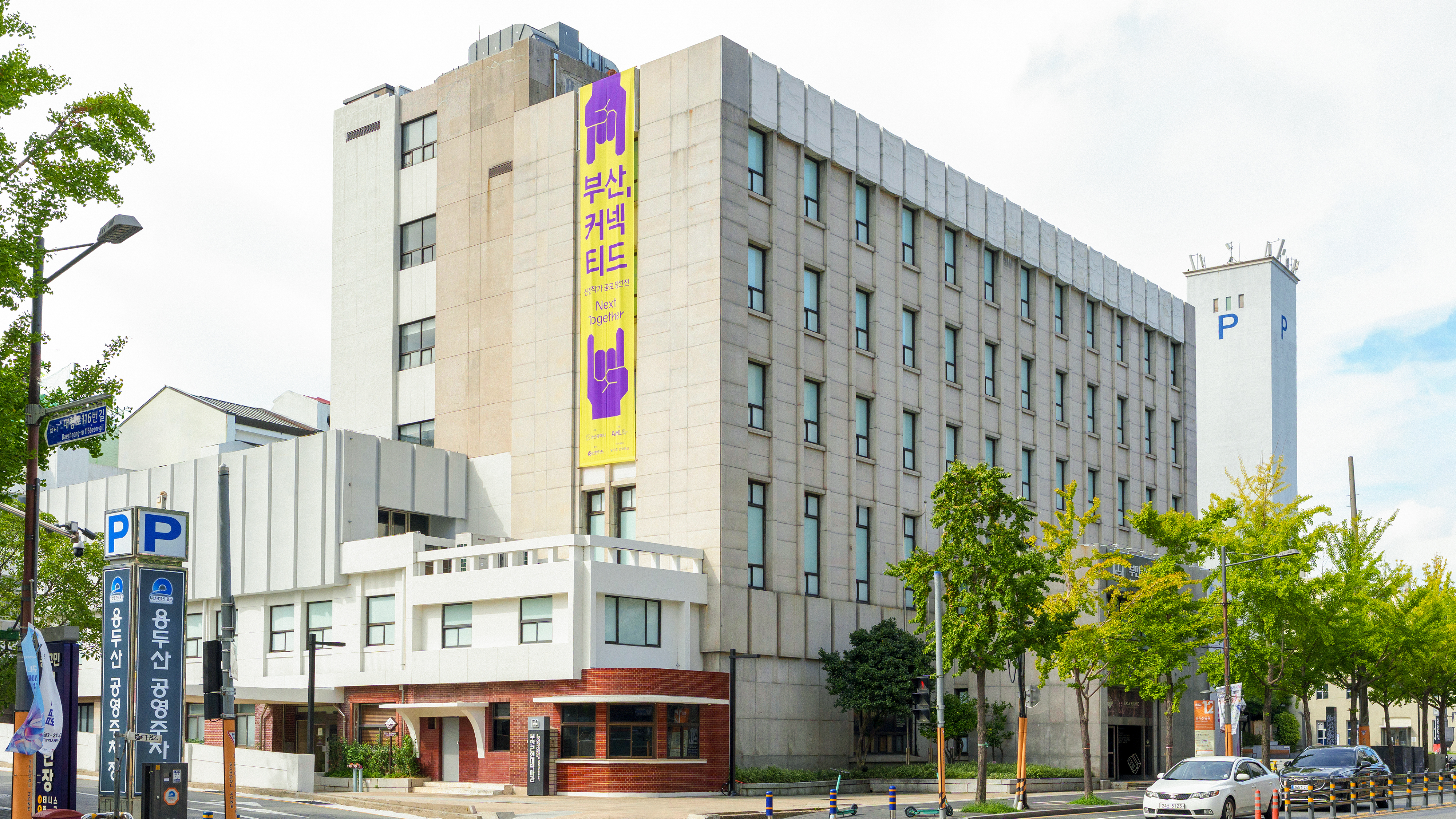
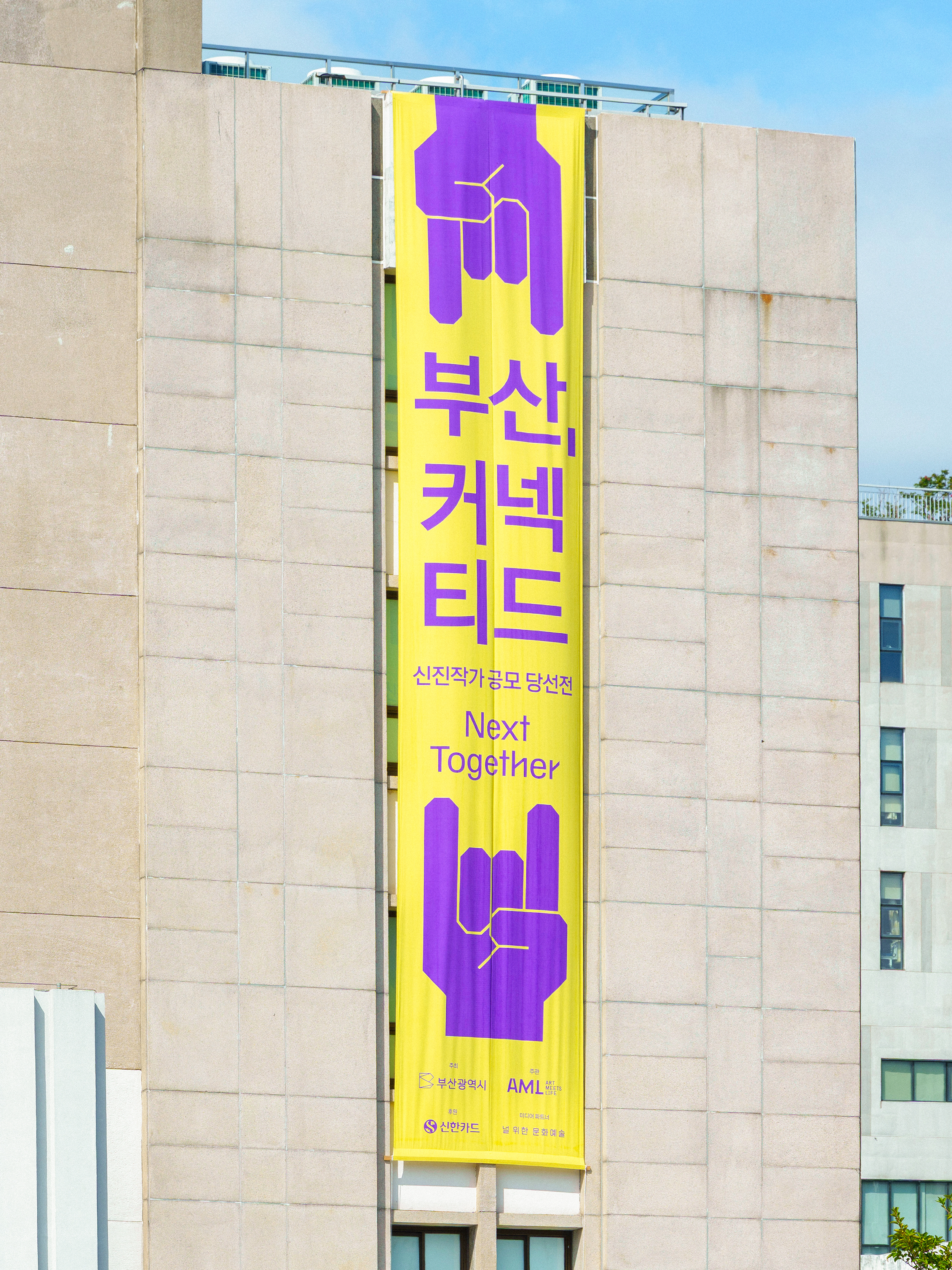
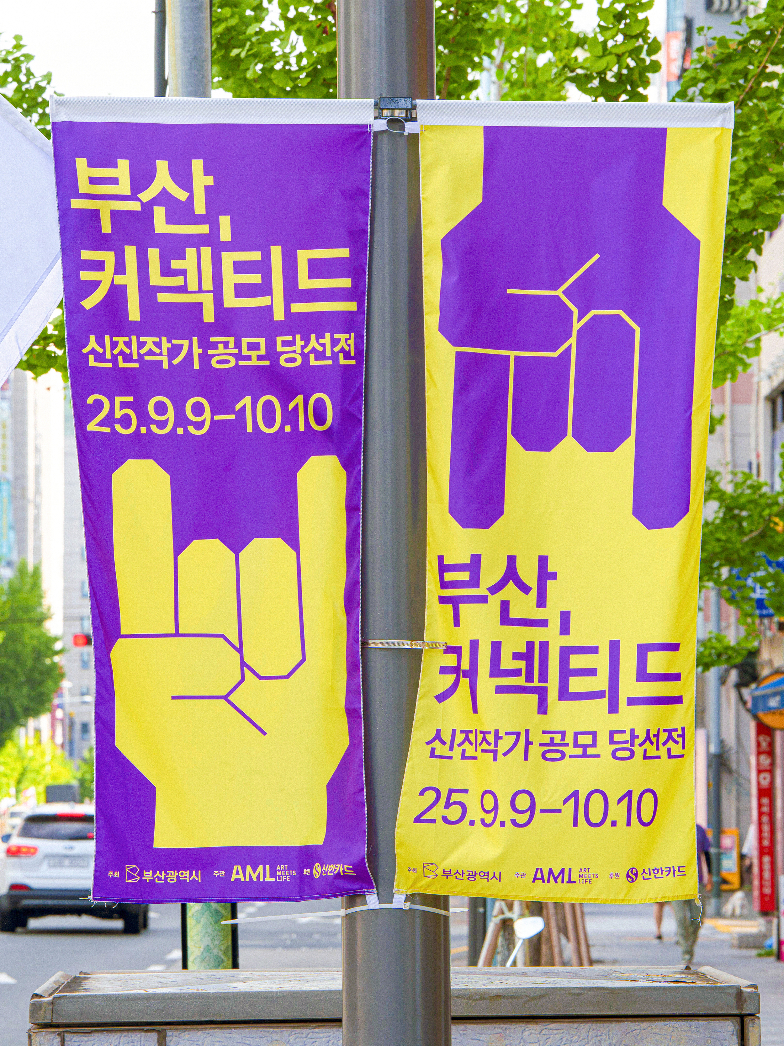
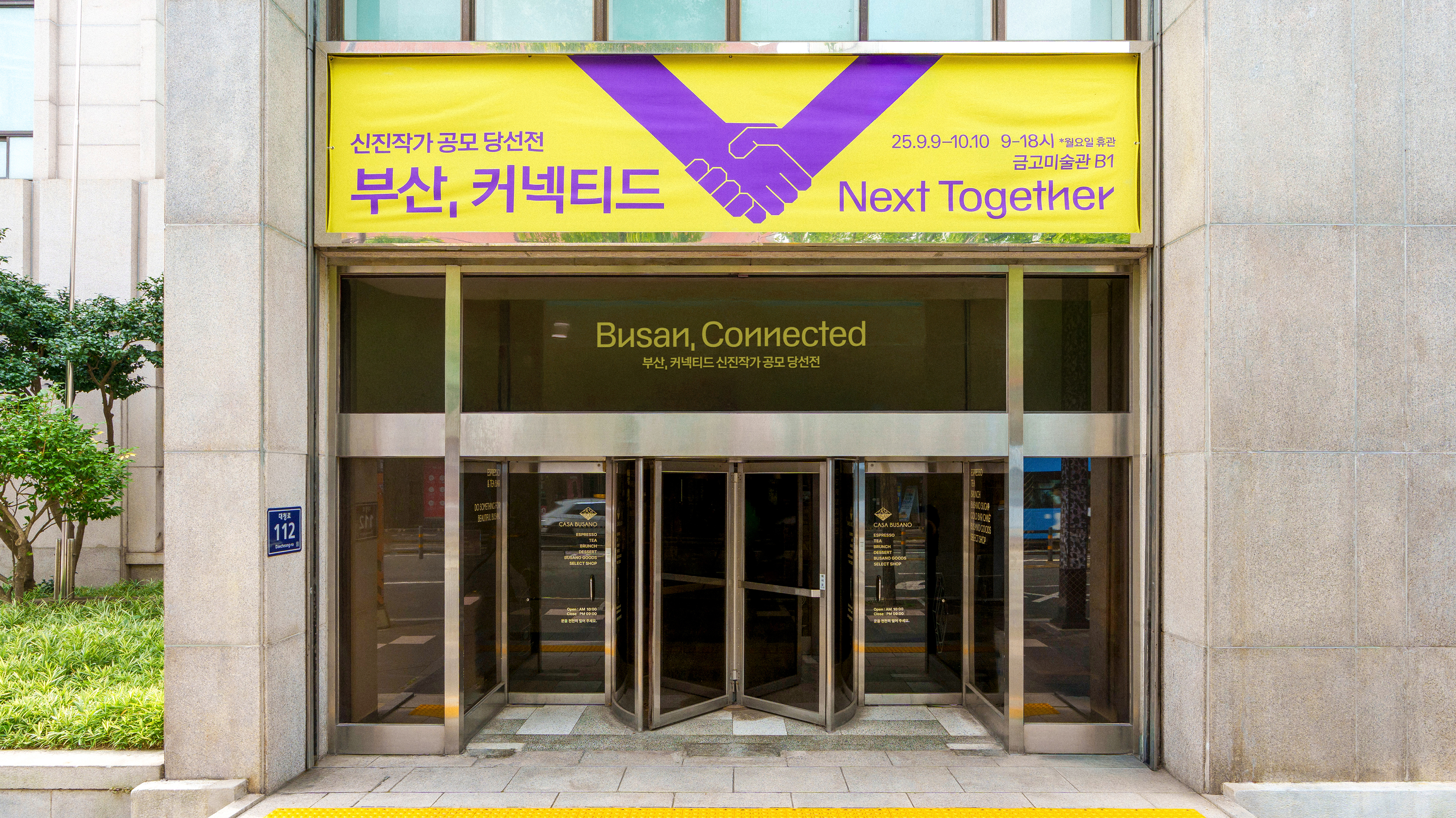
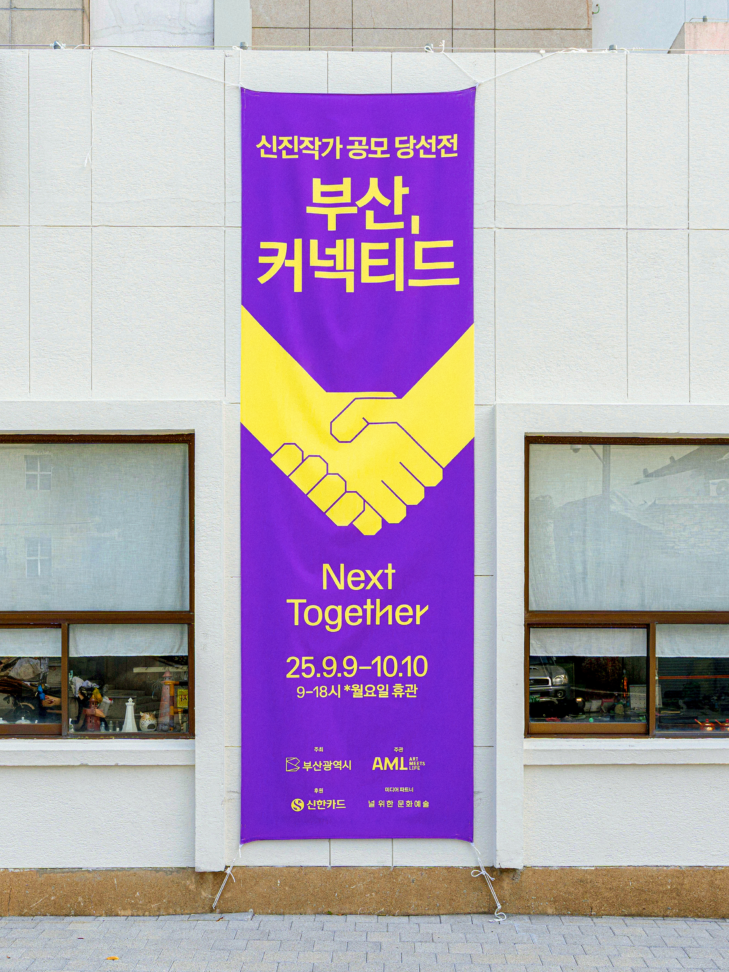


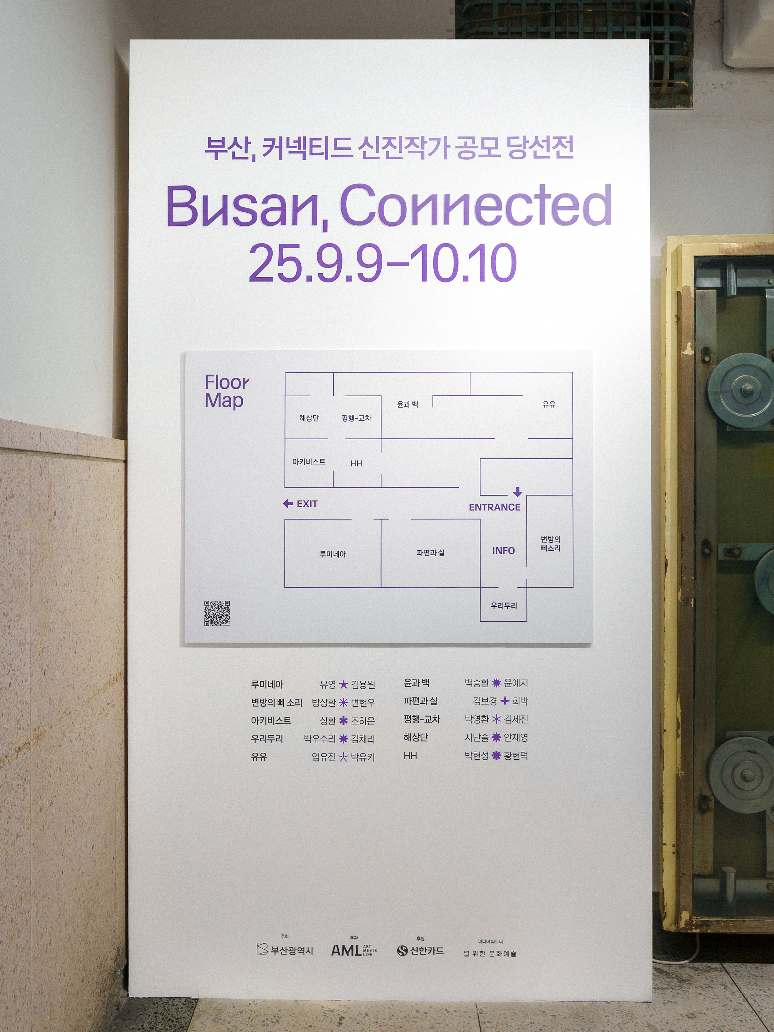


Hosted by Busan Metropolitan City
Organized by ARTMEETSLIFE(AML)
Sponsored by Shinhan Card
Design by jun.works
Videography by Jimmy Pictures
Photography by Meanvisuals
Organized by ARTMEETSLIFE(AML)
Sponsored by Shinhan Card
Design by jun.works
Videography by Jimmy Pictures
Photography by Meanvisuals
Artwork courtesy of the artists
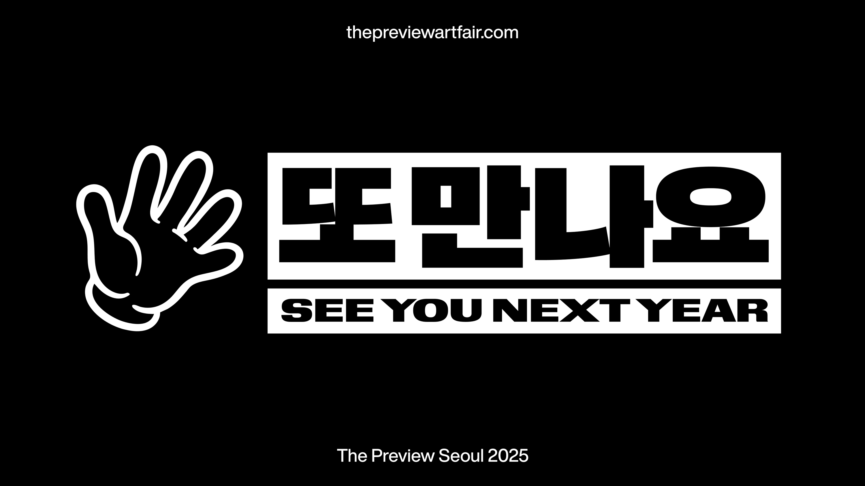
—Identity Design, Branding
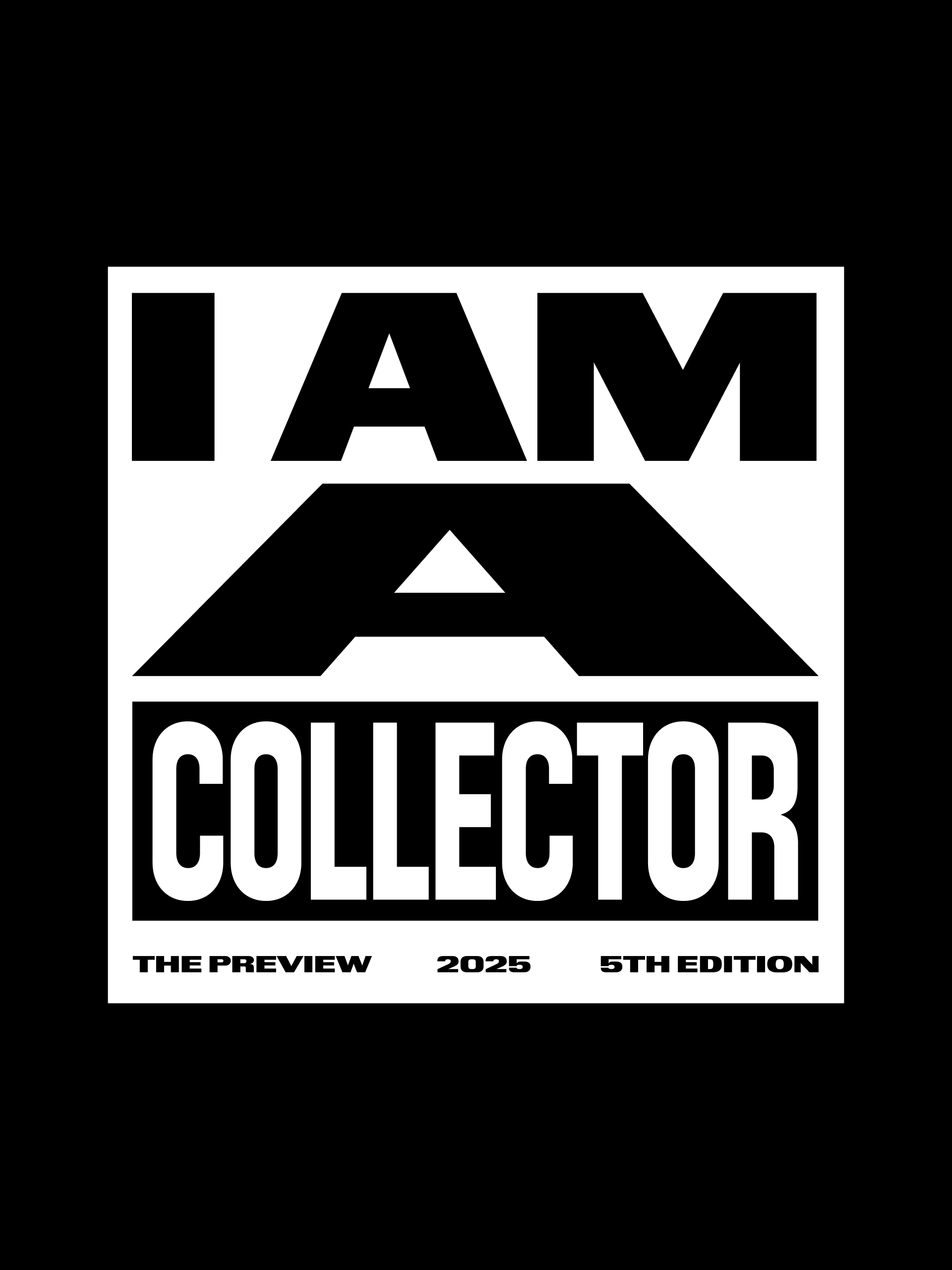
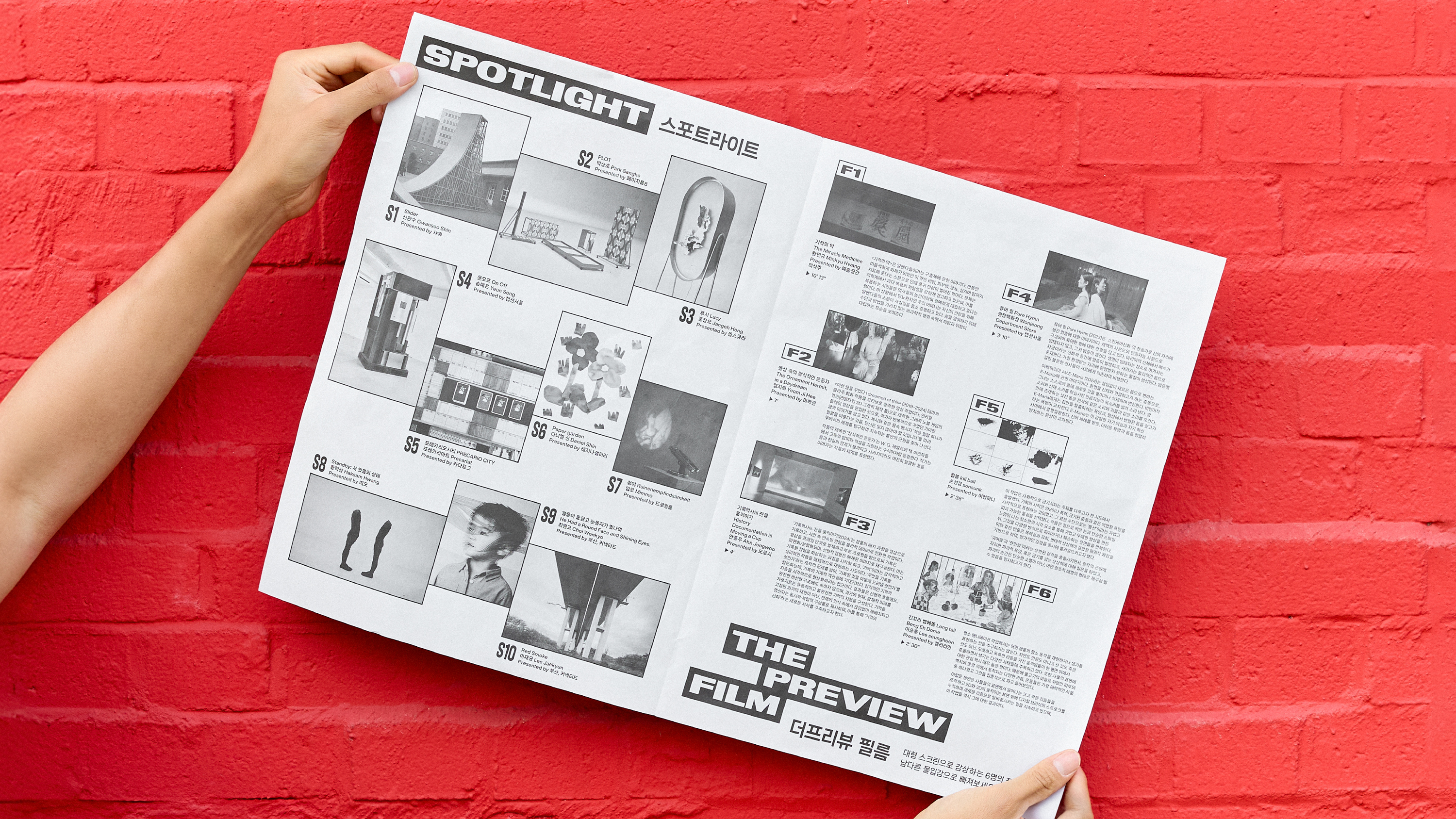
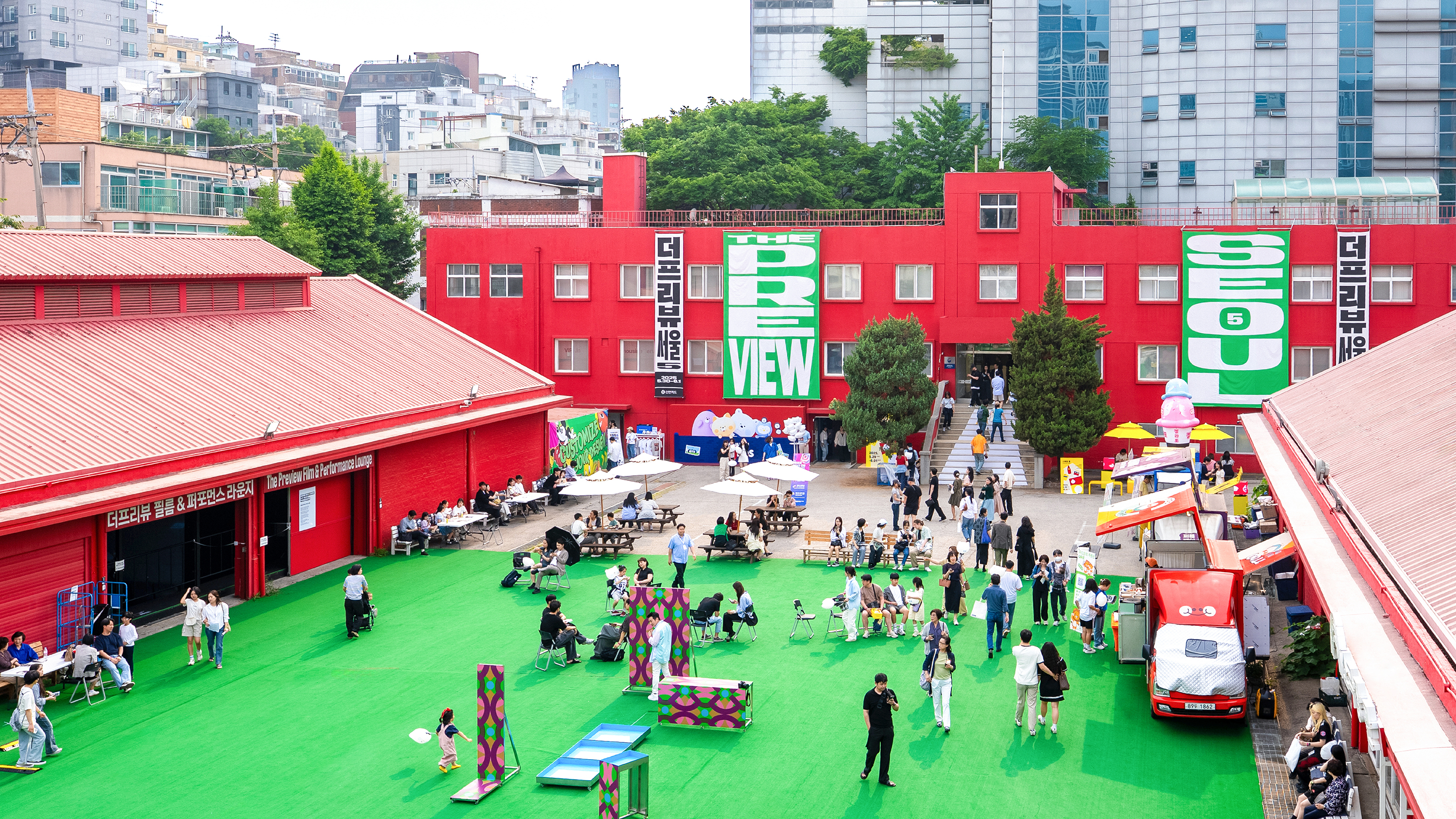
The identity design emphasizes this sense of transition and bold reinvention, highlighting the shift into an unfamiliar space while celebrating the fair’s growing presence. Bold typography and directional motion behaviors evoke the sensation of being propelled forward—signaling both movement and momentum—while the dynamic visual system captures the excitement of entering a new chapter.

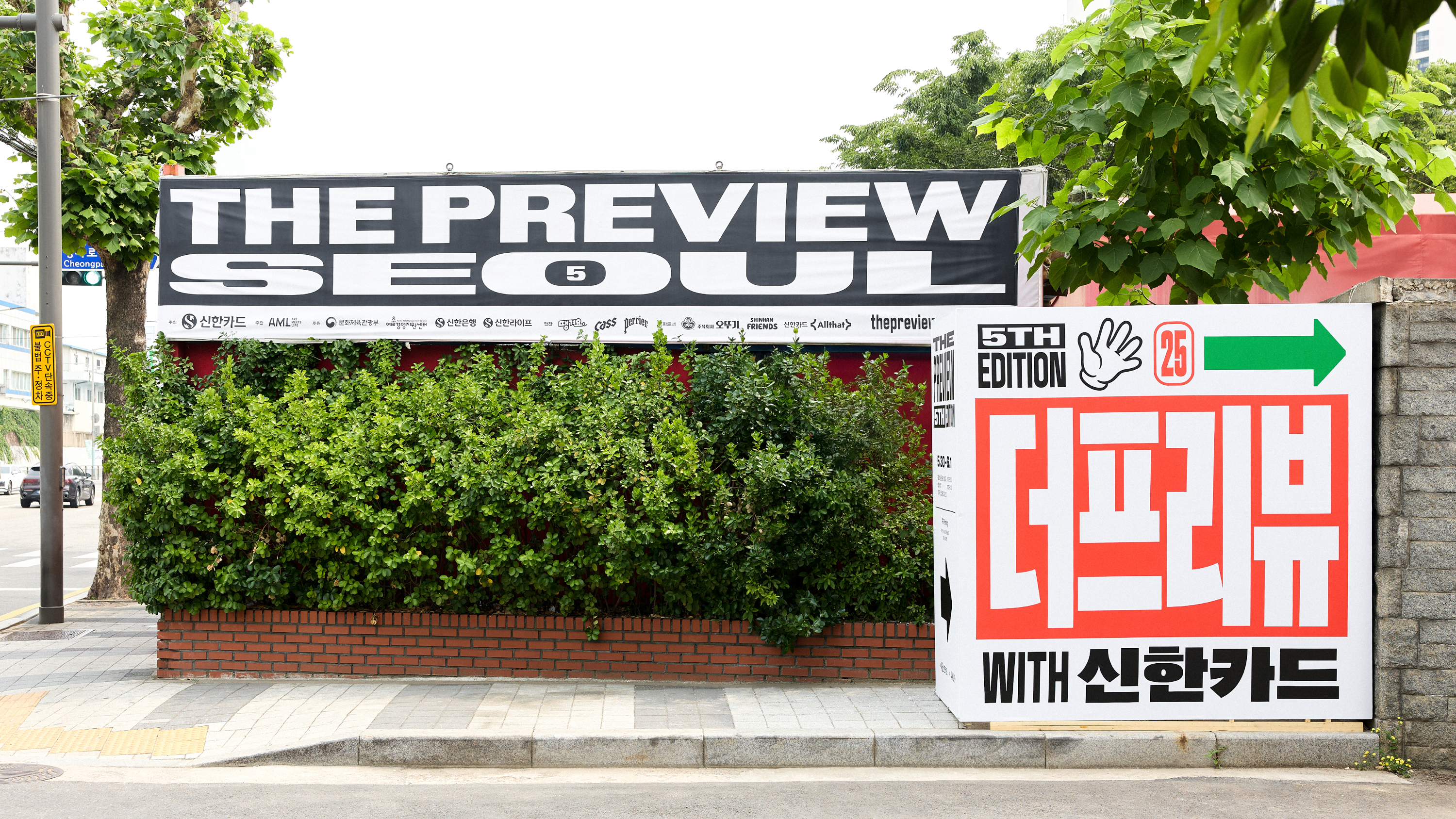
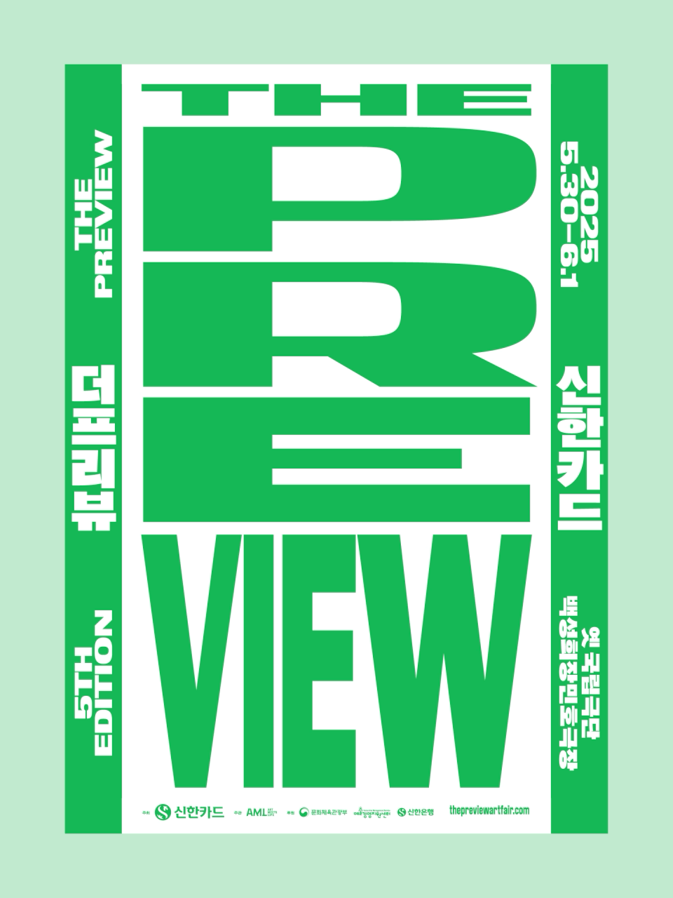


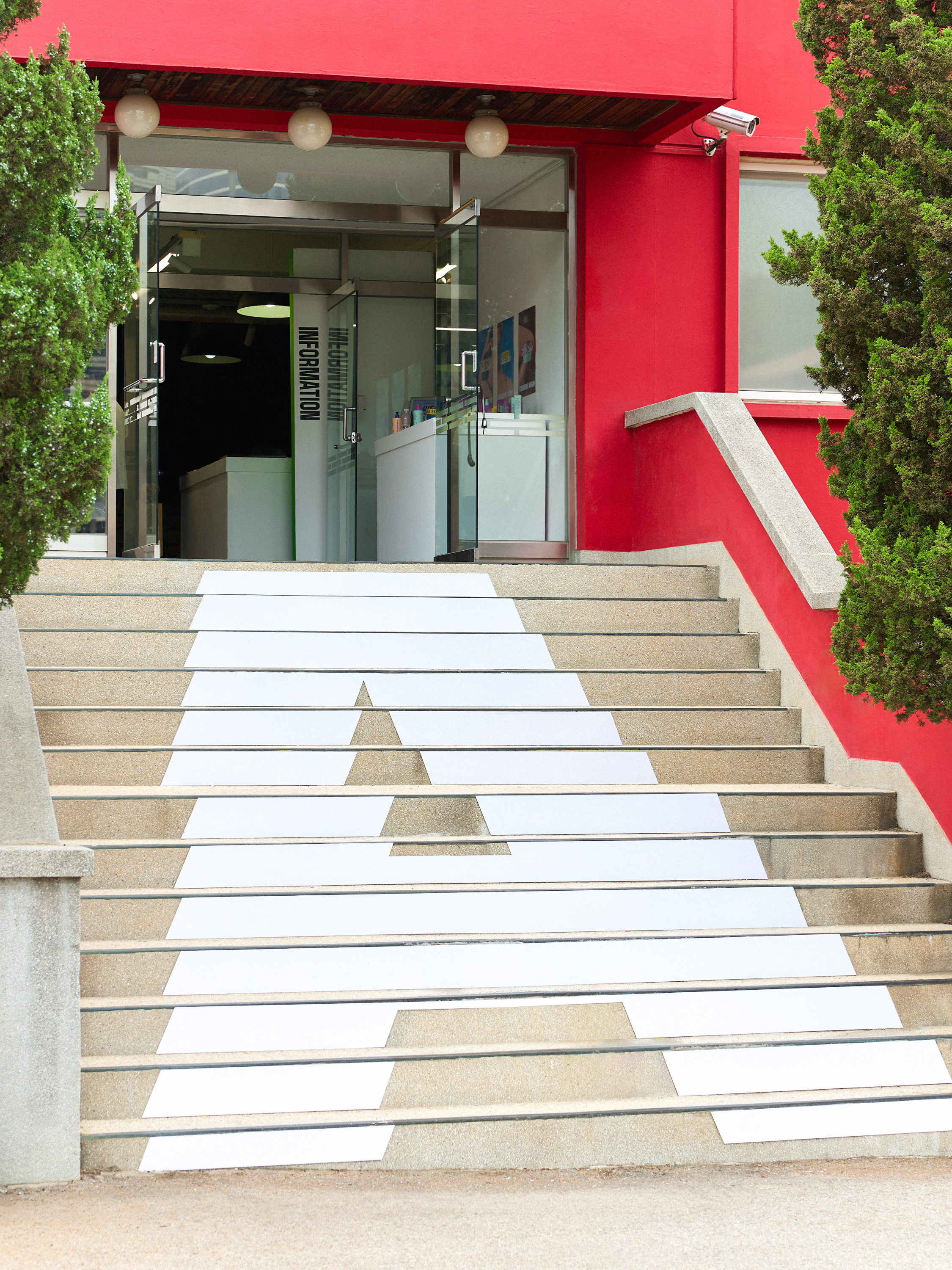
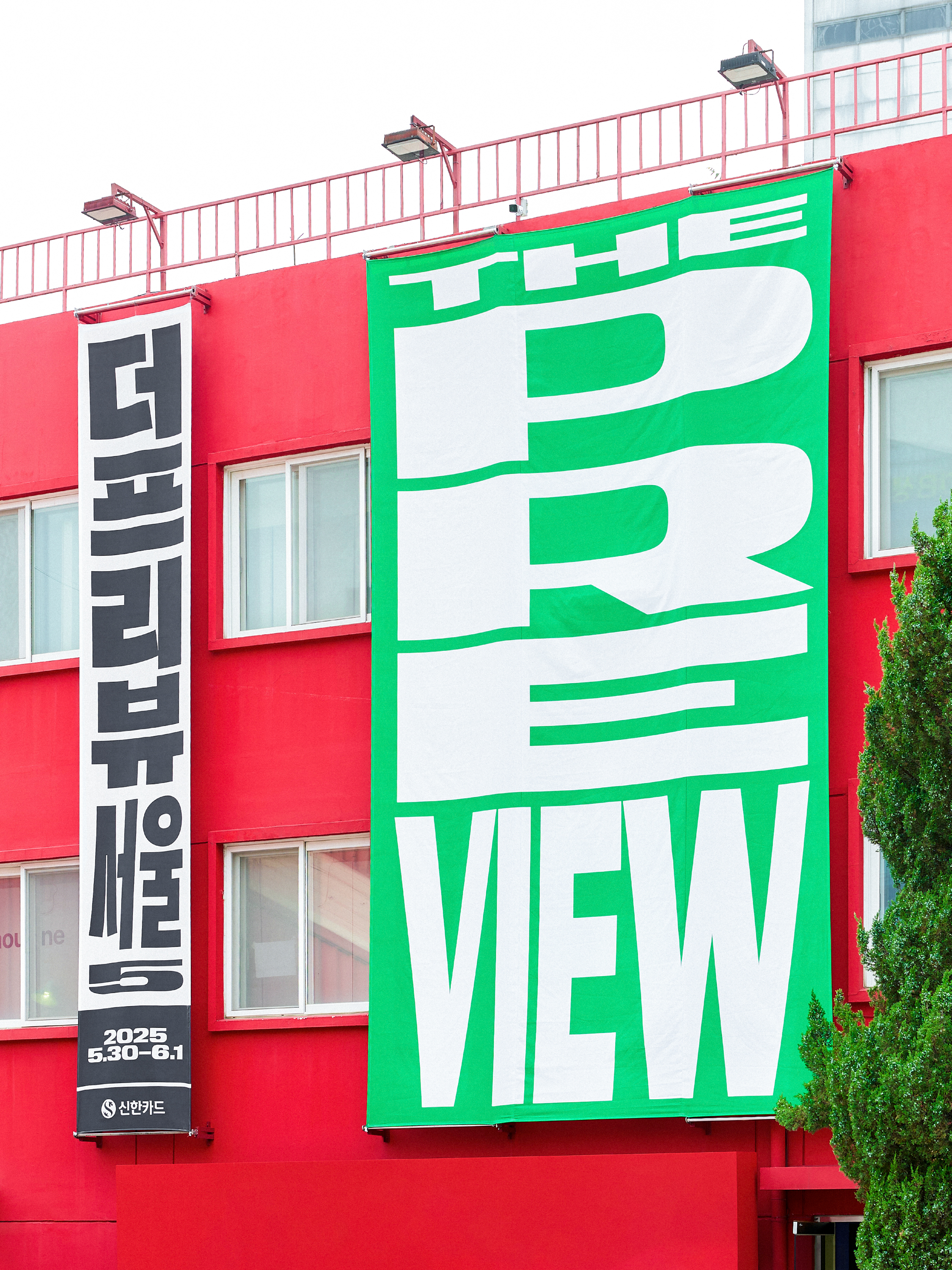


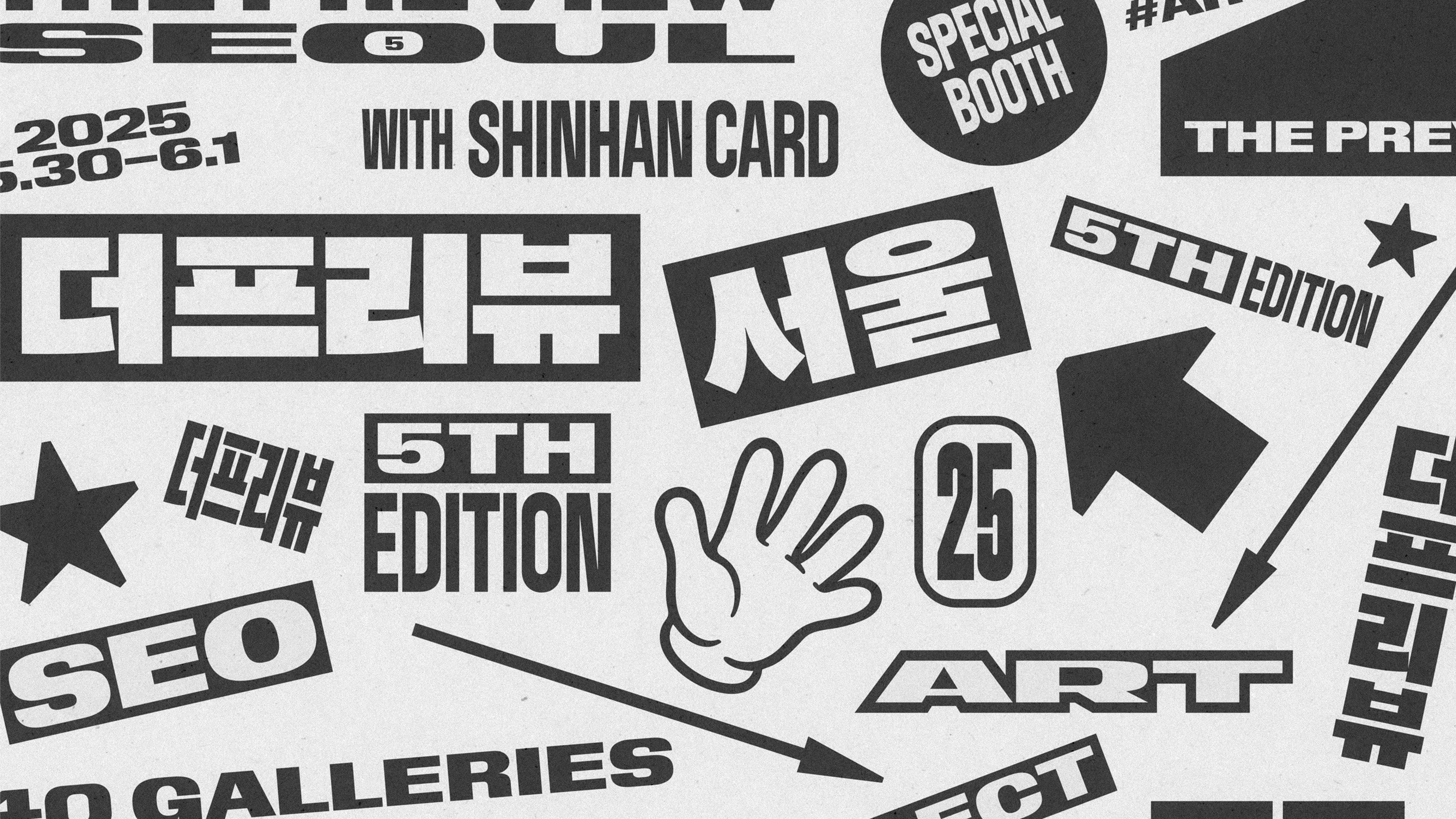
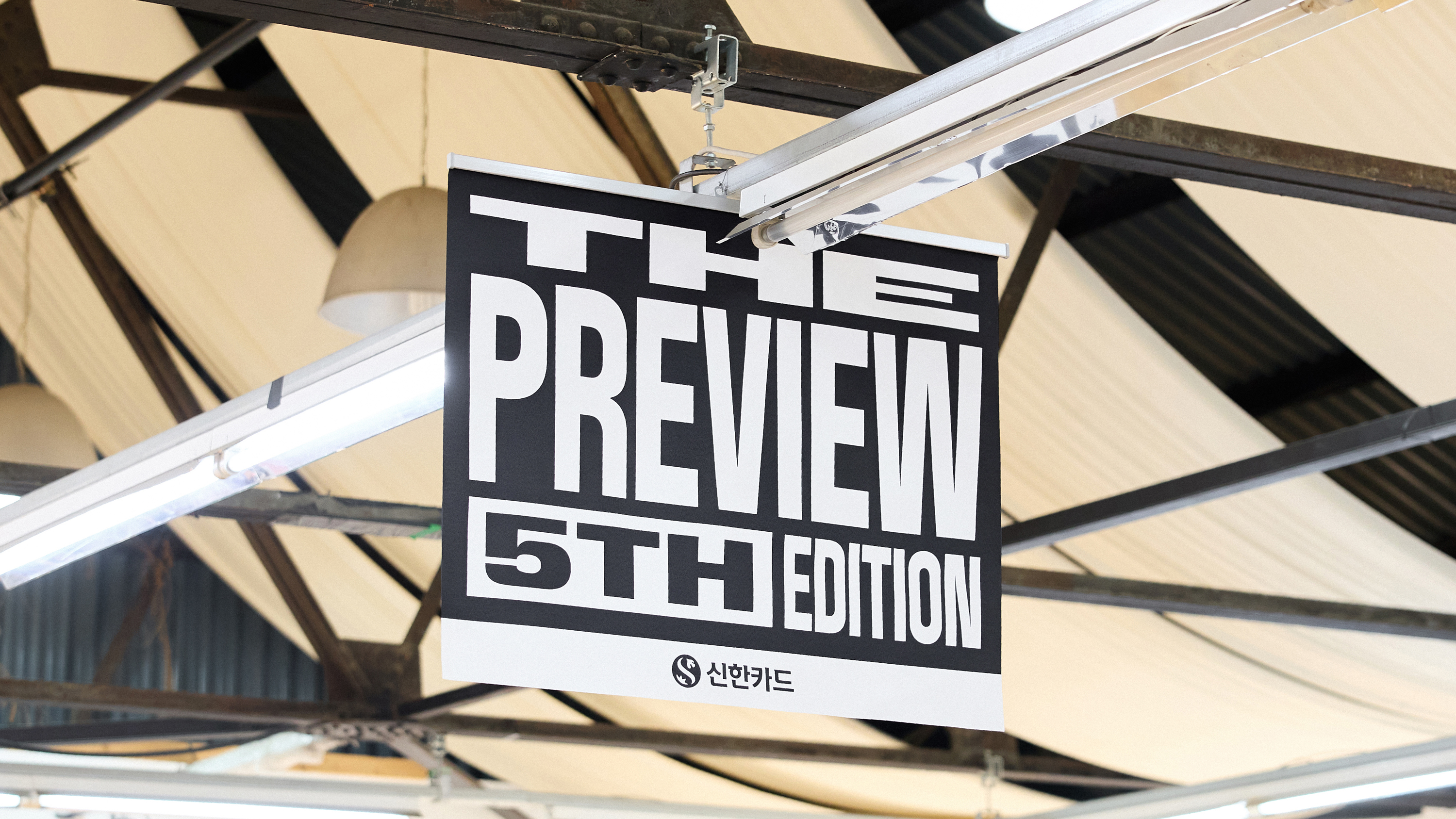
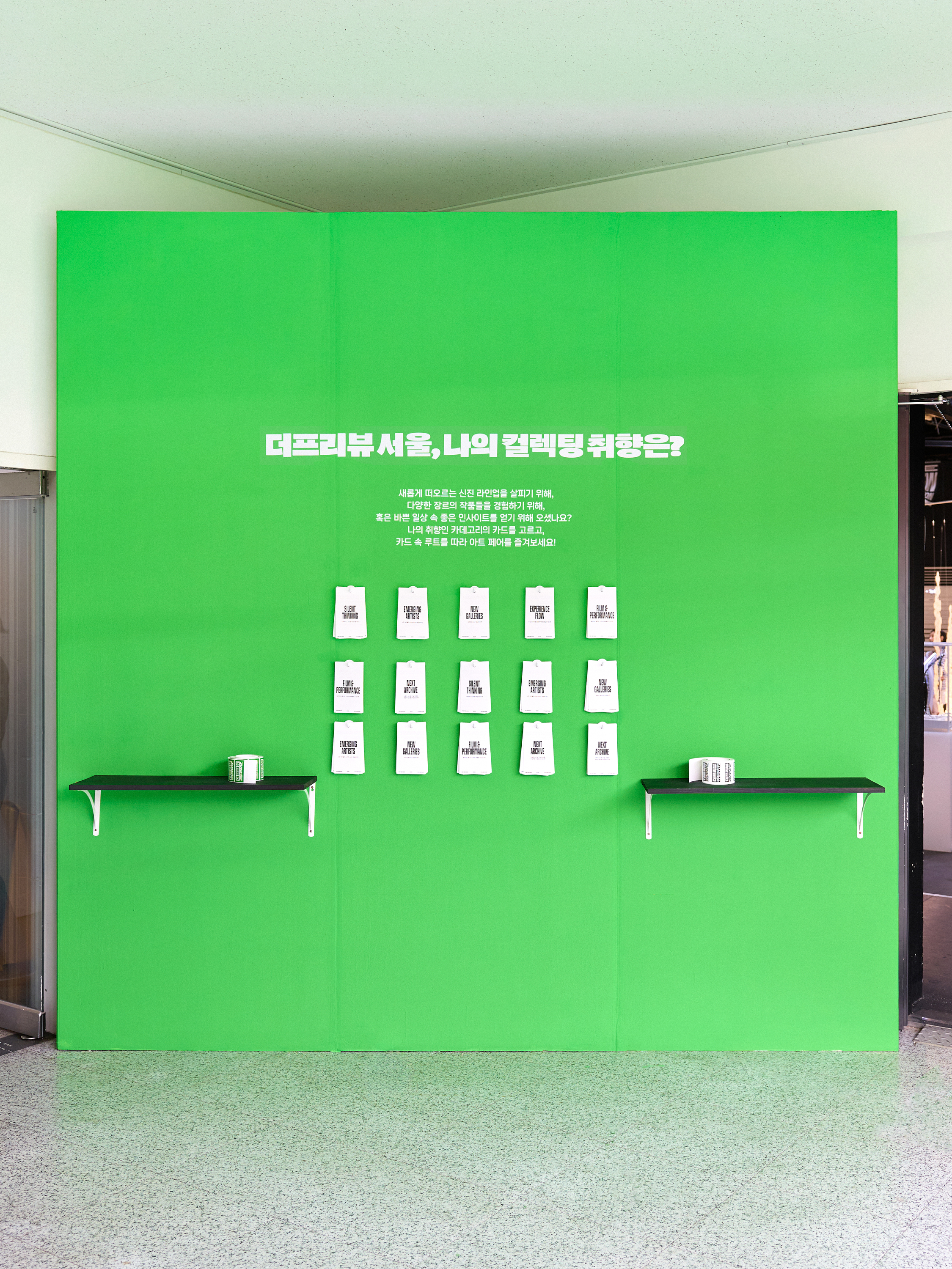

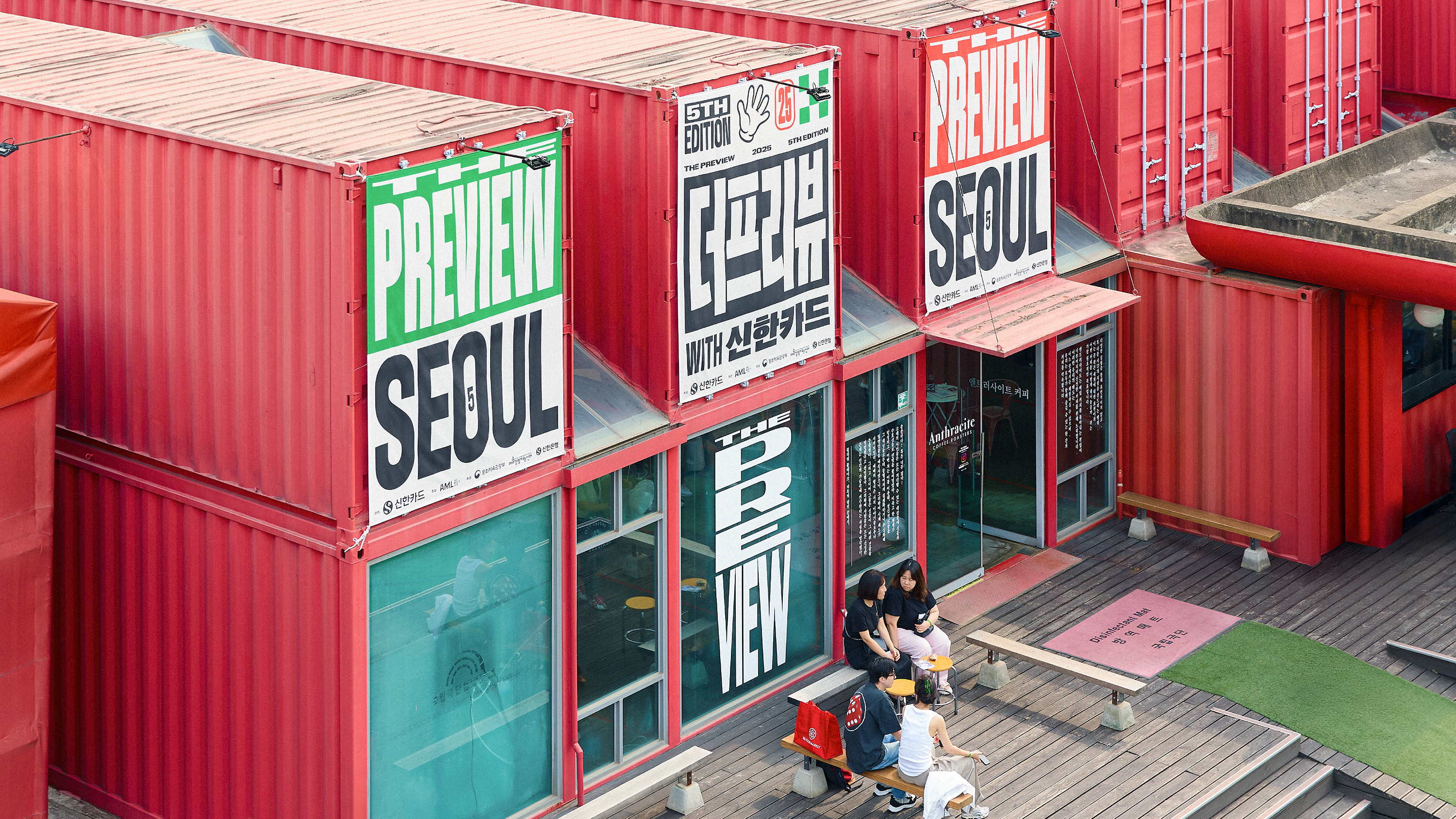


Hosted by ShinhanCard
Organized by ARTMEETSLIFE(AML)
Design by jun.works
Photography by Dan Ah Studio, Jimmy Pictures
Artwork courtesy of the artist and the gallery
—Identity Design, Branding
Agency: Hearty Handy
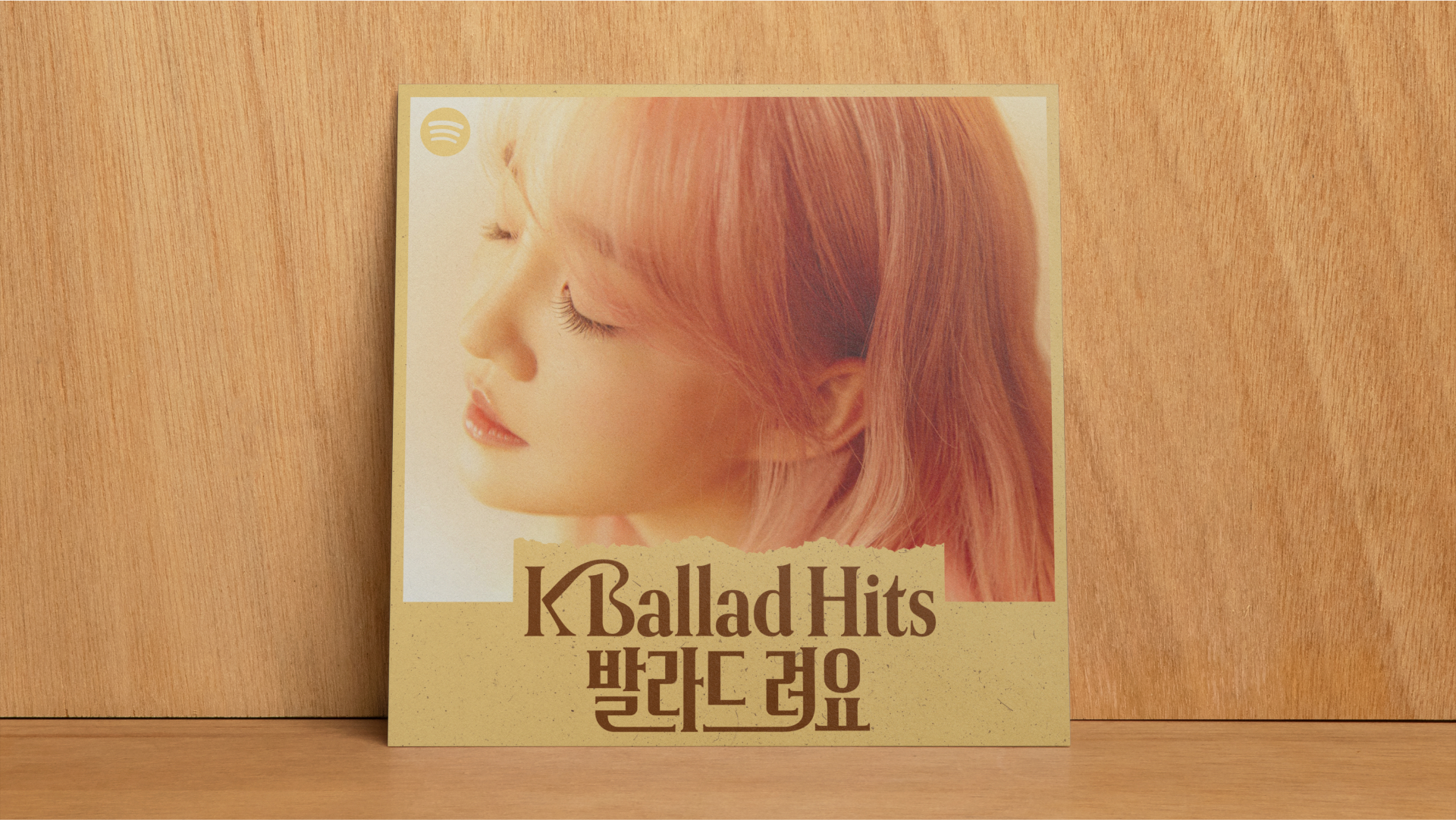
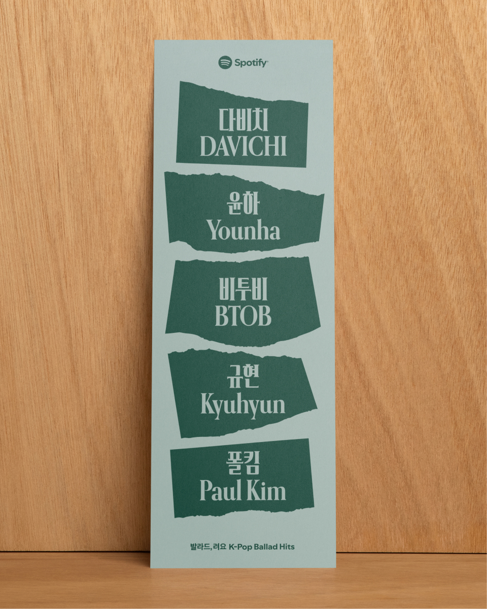
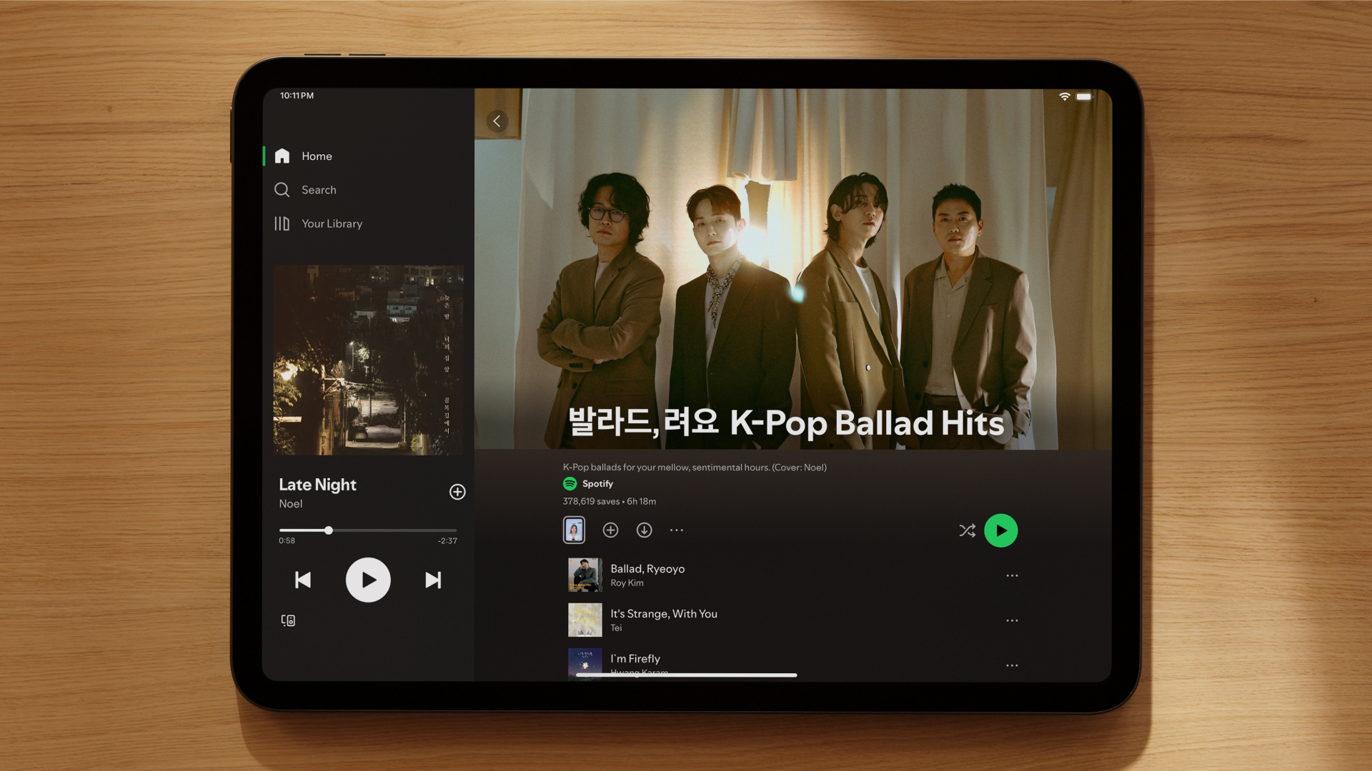
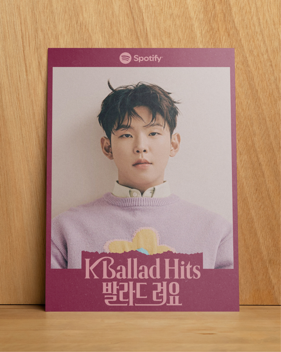
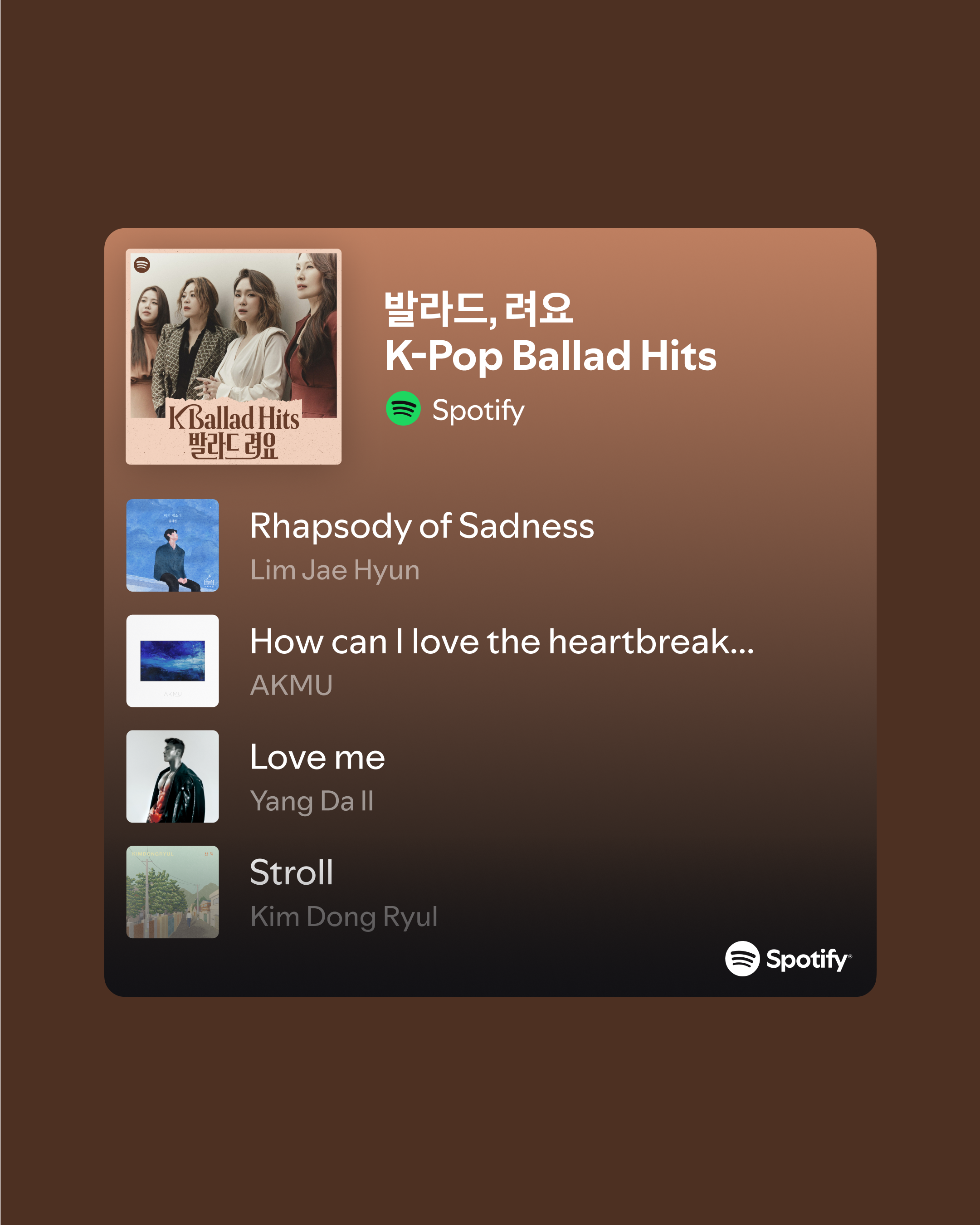
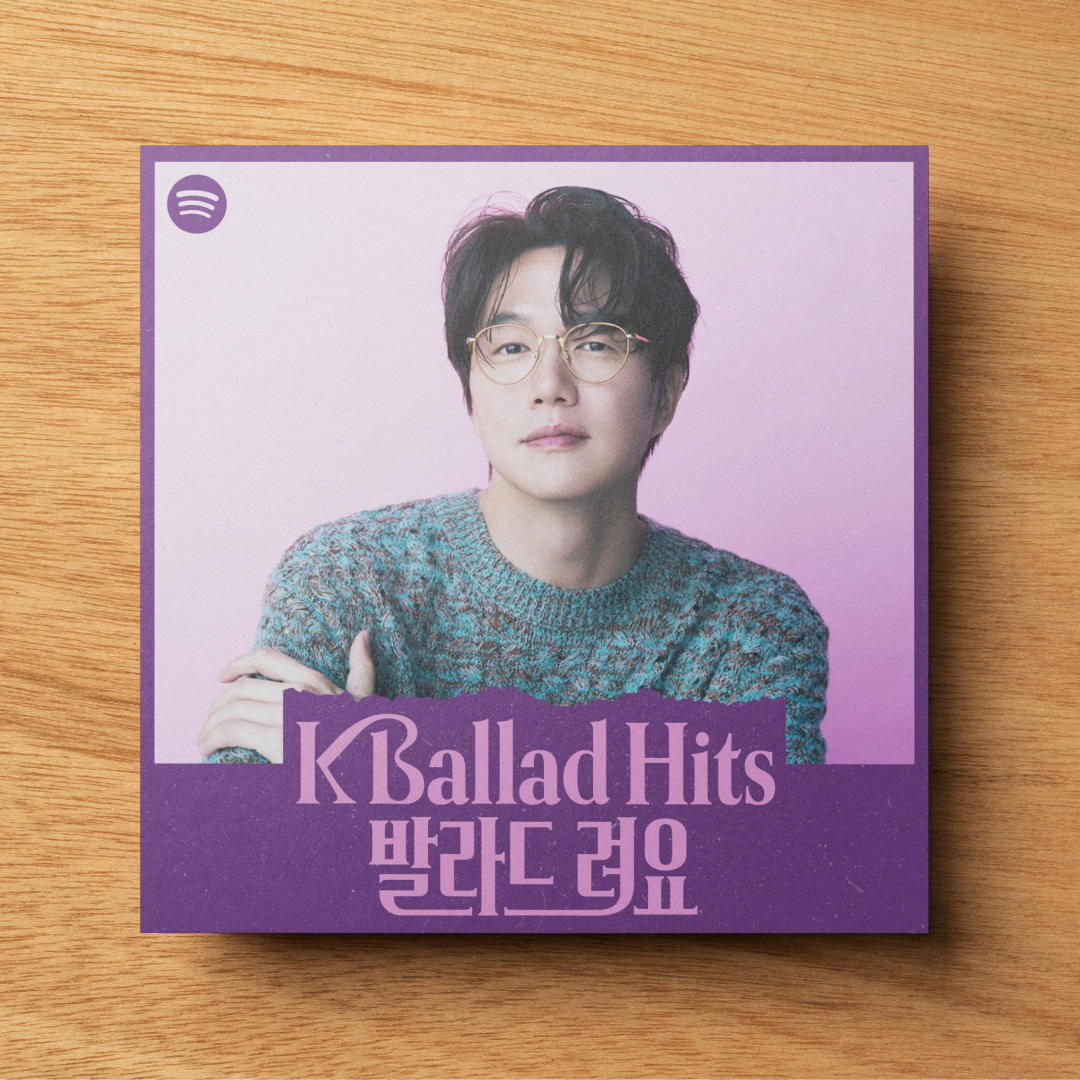
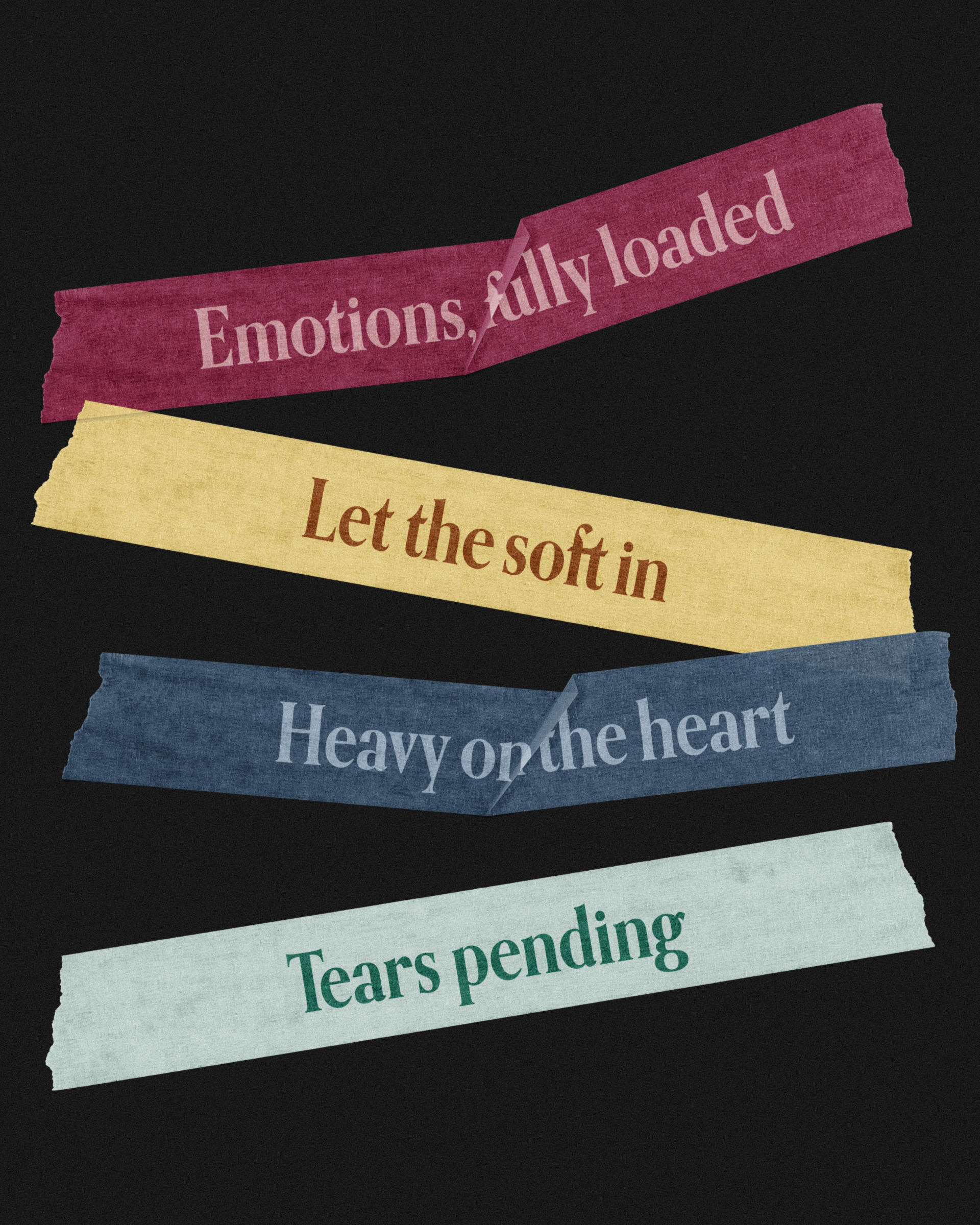
—Branding, Identity Design
The visual identity captures the soft emotional pull of the music. Korean and English typography weave together like overlapping voices, while torn paper textures and layered details recall the warmth of analog memories—mirroring the tender depth of ballads.